Process
I grew up around craftsmanship and creative processes in the studios and workshops of my mother (a furniture builder) and my neighbors (an array of painters, potters, woodworkers and more).
To this day I love looking at the sketches and prototypes of my favorite artists. Seeing their process not only gives insight to their inspiration and development but can also reveal an artist’s more expressive side. Early sketches and quick notes can exude personality and uncensored, unrefined creativity.
Beyond concept development I also enjoy seeing an artist “build” their work. This phase in any art project is where we see an artist ply their craft. Craft and technical skill are sometimes overlooked at this time in art history when concept (not execution) is supreme.
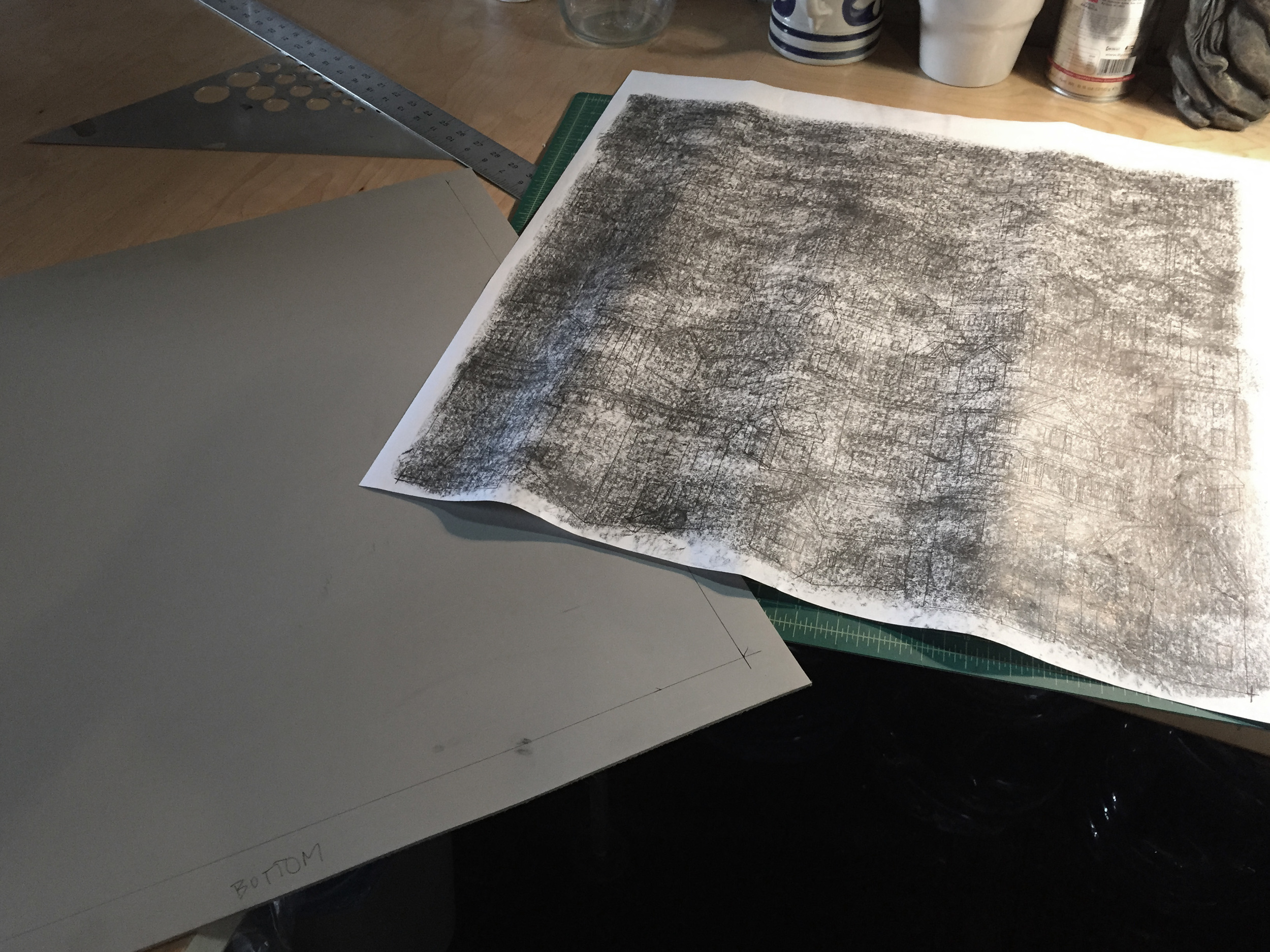
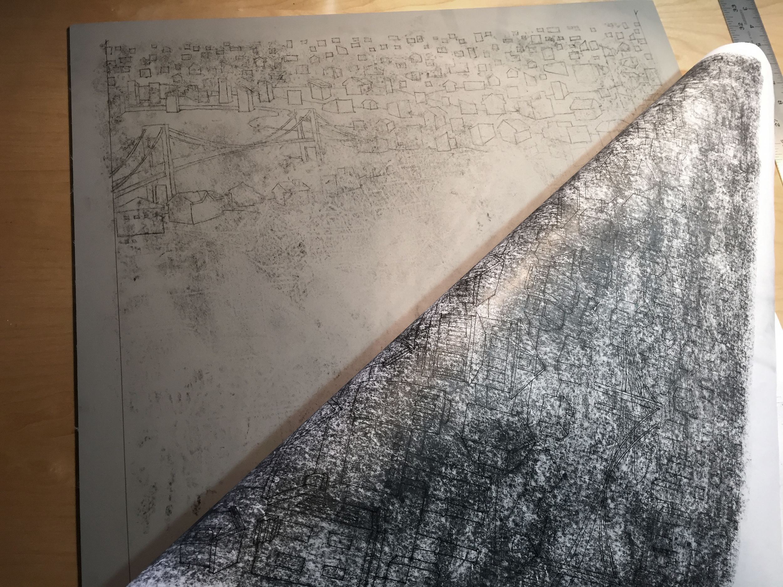
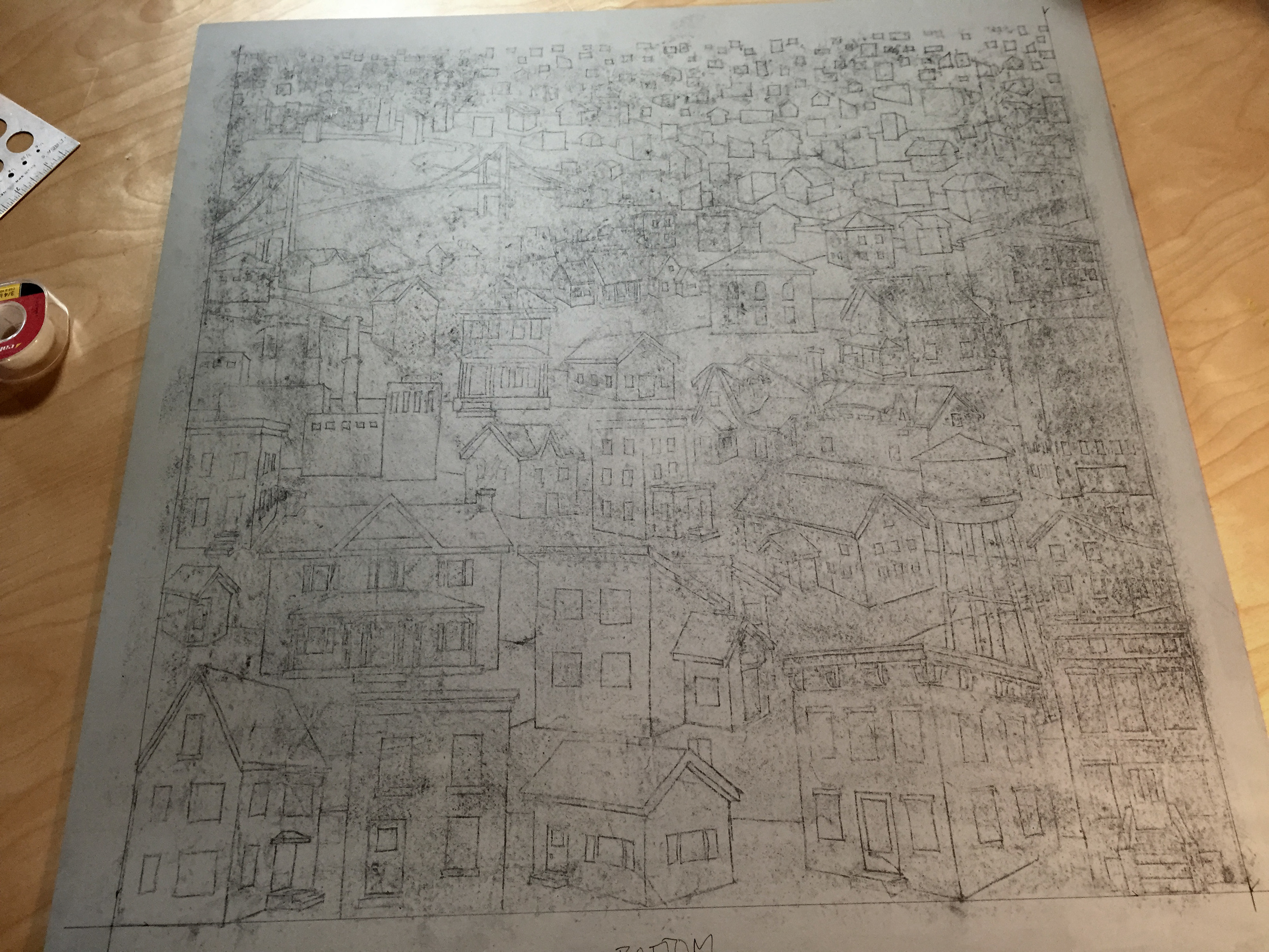
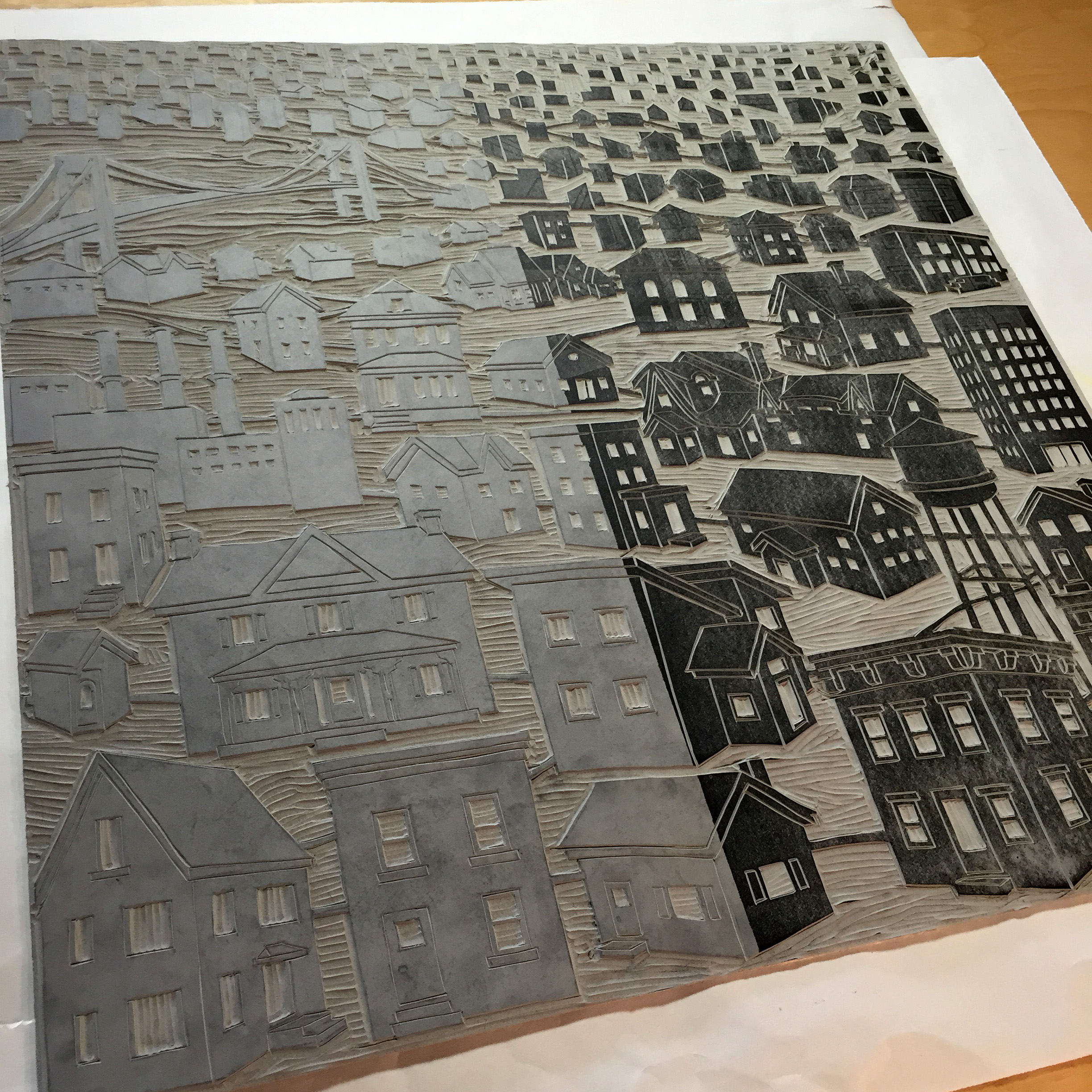
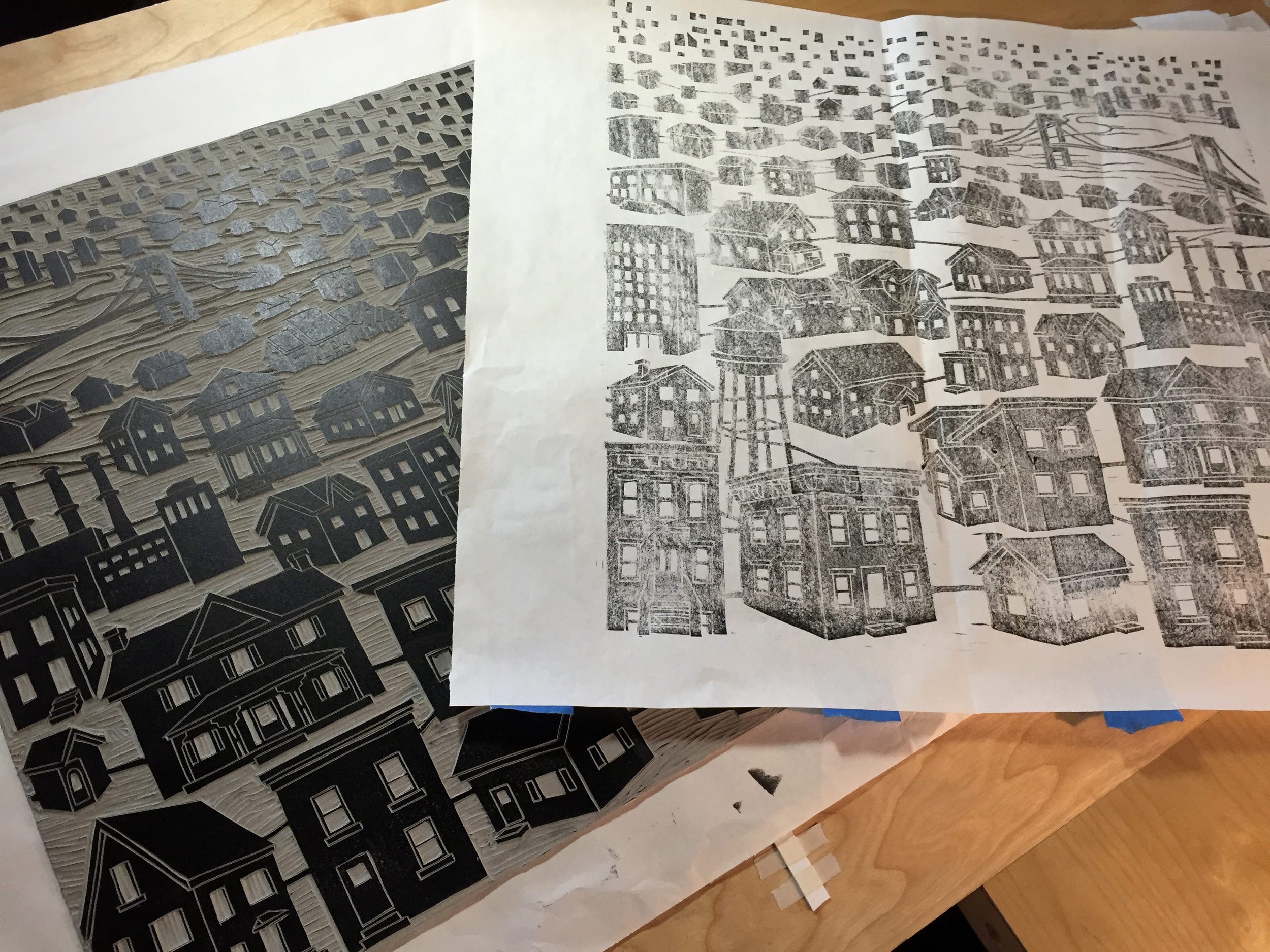
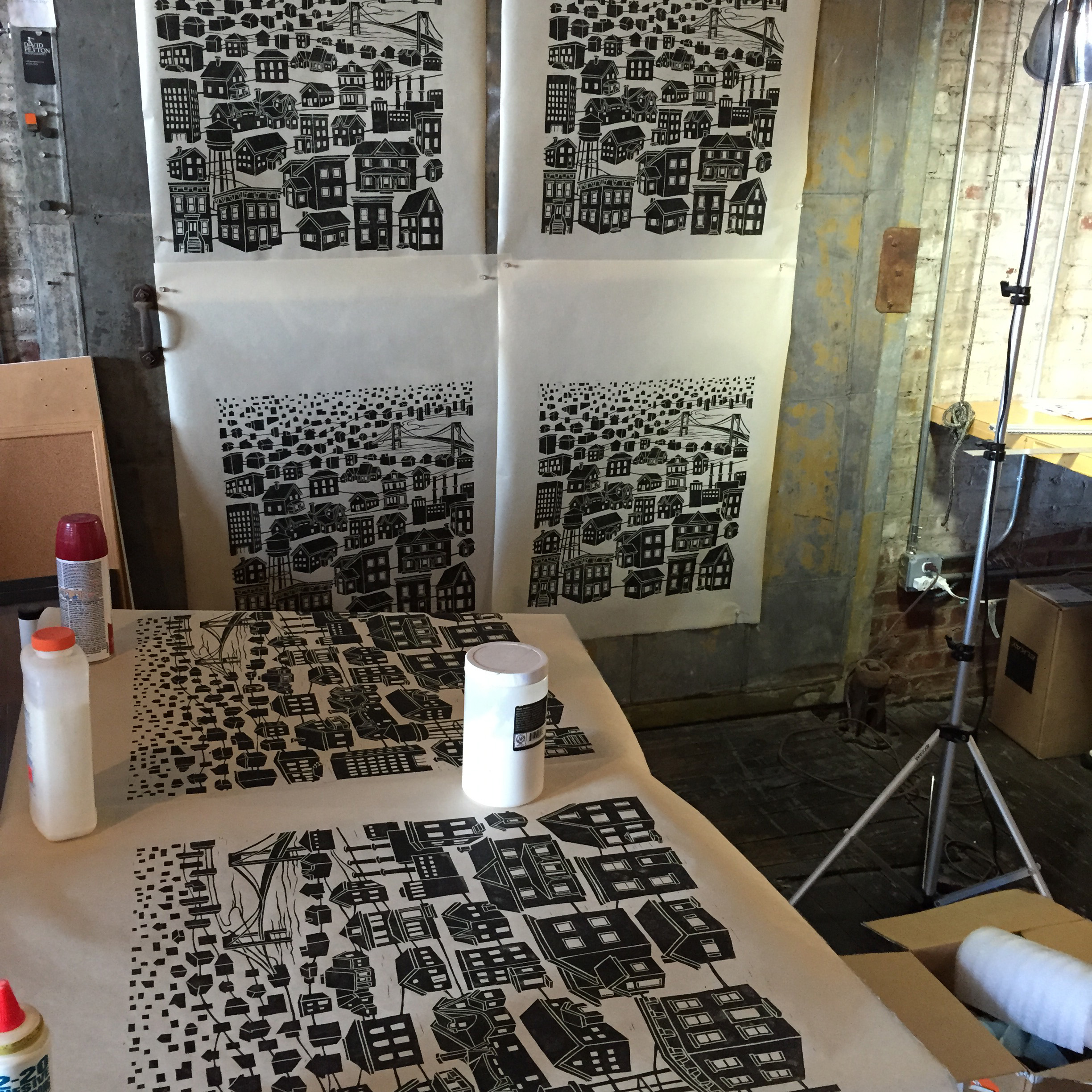
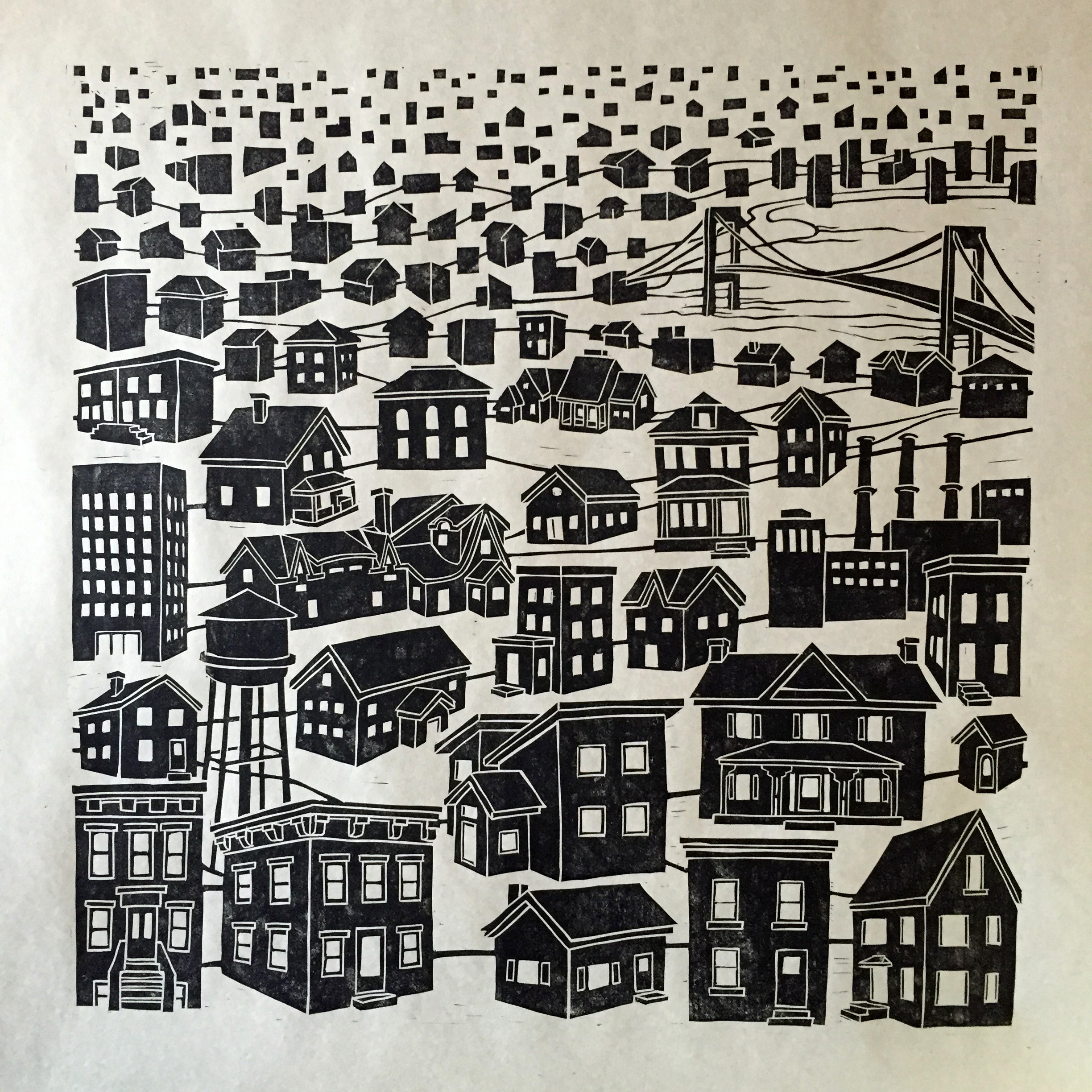
2015: Linocut Print Process
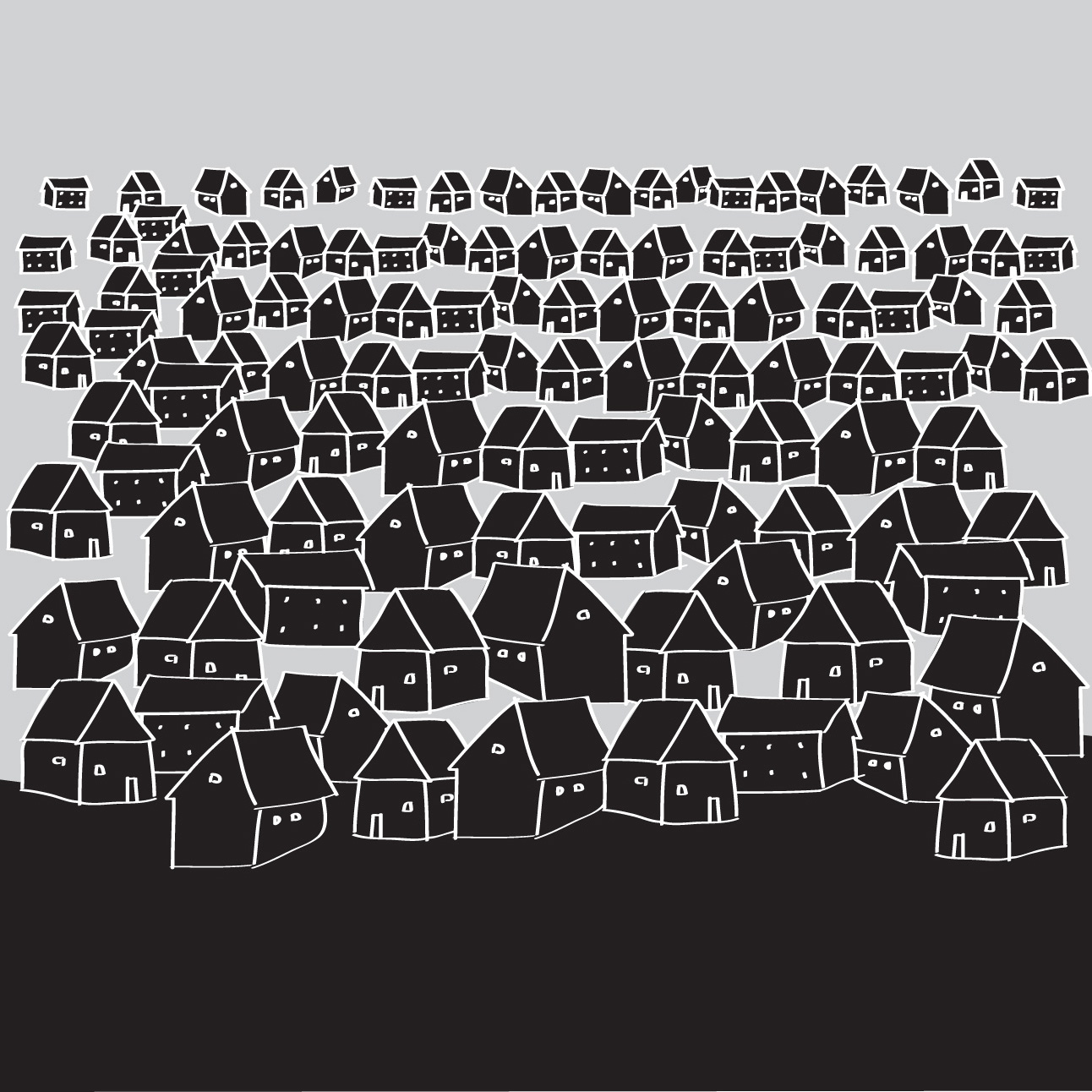
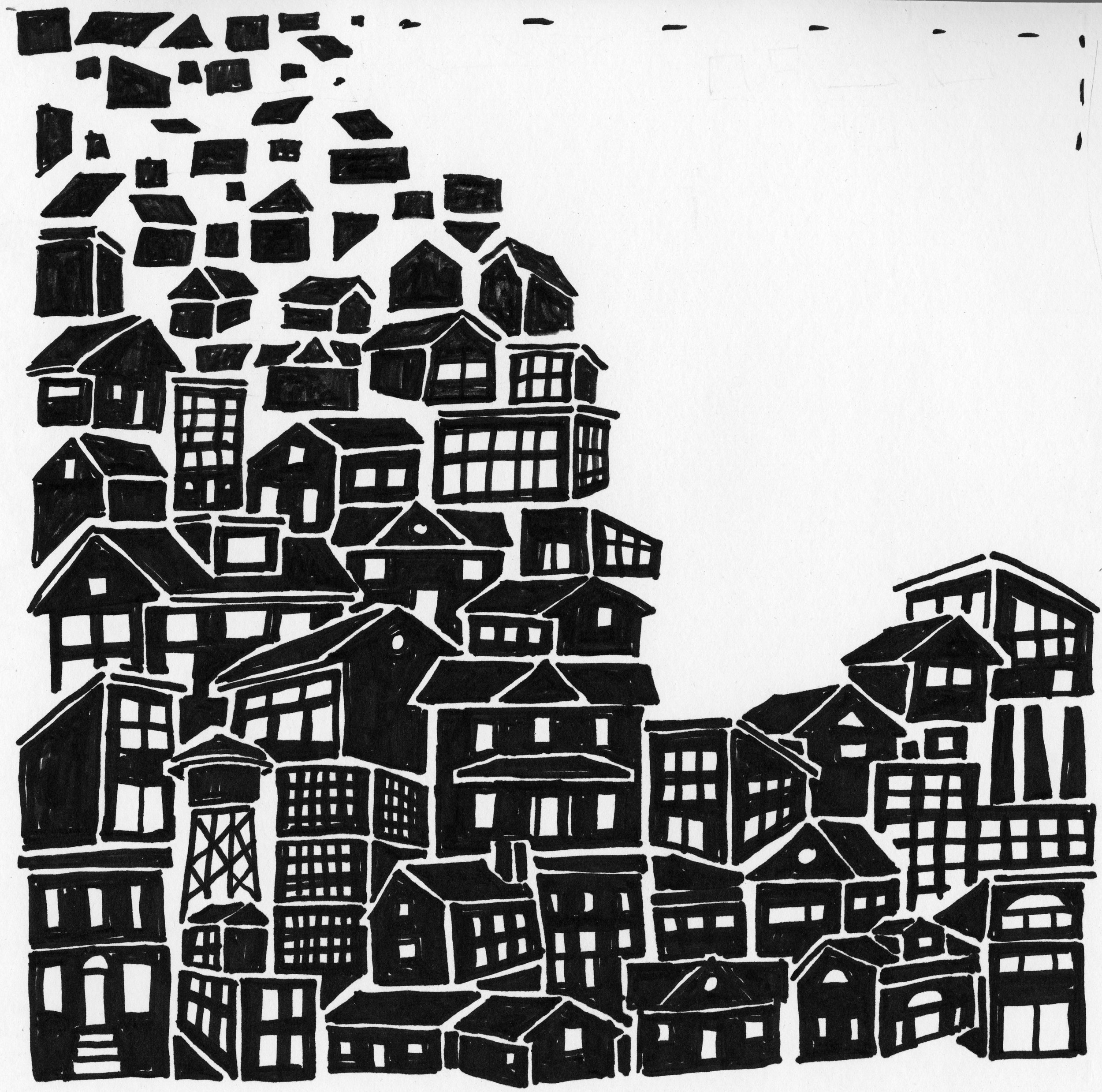
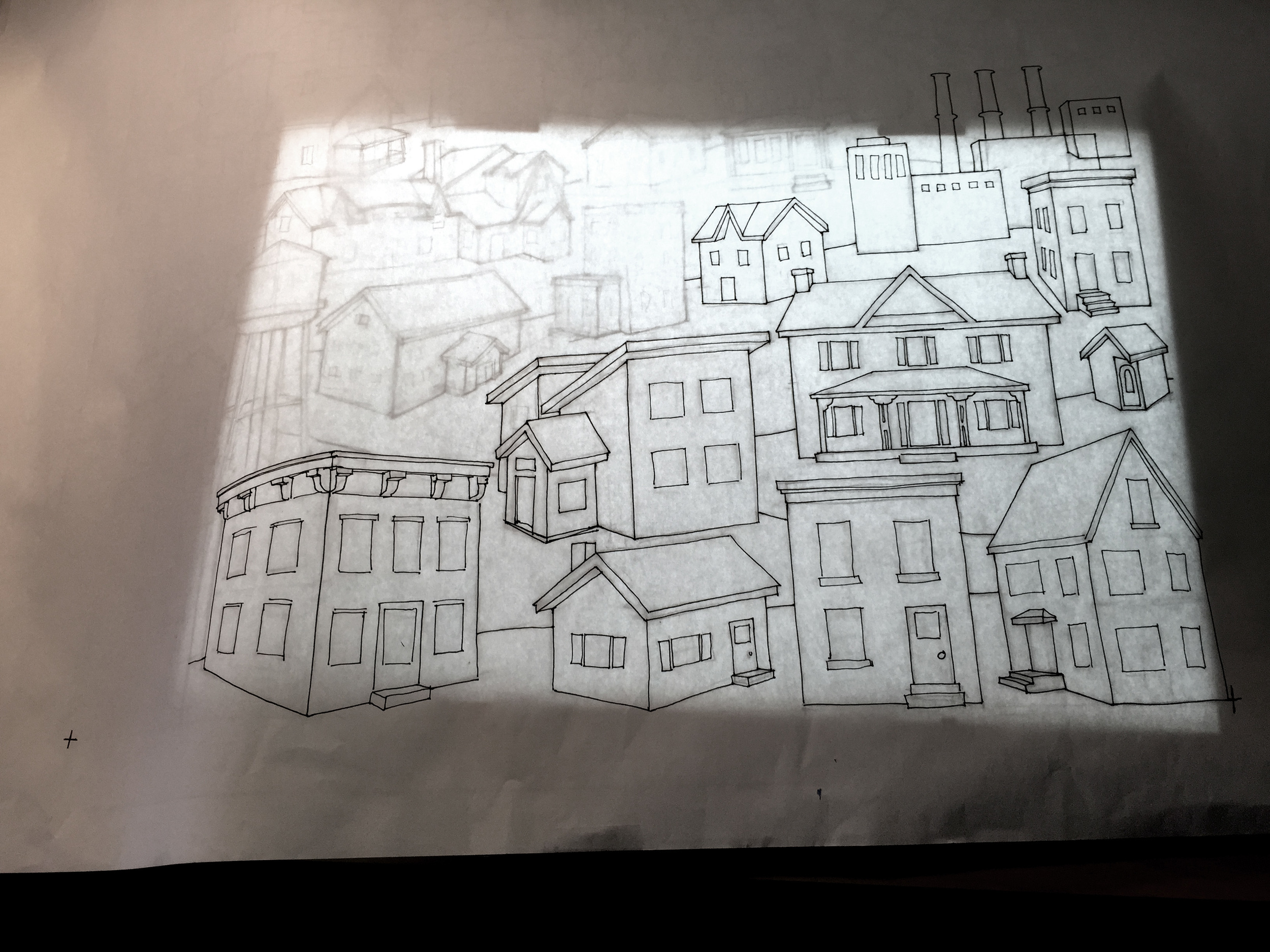
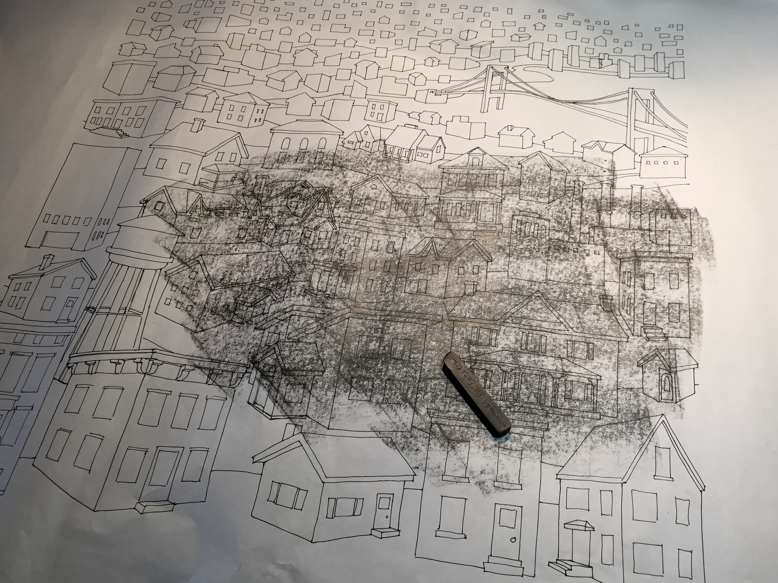
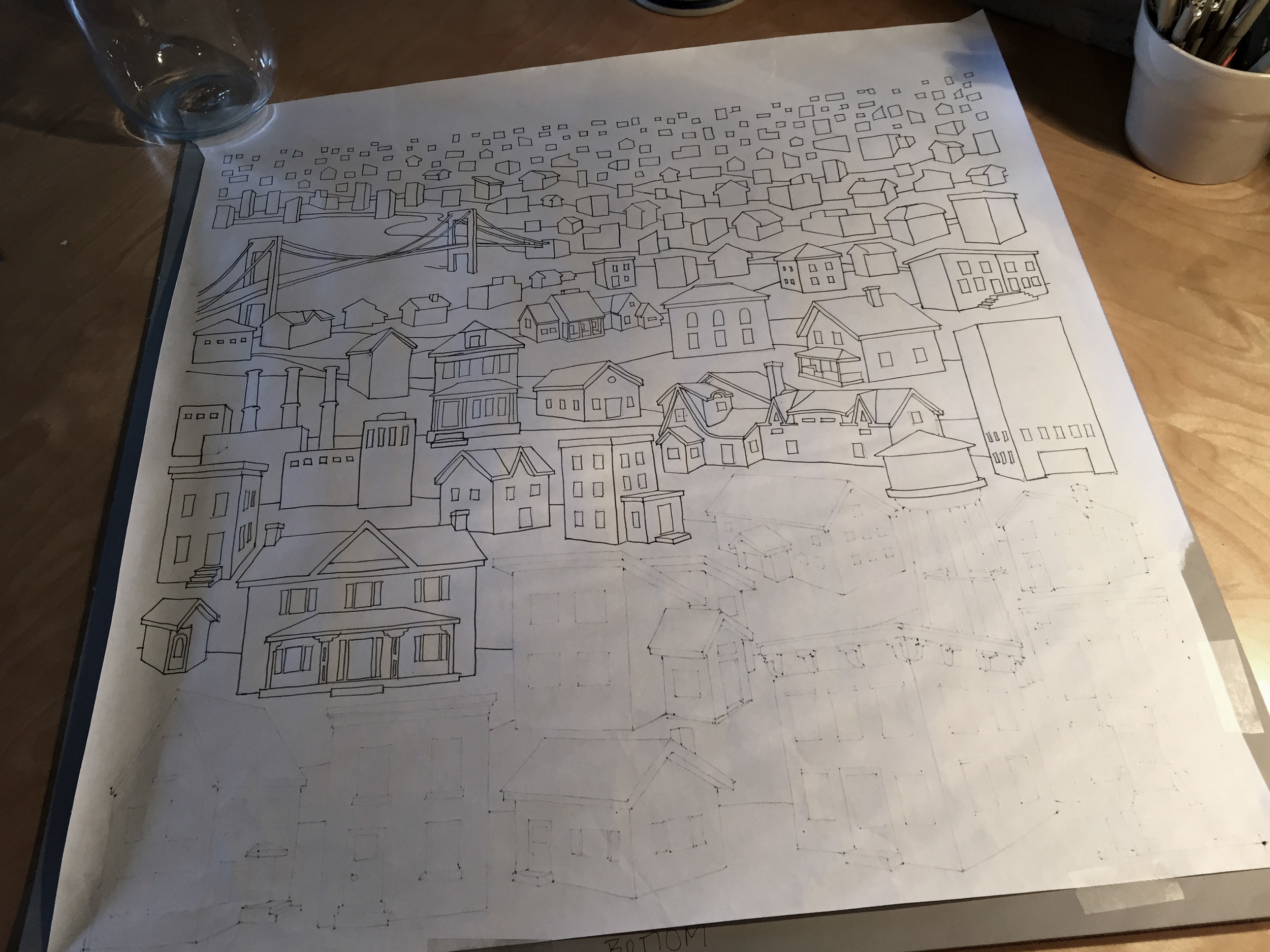
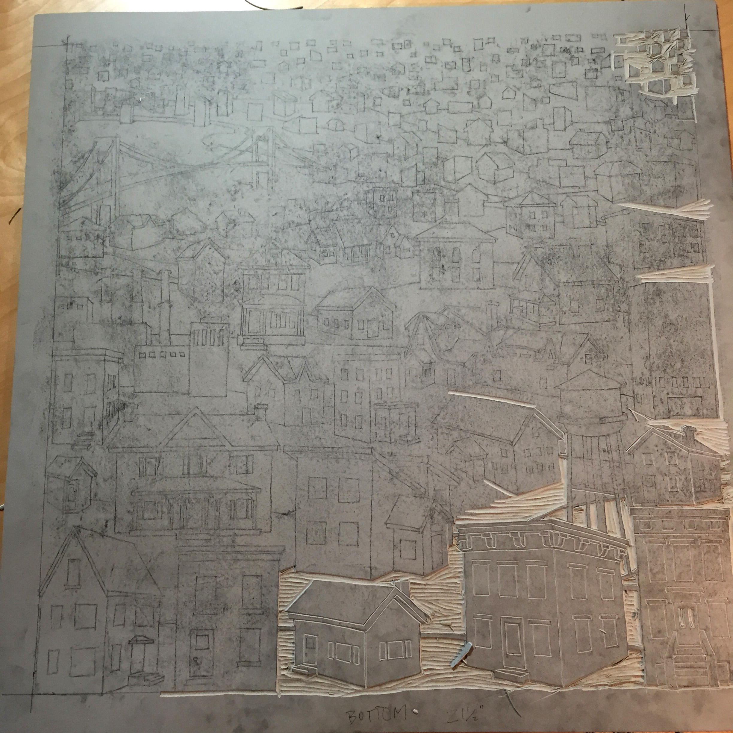
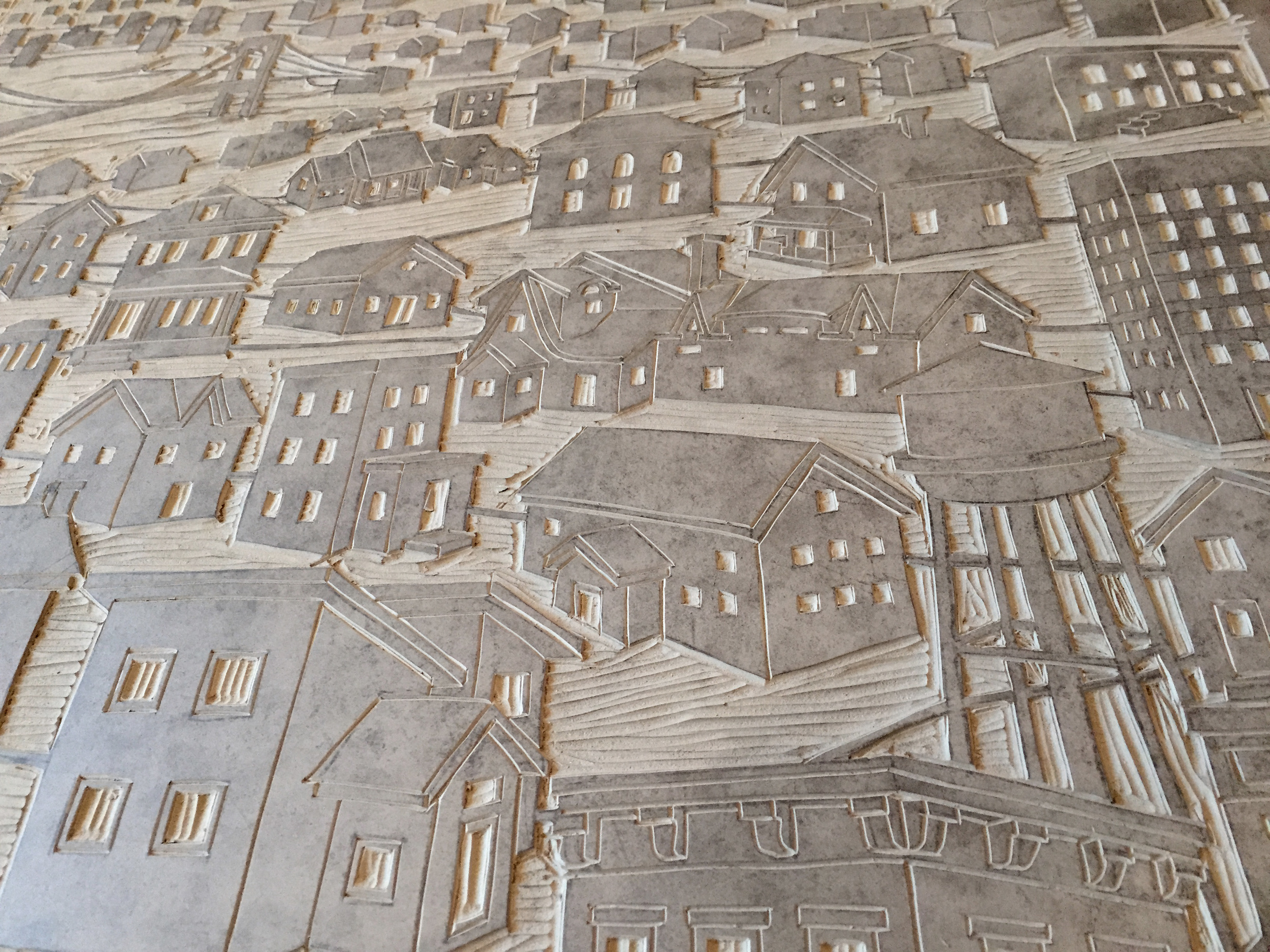
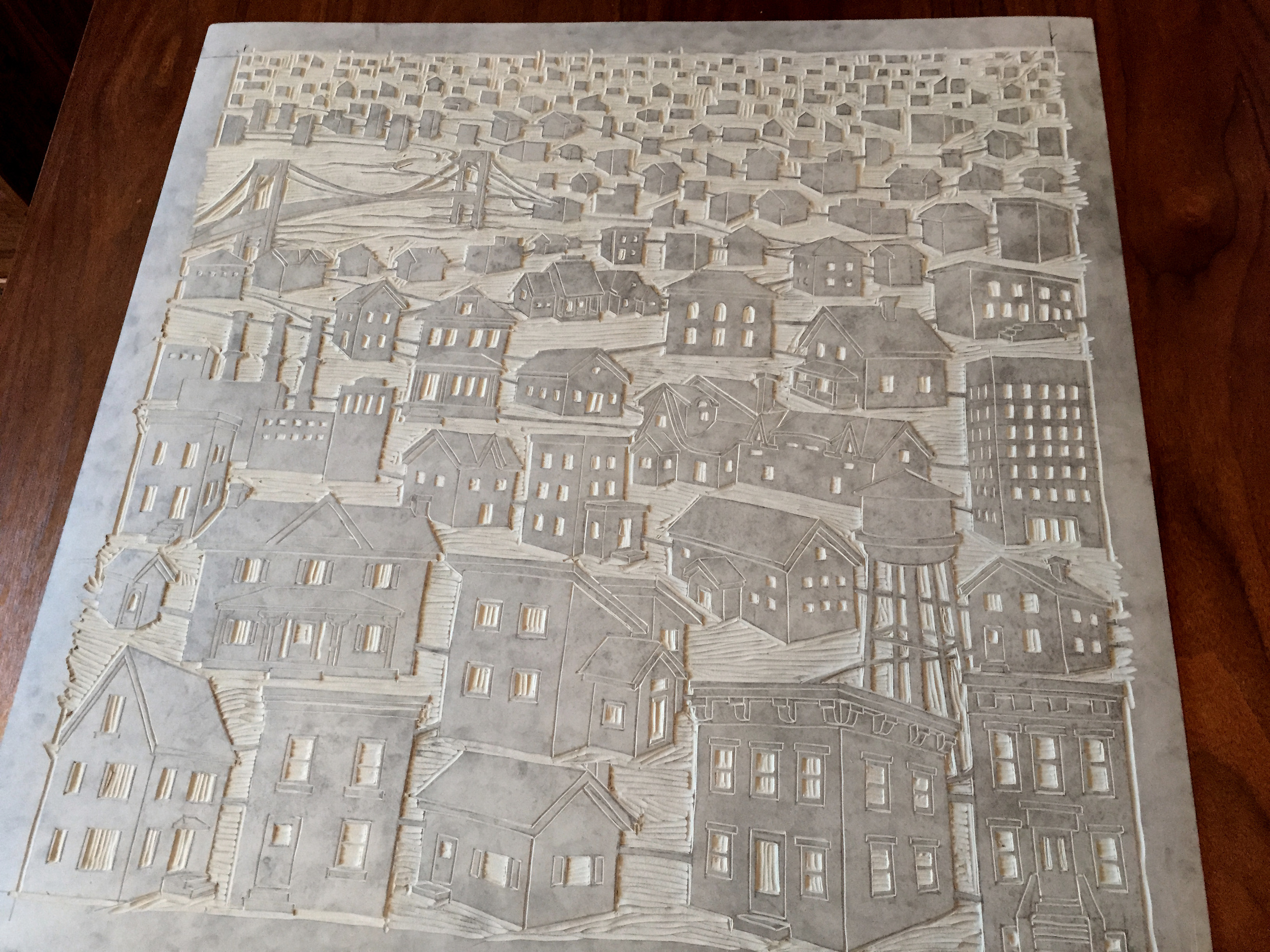
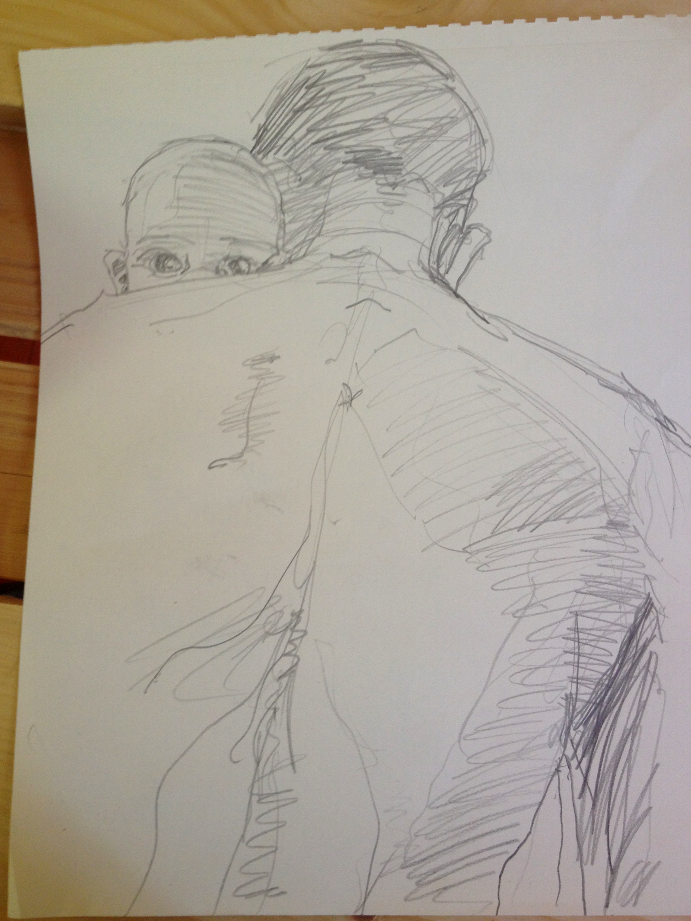
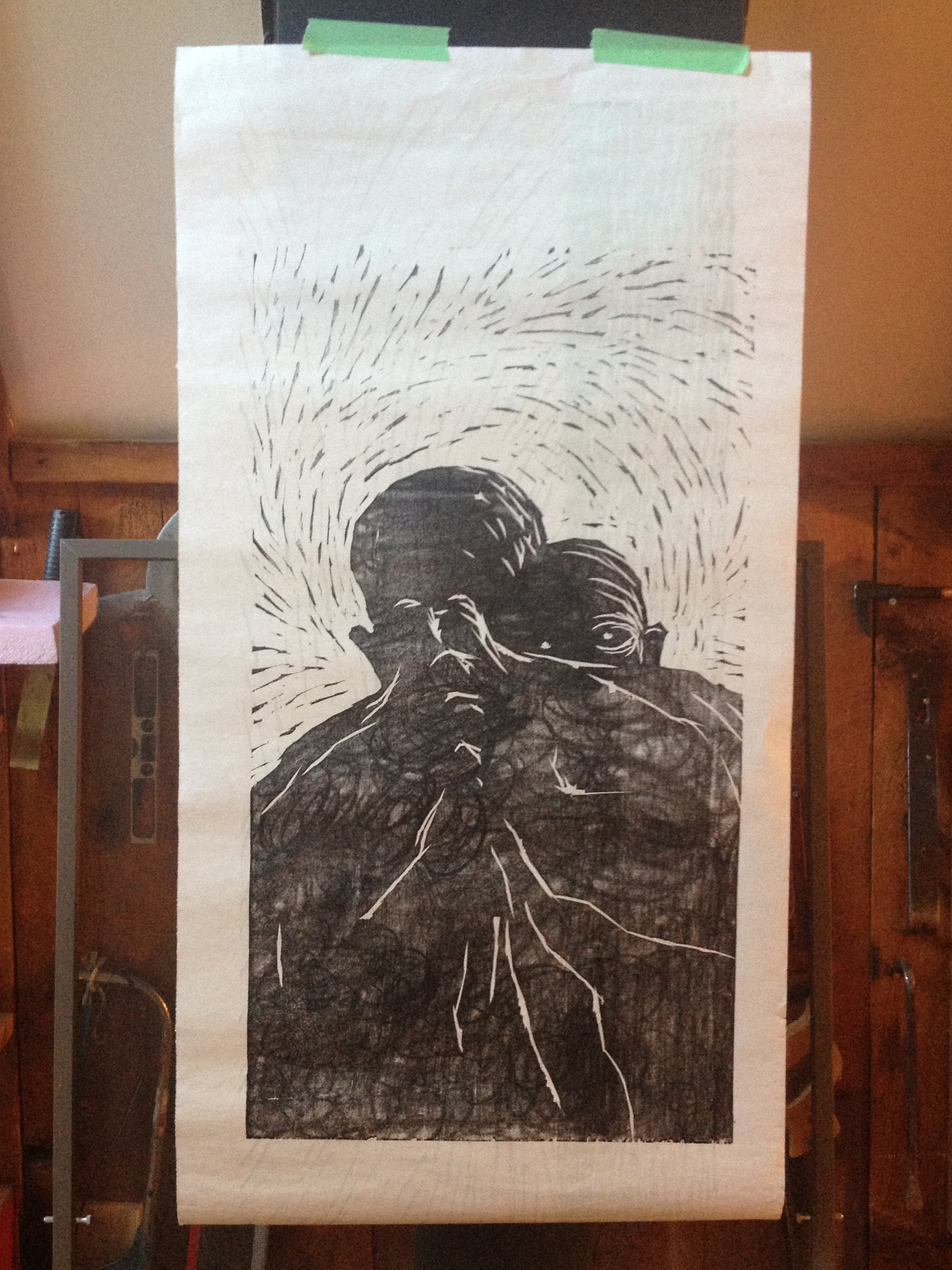
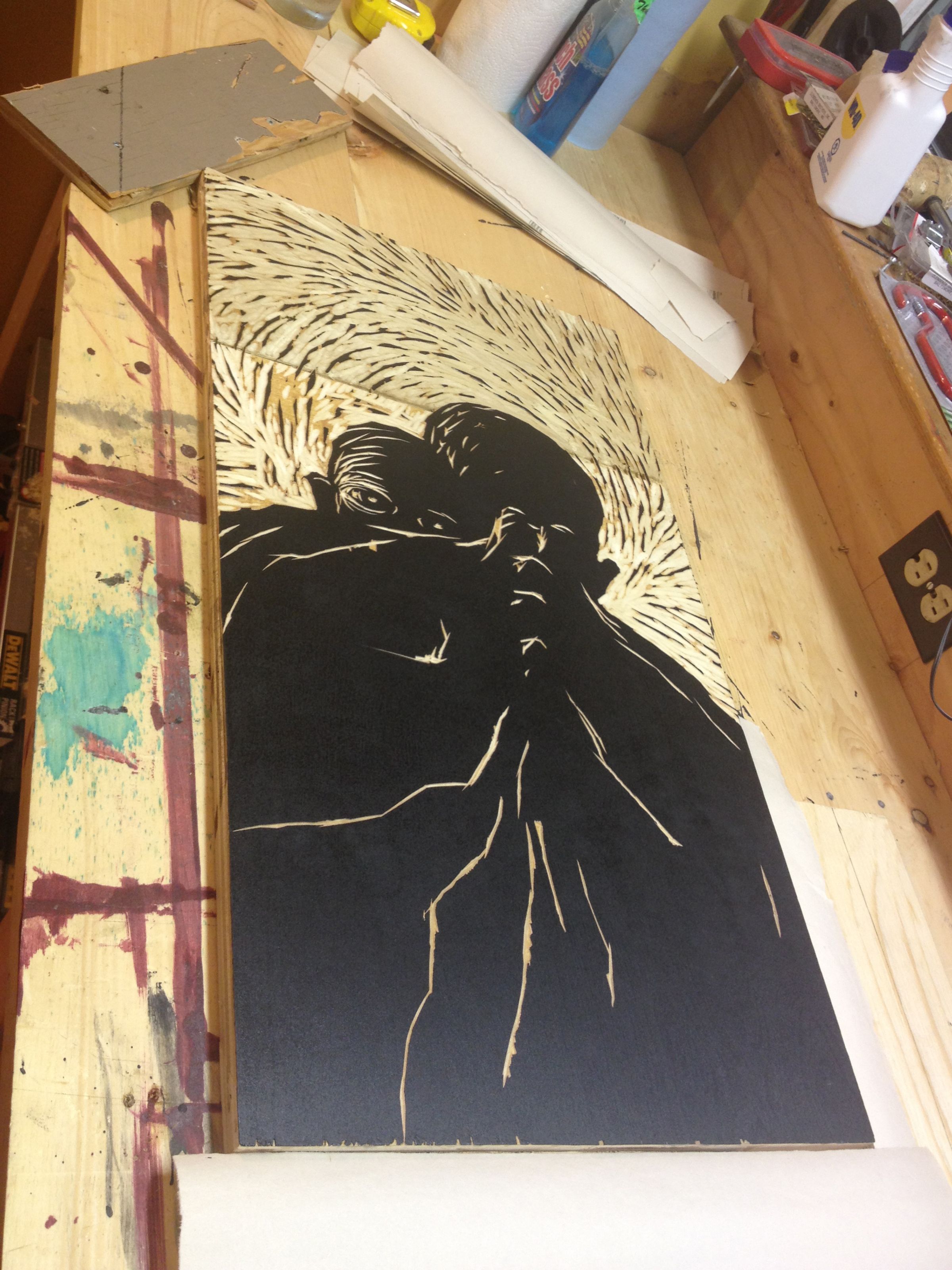
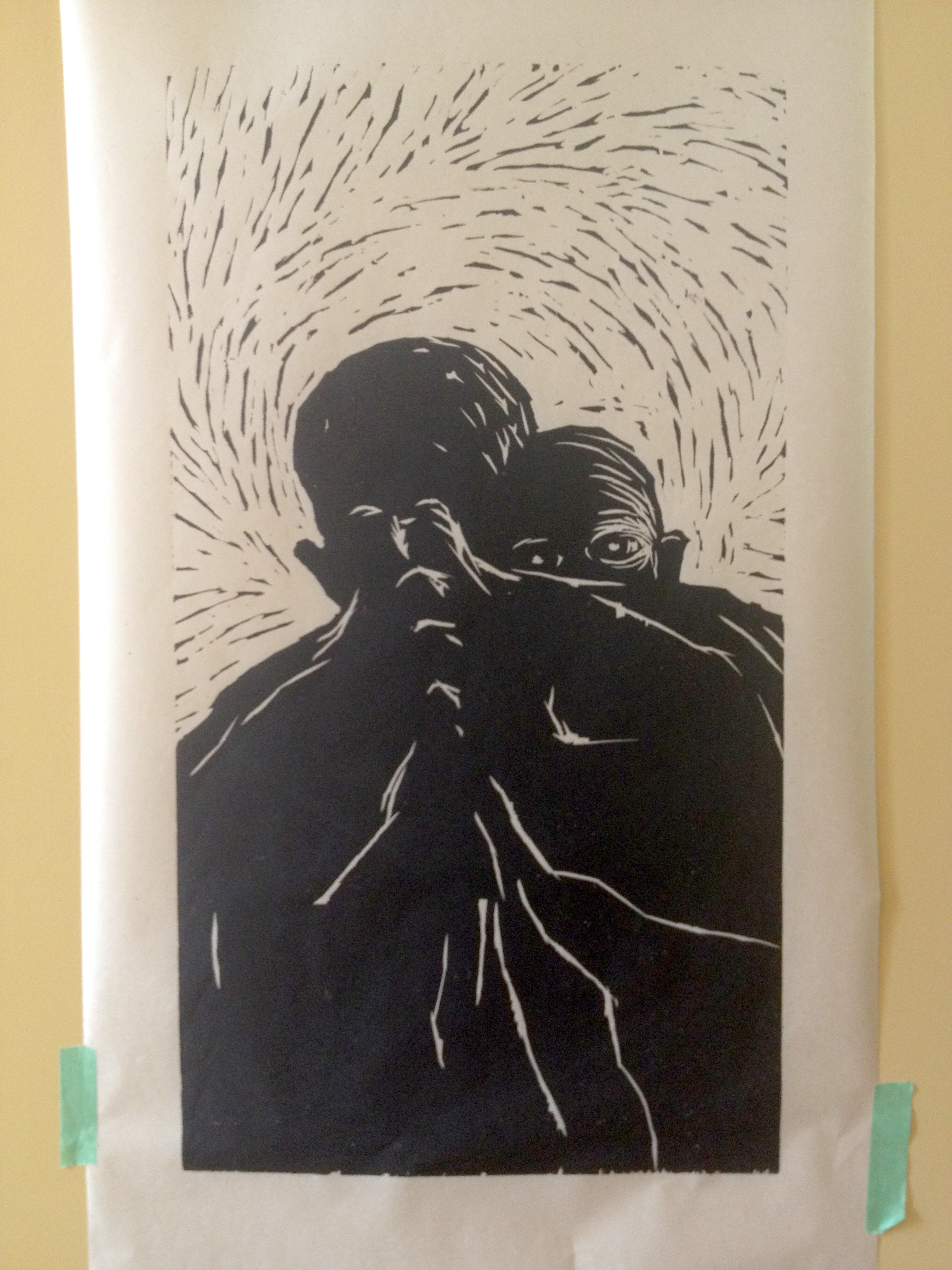
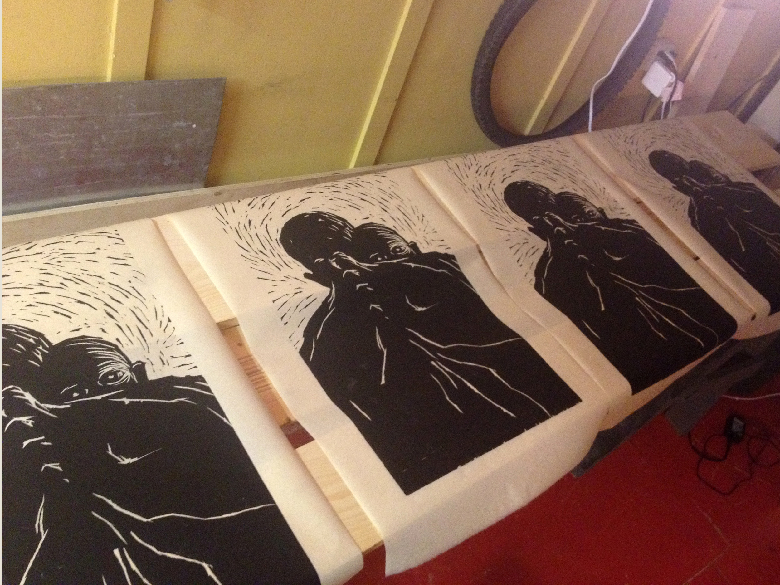
In the summer of 2015 I was commissioned to create a new art piece. The couple commissioning the work was going to give the piece to a dear friend who had officiated their wedding. We discussed all the themes they wanted to get across in the work, most importantly friendship and community. We all agreed these themes have a lot of cheesy design solutions attached to them and we wanted to avoid common tropes. The challenge: create a piece about friendship and community that wasn't tacky, overly sentimental, but still deeply meaningful to everyone involved.
My early concept was to use homes as a symbol of community. Their close proximity and unrealistic perspective was to imply closeness and friendship.
As I developed the work I attempted to push the forced flat perspective even further. The idea here was that the houses would move from top to bottom, eventually being reduced to simple geometric shapes. Reducing the homes to a simple, interconnecting pattern was another nod to themes of connectivity and community.
The most exciting change thematically came from a feedback session with the clients. We decided to include the homes of everyone involved in the project in the composition.
In order to create a print from my drawing I needed to reverse the image and transfer it onto the linoleum block. First I traced my pencil drawing with pen using a light box. This also gave me the opportunity to clean up the sketchy drawing and make any final tweaks.
I call this stage "poor man's carbon paper." Here I take soft graphite and completely cover over my newly traced drawing.
With my drawing fully obliterated by graphite I'm now ready to transfer the image to the linoleum block
I place the image (graphite down) on the linoleum. I then trace the image (again!), pressing firmly with a hard pencil.
The loose graphite acts just like carbon transfer paper (only messier) and transfers the image where I traced with a hard pencil.
This is where the "relief" in relief printing starts to make sense. I remove any of the surface that I don't want to print. What is carved away will not pick up any ink later when I print. Only the high surfaces will take ink.
"The term relief is from the Latin verb relevo, to raise. To create a sculpture in relief is to give the impression that the sculpted material has been raised above the background plane. What is actually performed when a relief is cut in from a flat surface of stone (relief sculpture) or wood (relief carving) is a lowering of the field, leaving the unsculpted parts seemingly raised." https://en.wikipedia.org/wiki/Relief
I use a piece of glass as a perfectly flat surface to roll out my ink. At this point I've already torn down all my paper to the right size. I've also got a bunch of newsprint cut to size to make my test prints.
This was taken in the middle of rolling ink on the block for the first time. The block will never be this clean again.
First test print! You can see that the image is light and uneven. It takes time to build up the ink surface on the linoleum block to a point where it will print nice and black. I printed seven test prints before the block was ready for the good final paper.
I print by rolling out ink on to the block with a large roller. I then place the paper over the block and rub the back of the paper with a wooden spoon or a block of wood.
Finished prints drying in the studio. After examining the prints for irregularities and after on mishap (rip) I ended up with an edition of six prints exactly the same.
The paper is Kitikata, a lightweight but strong Japanese paper.
"Friendship"
Linocut print on Japanese Paper
Image: 21.25" x 21.25"
Paper: 29" x 29"
2014: Photo Collage and Drawing
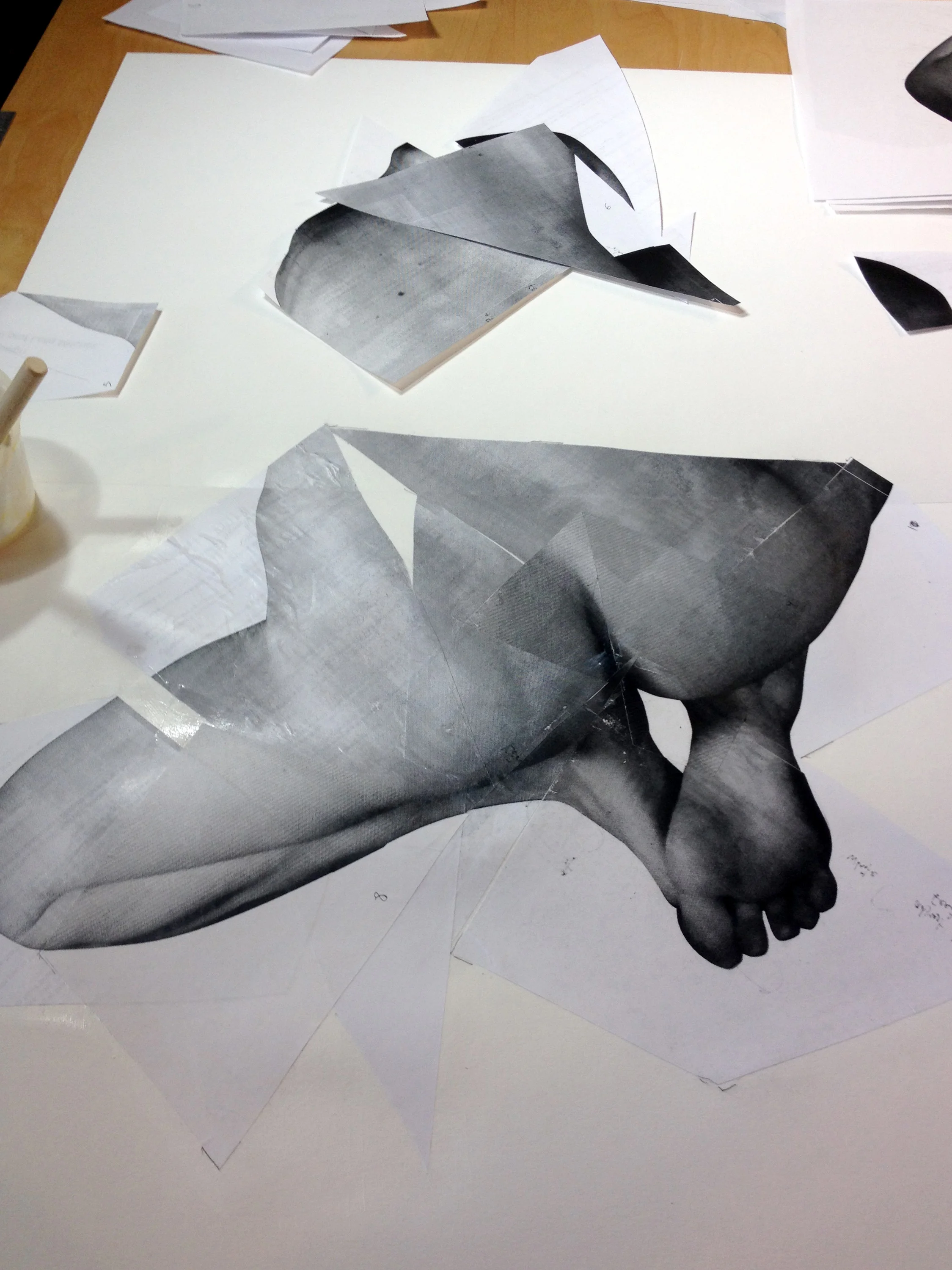
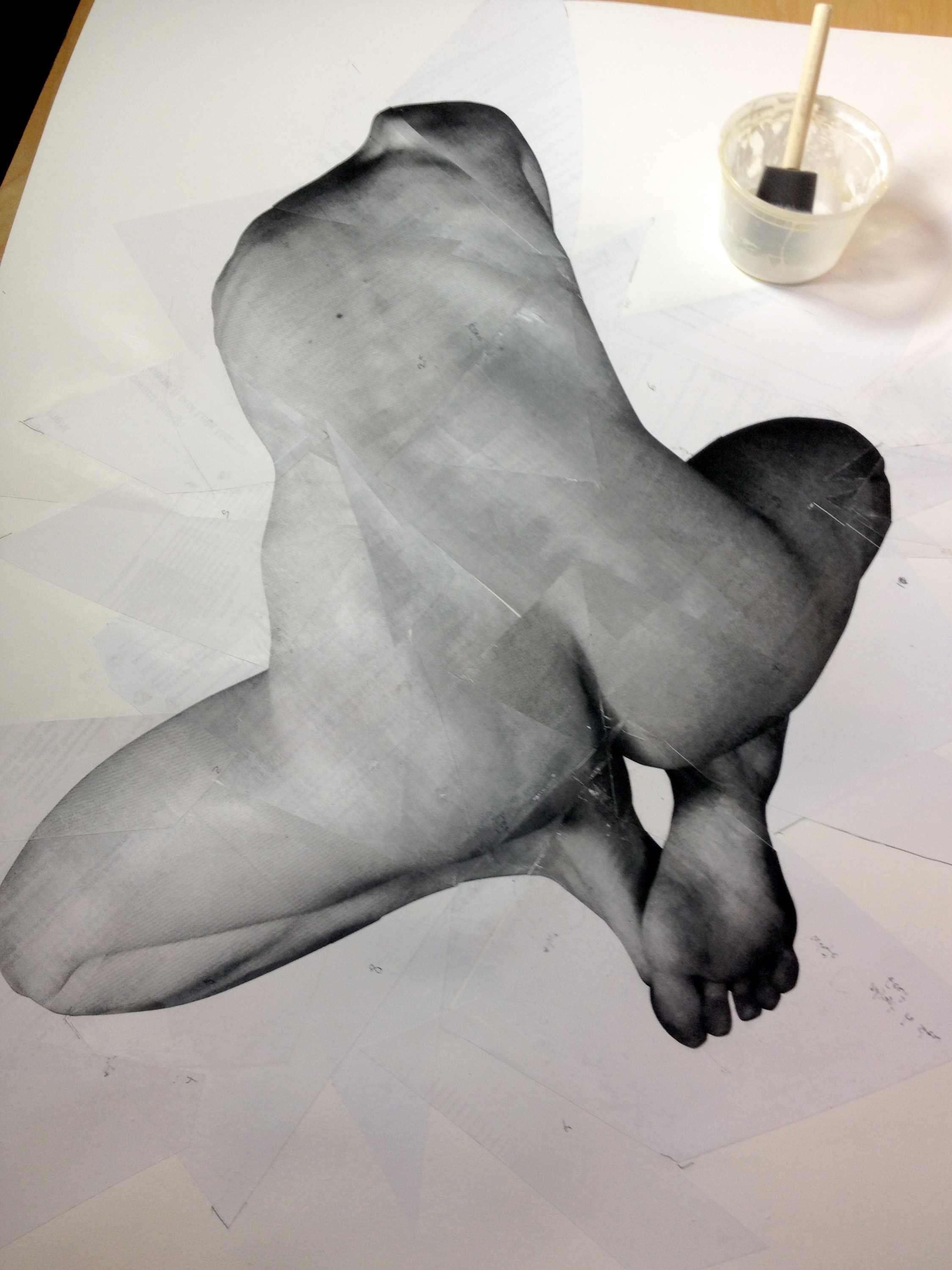
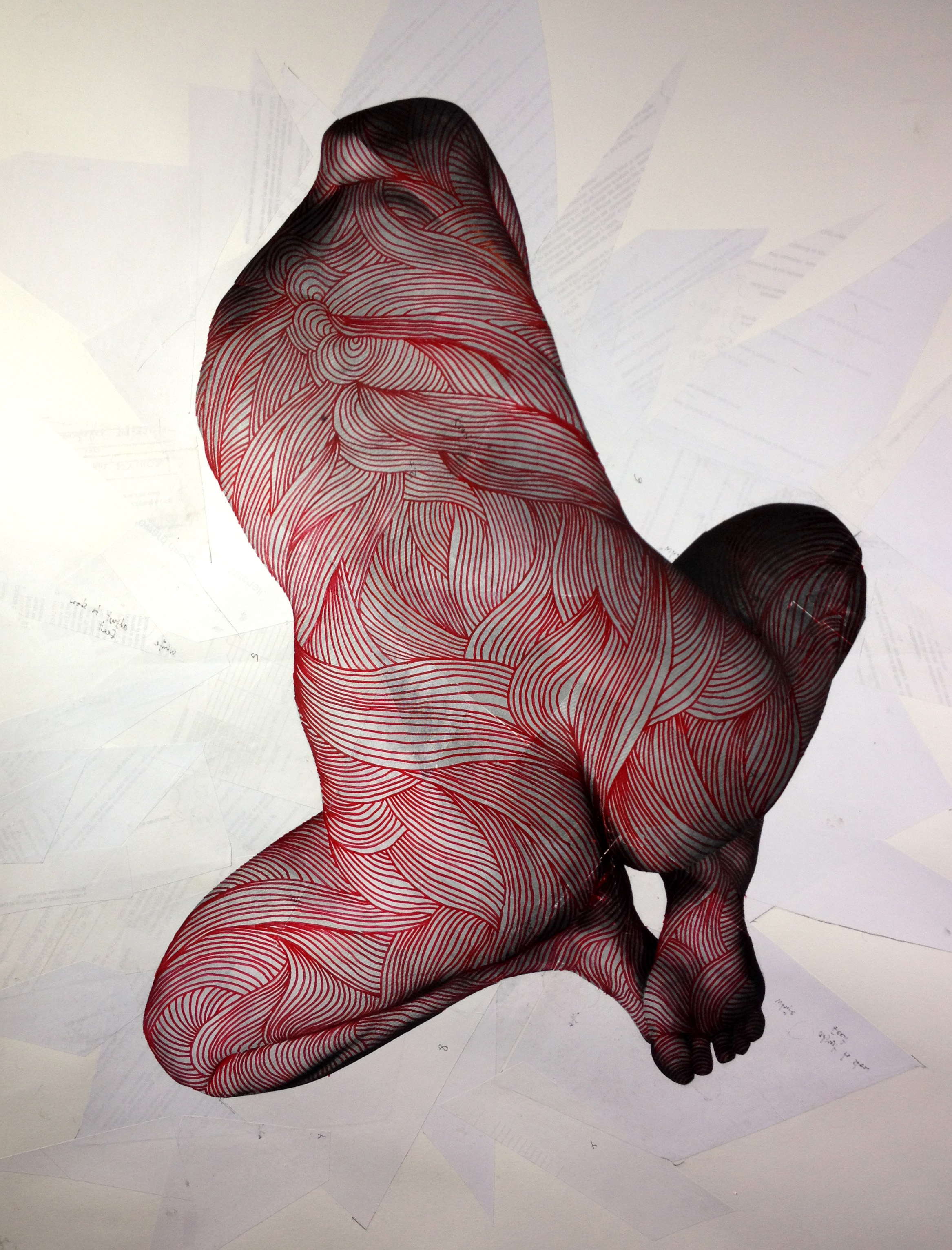
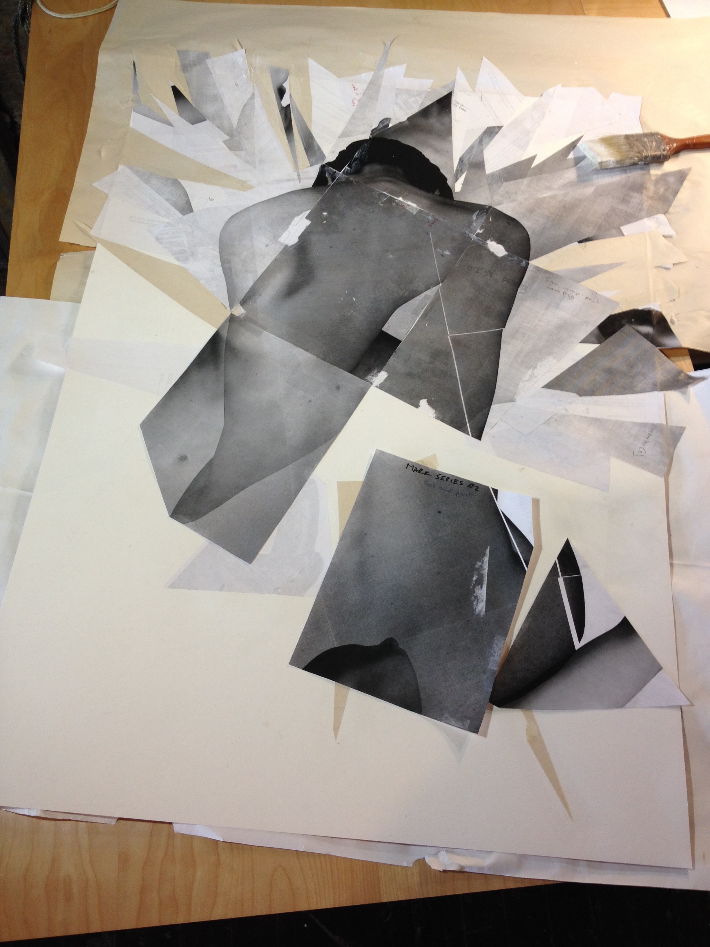
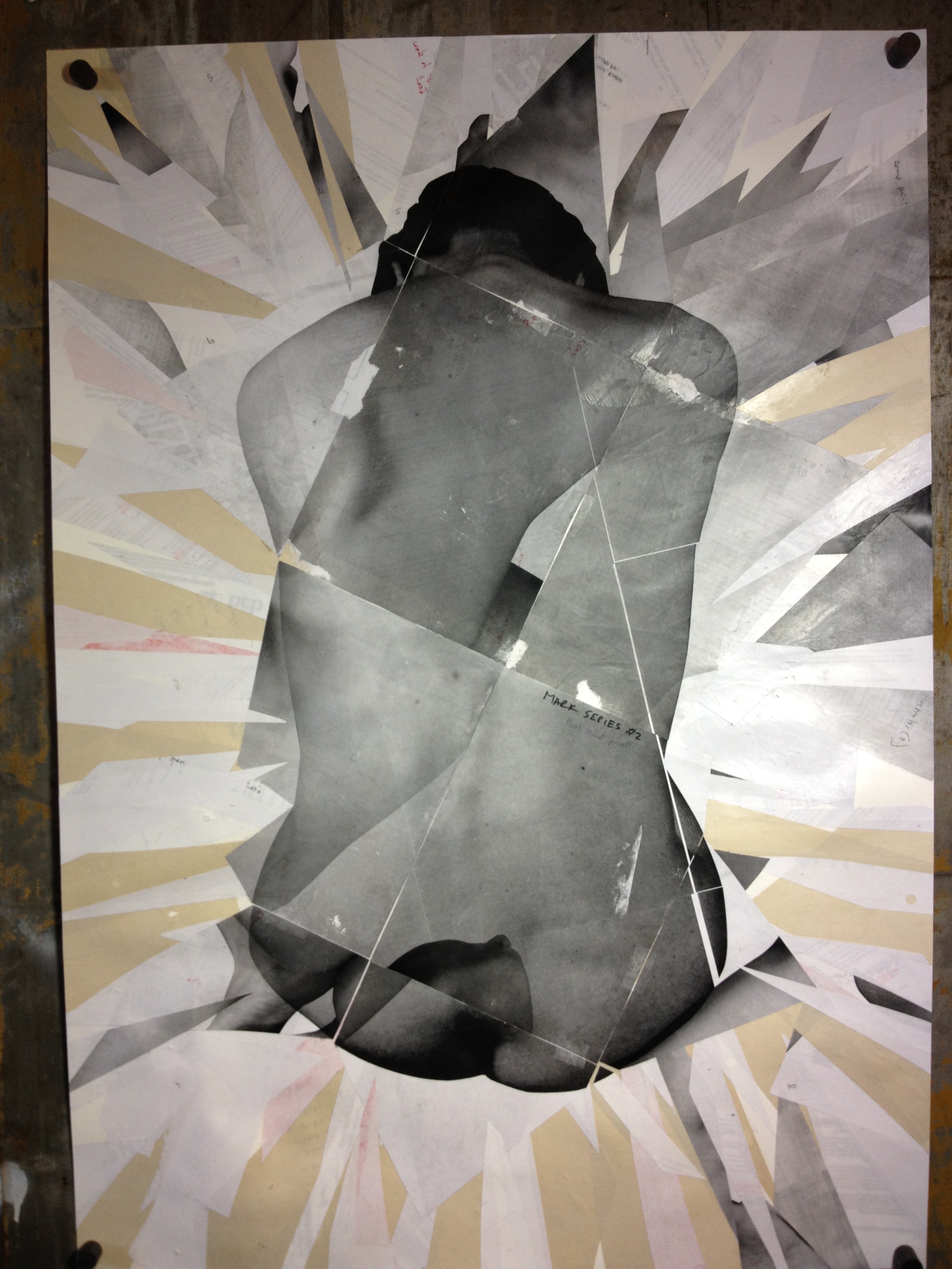
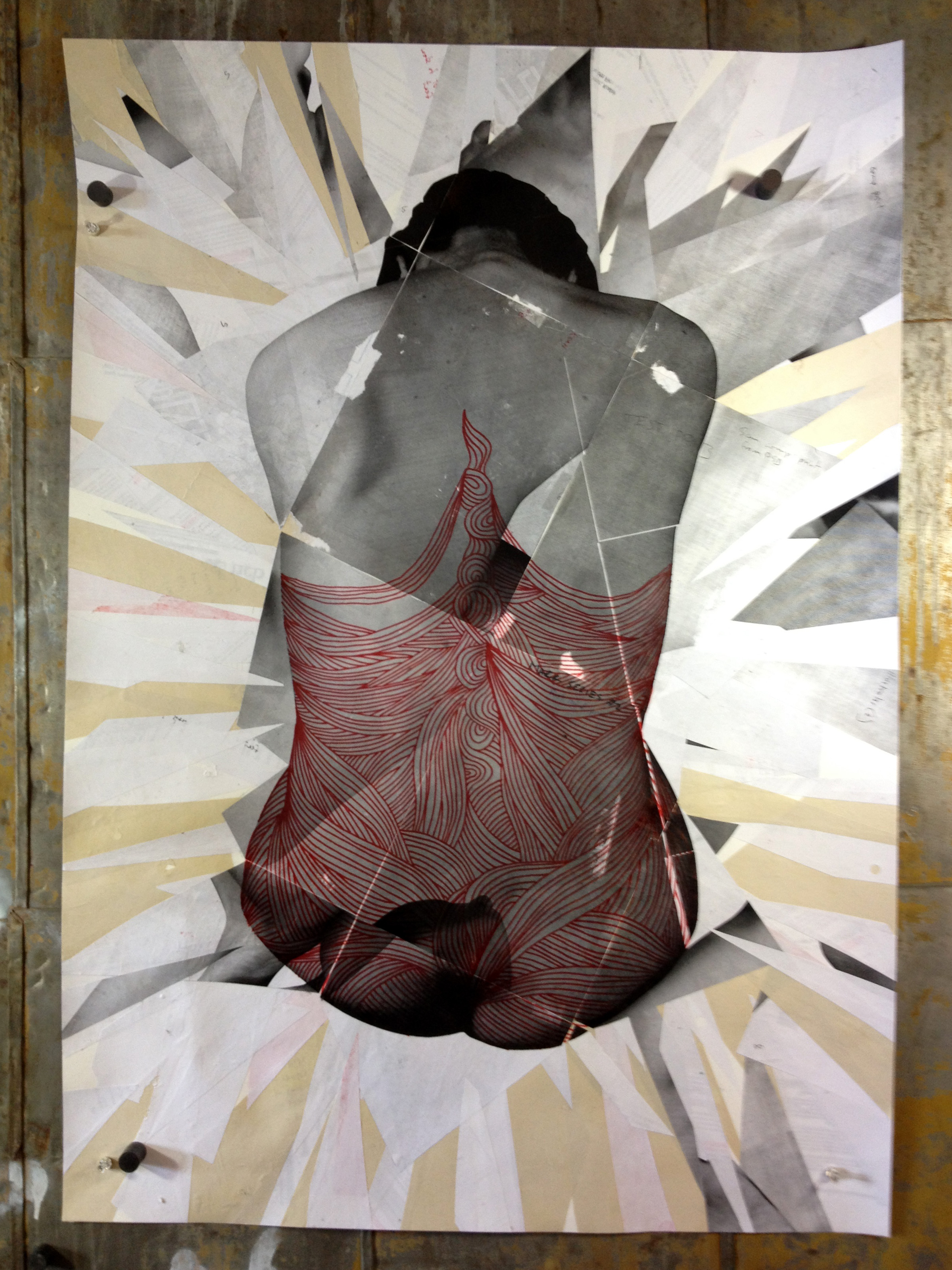
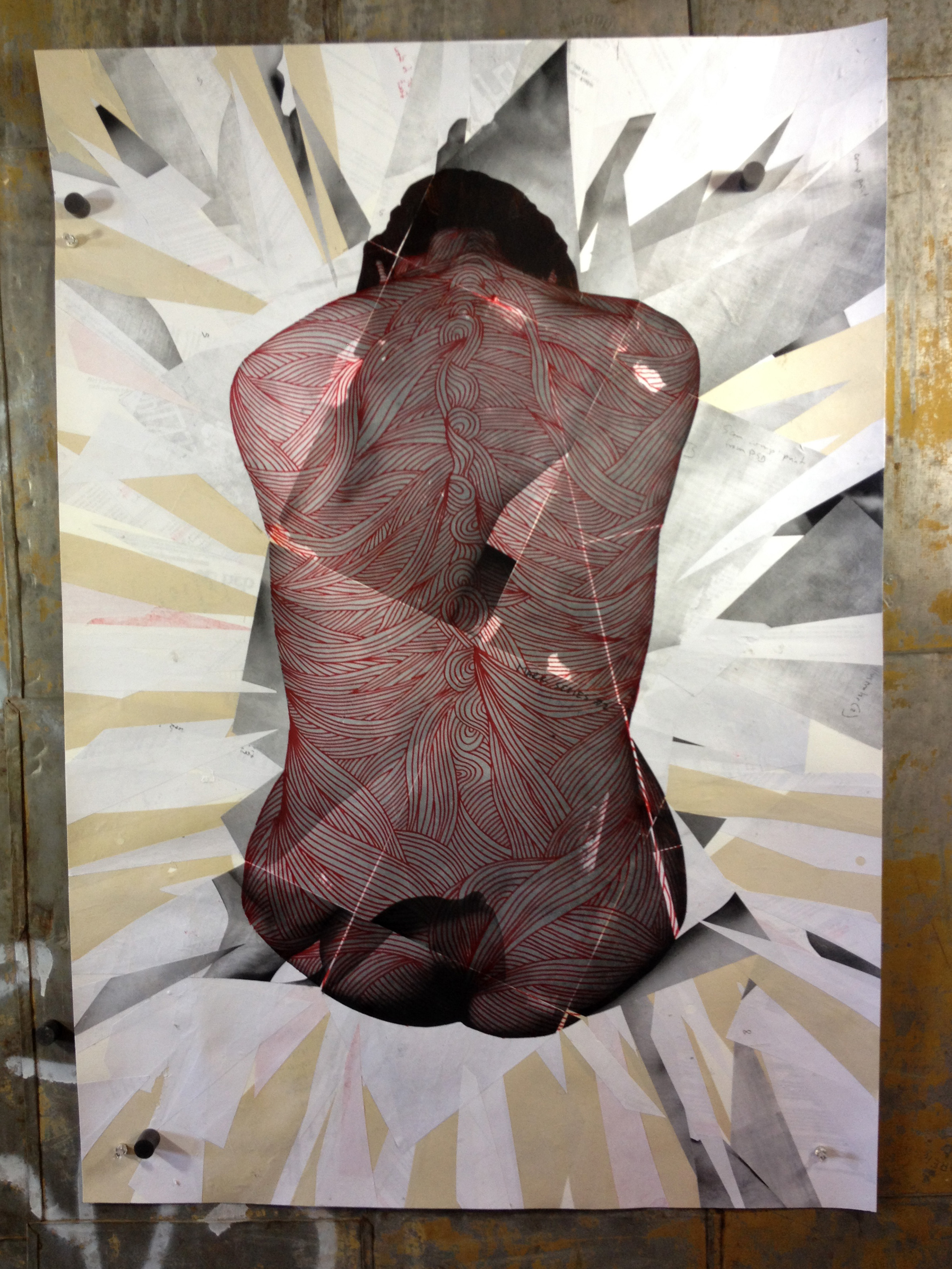
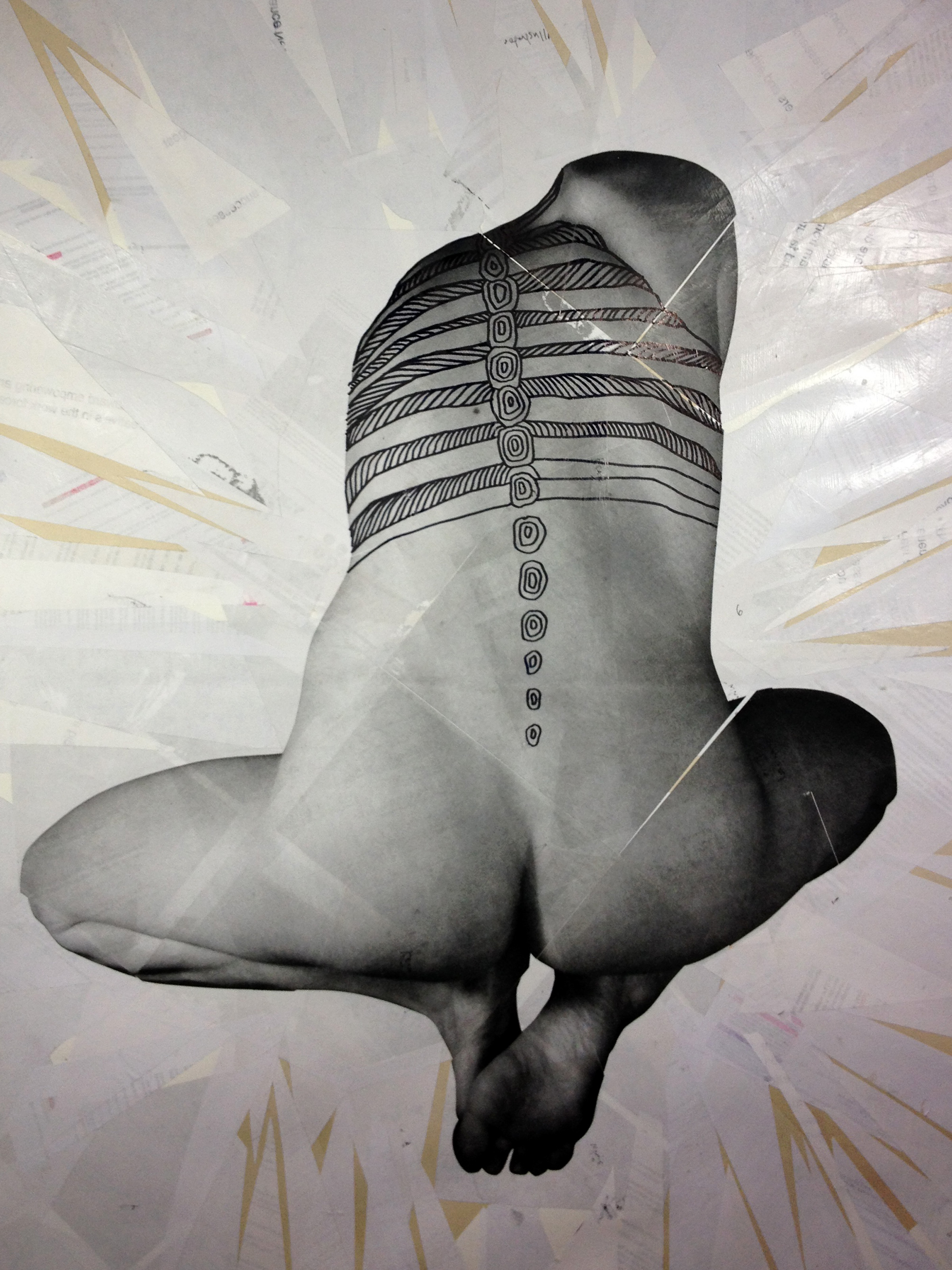
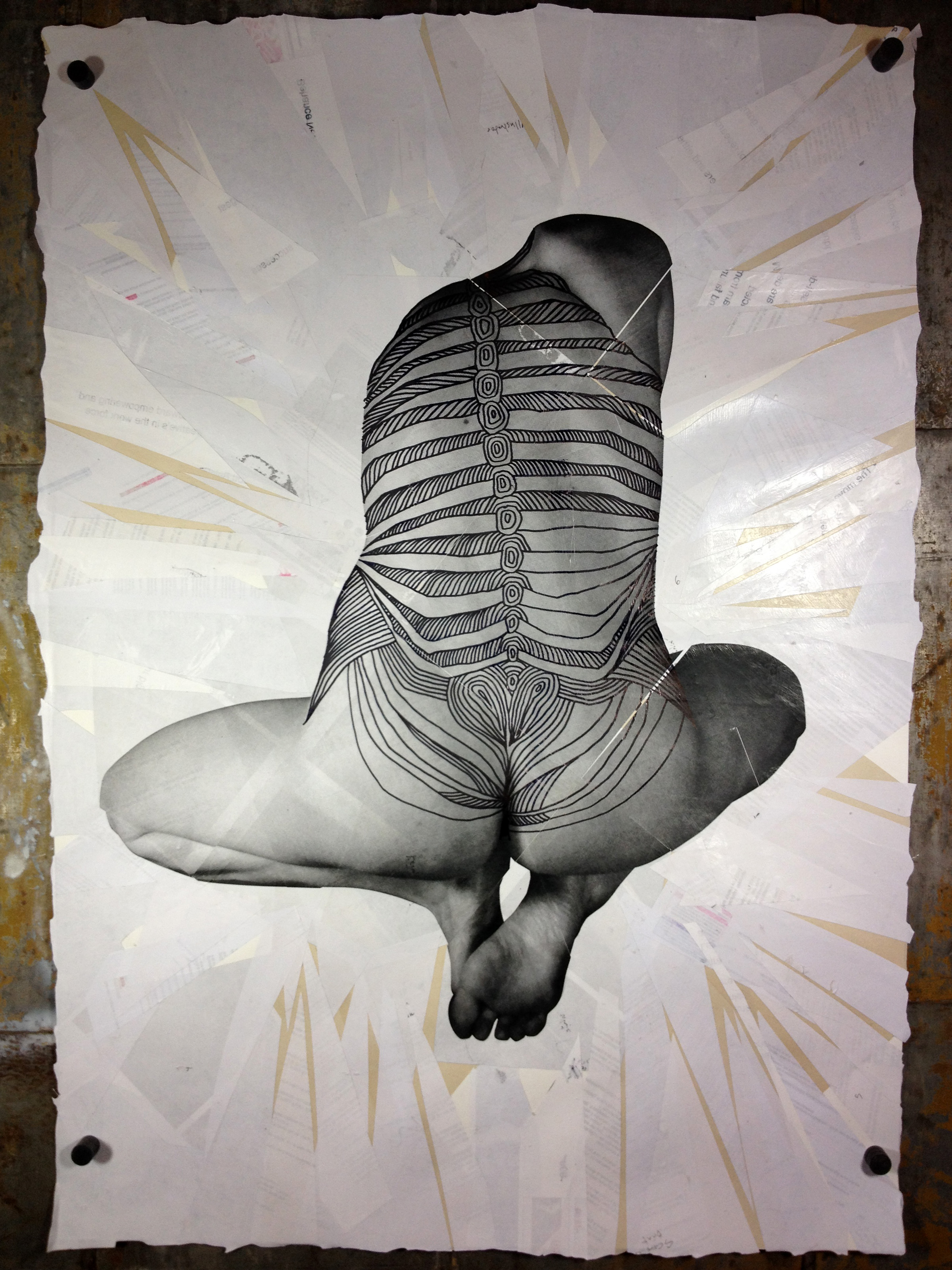
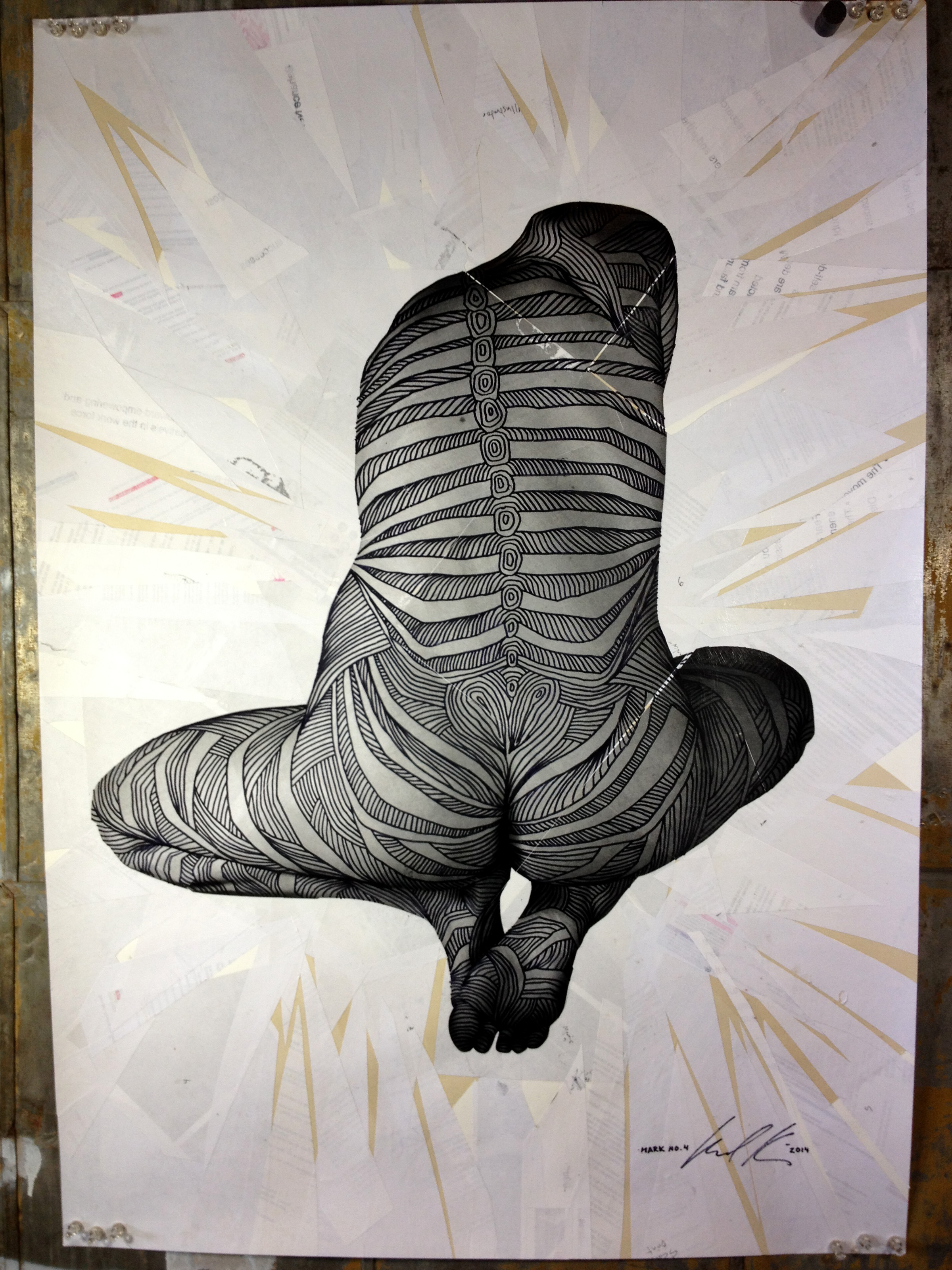
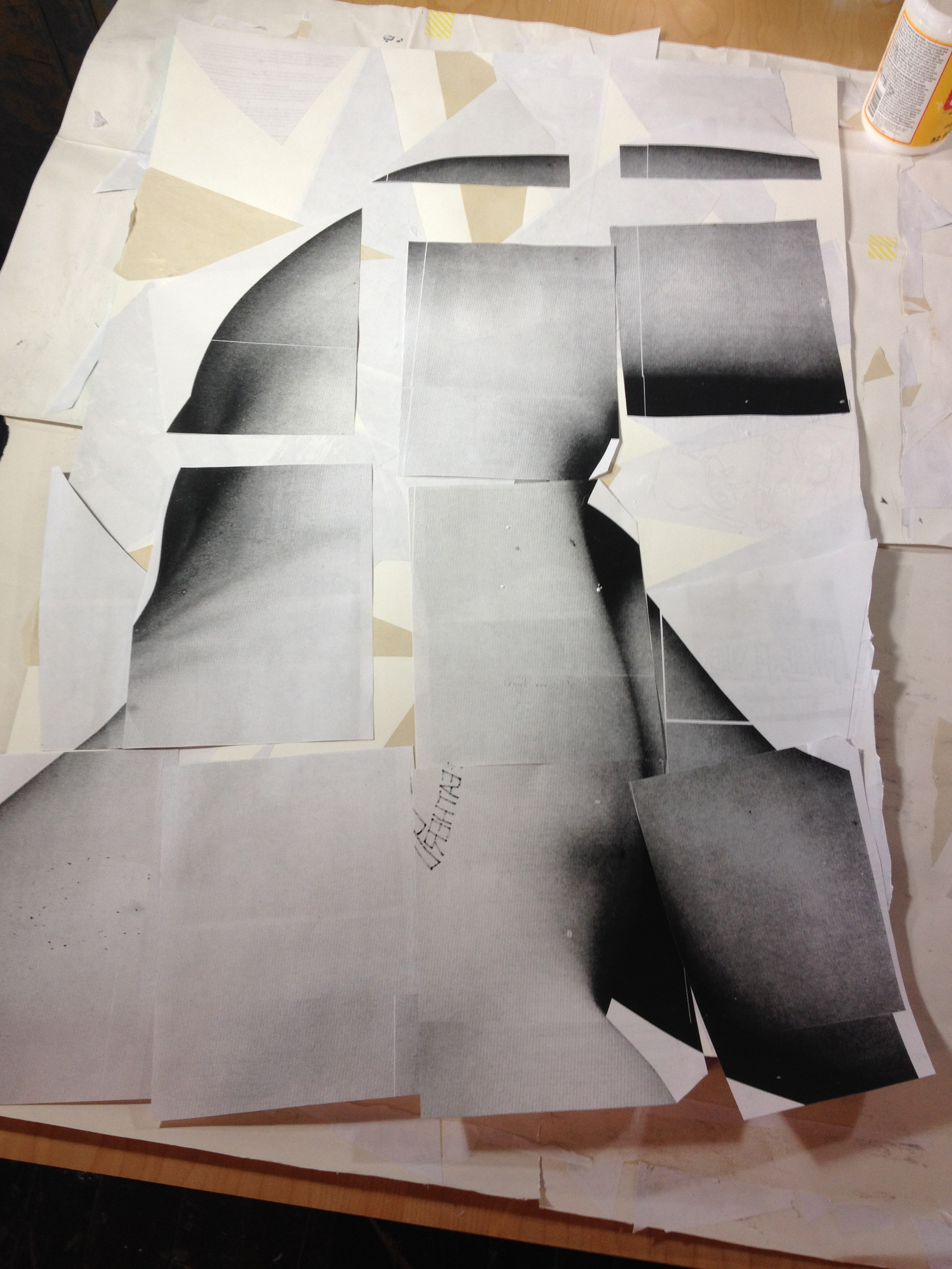
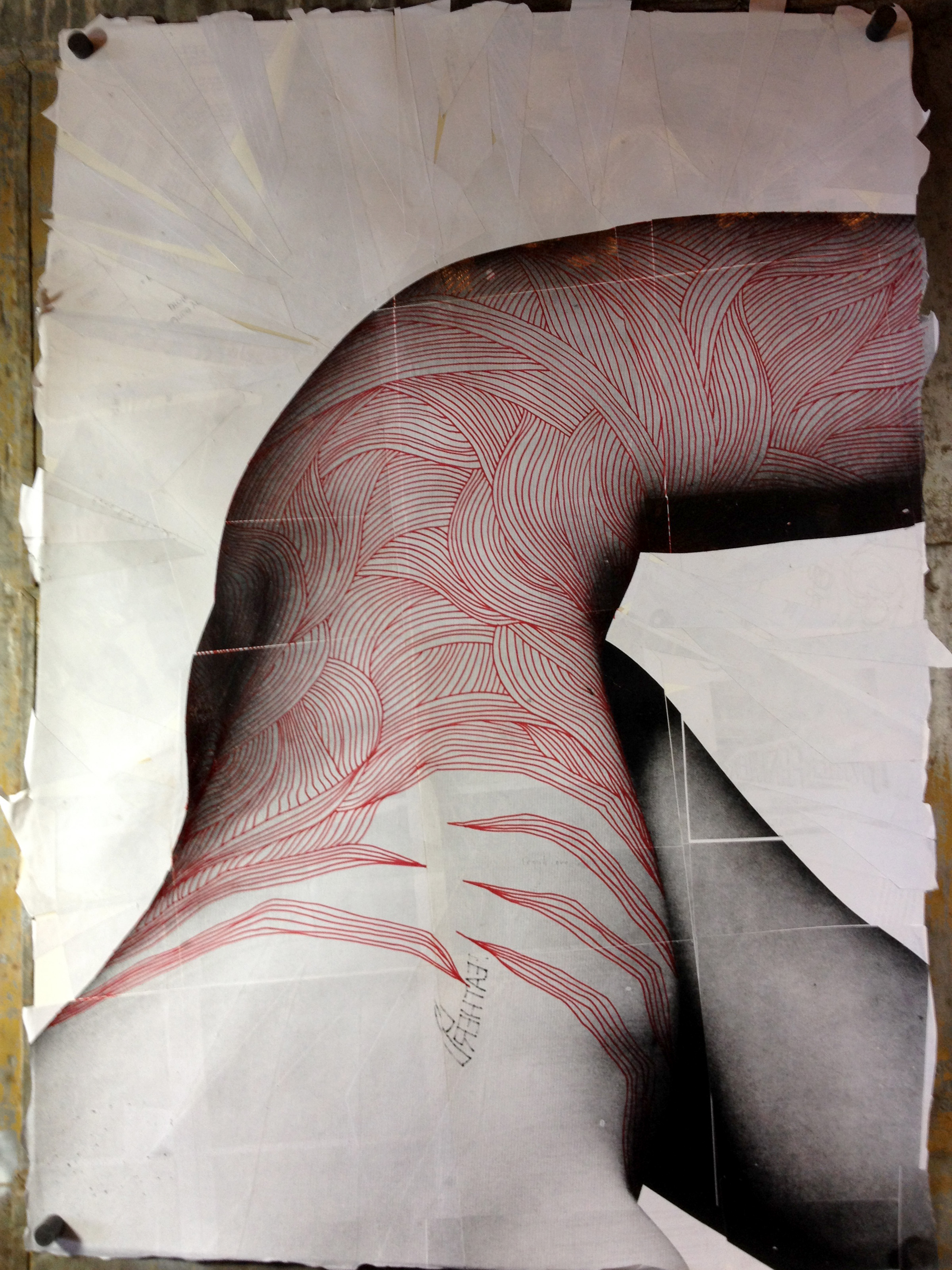
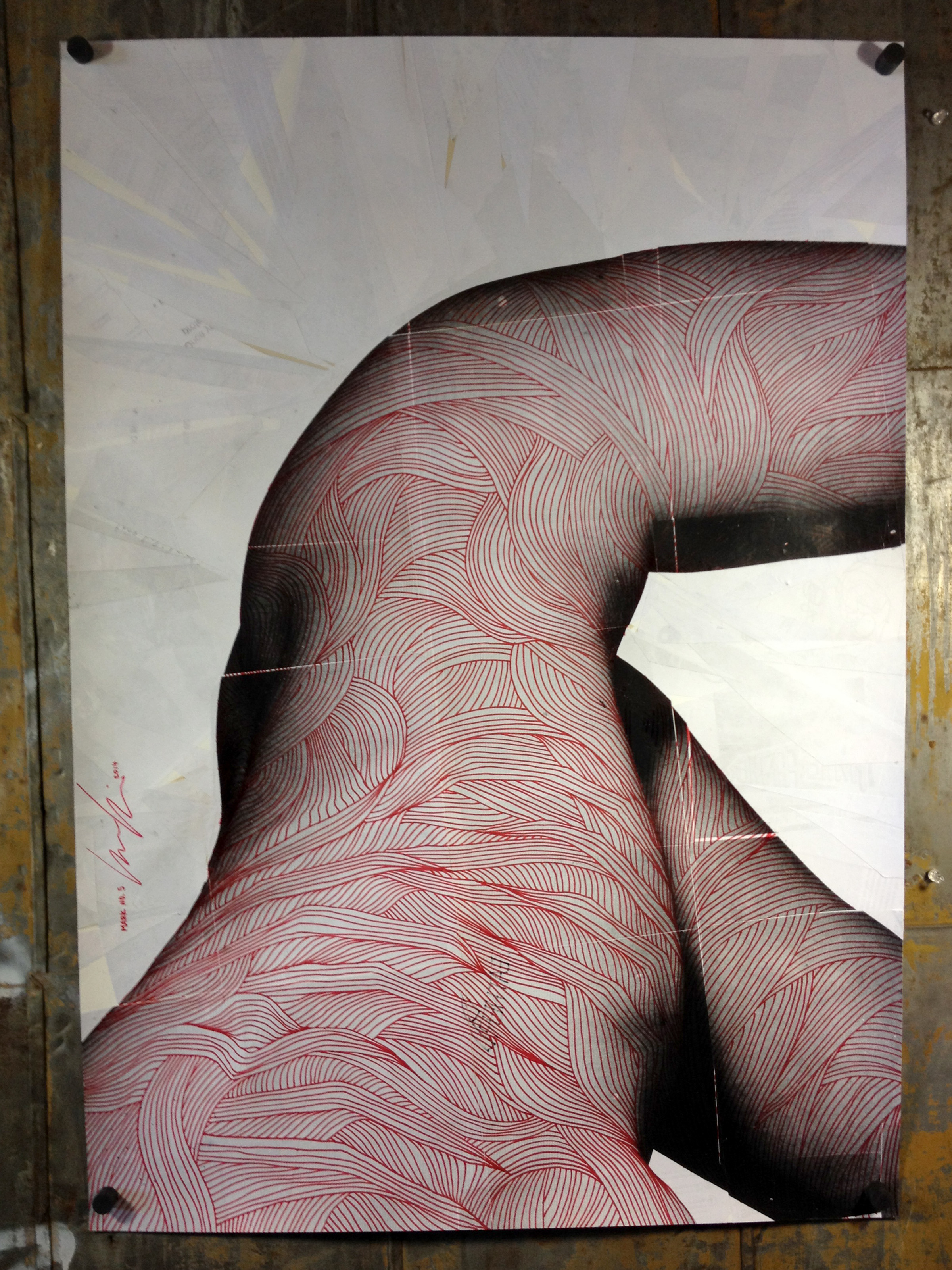
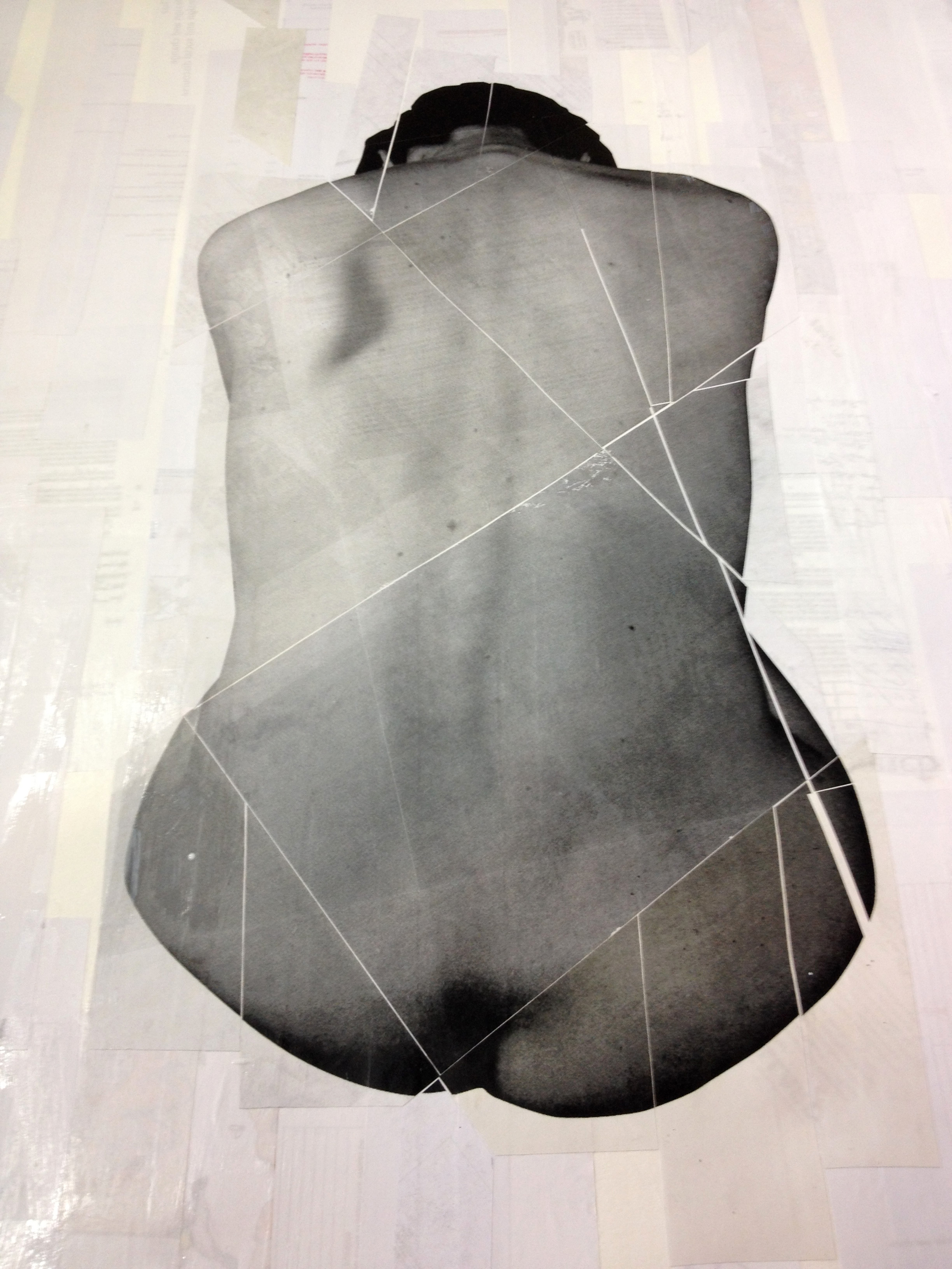
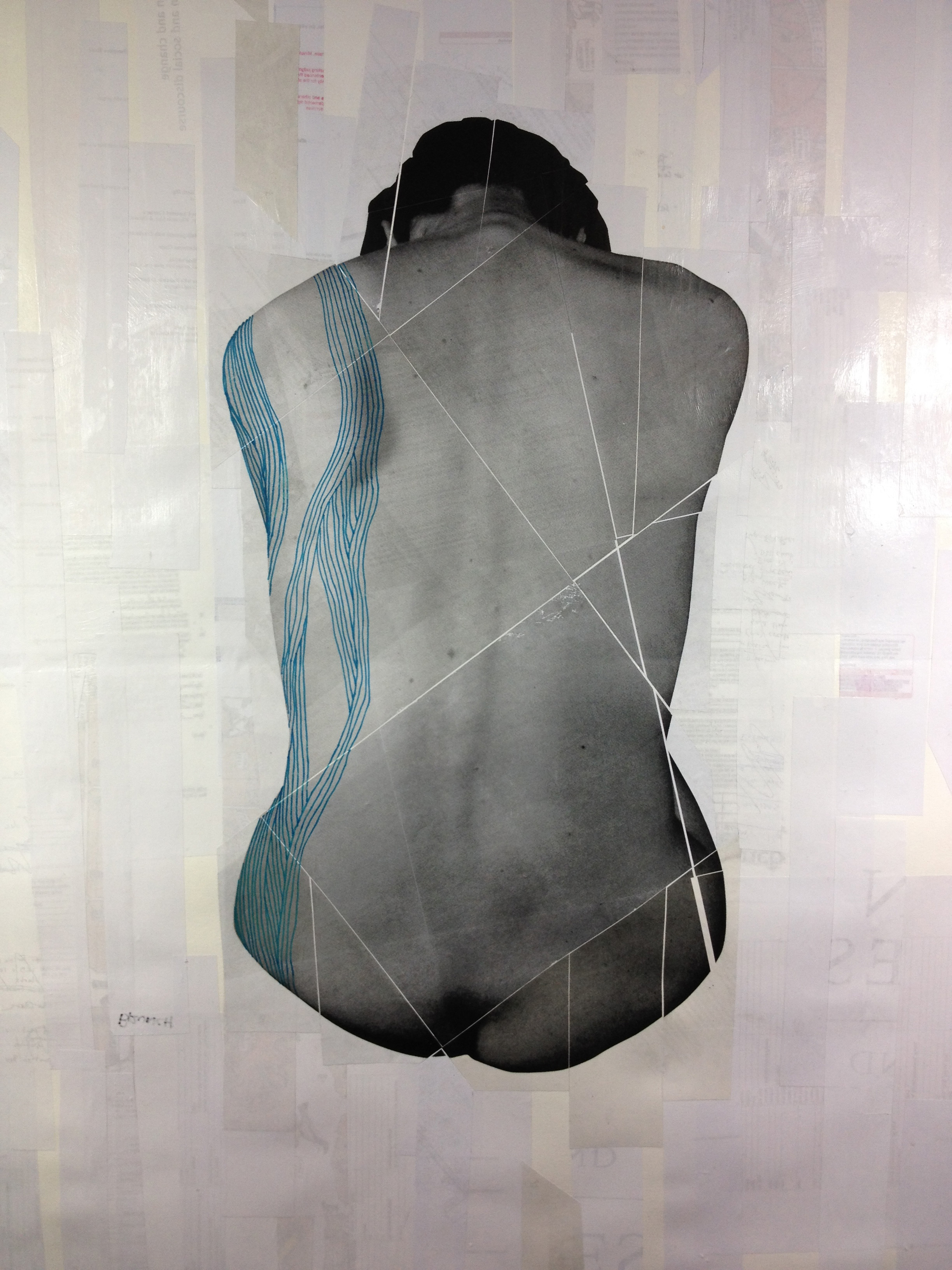
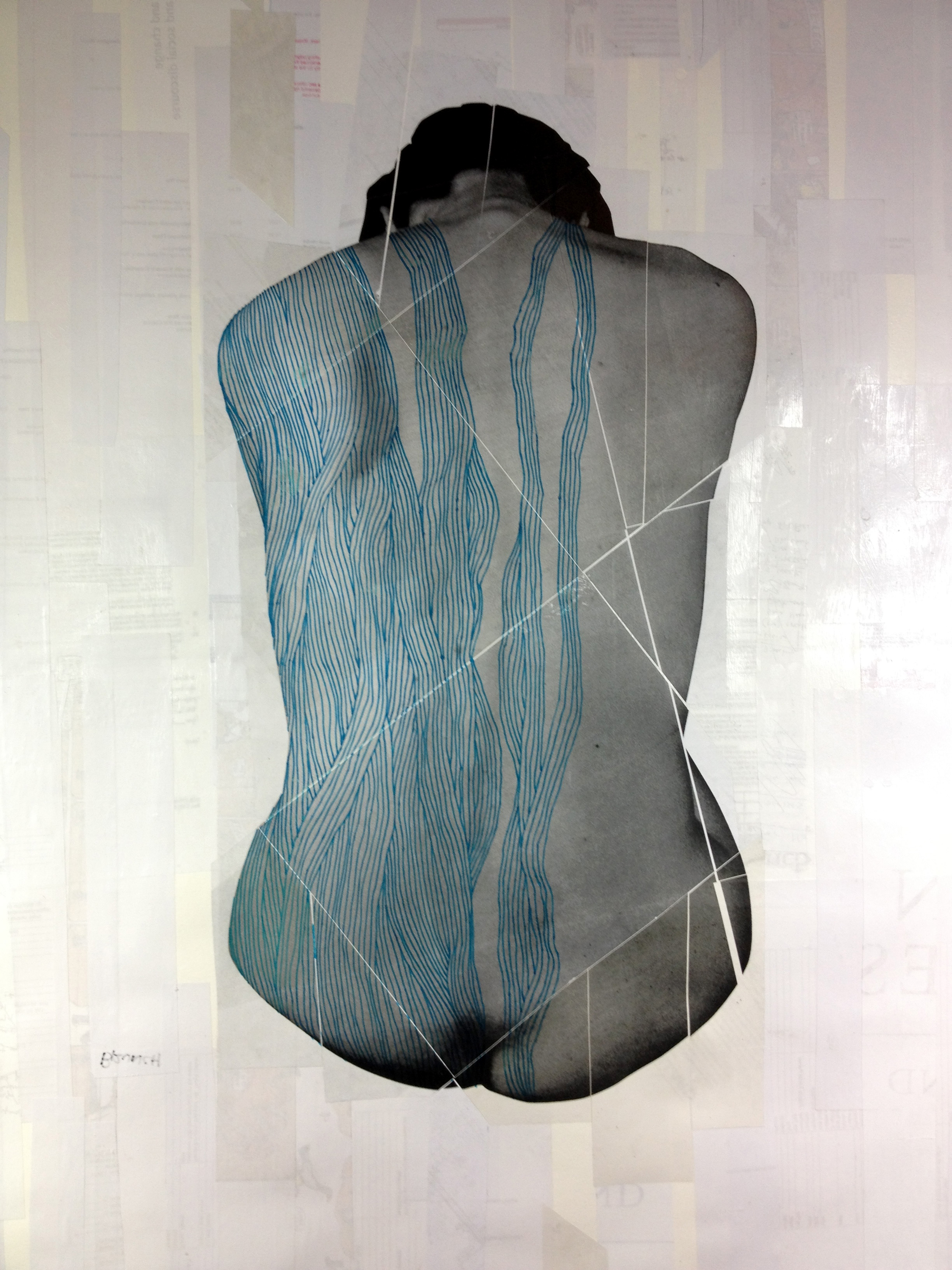
The Mark Series is an ongoing exploration into combining photographs of the human form with expressive line drawing. The compositions strive to transform the human body into an almost abstract shape or “mark” isolated on the page by the prominent surrounding negative space.
Layers of recycled paper are used to build up texture on the page. The photos themselves have been printed rescanned and printed again to create texture and degrade the original photo quality. The line drawing over the photography is informed by the form of the body, in some cases it points to bone and muscle structure. Primarily the drawings serve to add handmade expression to the photographs and push the image closer to general form rather than explicit human bodies.
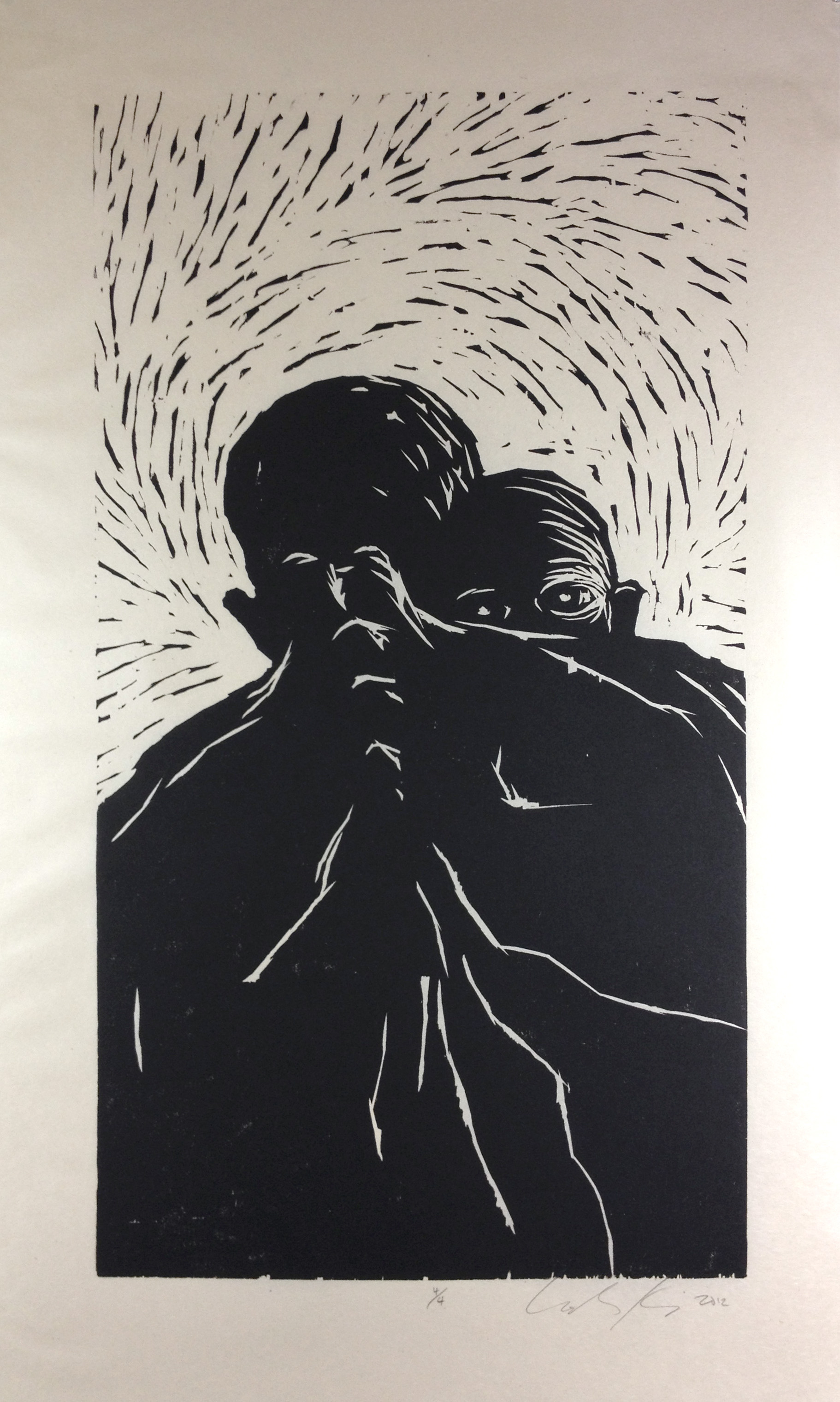
2012: Woodcut & Writing Collaboration
This piece was created for the 2012 exhibit "Worth Telling" pairing NYC artists and writers. This woodcut is a reaction to a short piece written by journalist and human rights worker Jimmie Briggs. The exhibit was at the Abrazo Interno Gallery in New York City, NY.
Pencil drawing based on two separate model photographs (one of the baby, one of the male figure).
I use cabinet grade ¾ inch birch plywood. I first brush a light ink wash on to the block so that I can better see the image emerge as I carve.
I use a piece of glass as a perfectly flat surface to roll out my ink. At this point I've already torn down all my paper to the right size. I've also got a bunch of newsprint cut to size to make my test prints.
An early test print on scrap paper. It takes time to build up the ink surface on the linoleum block to a point where it will print nice and black.
A test print on newsprint paper. The ink is now laying down black and even so it’s ready to move on to the good paper.
Final numbered and signed print.
Edition of four.
Image: 27.75" x 15.25"
Paper: 33.75" x 20.25"
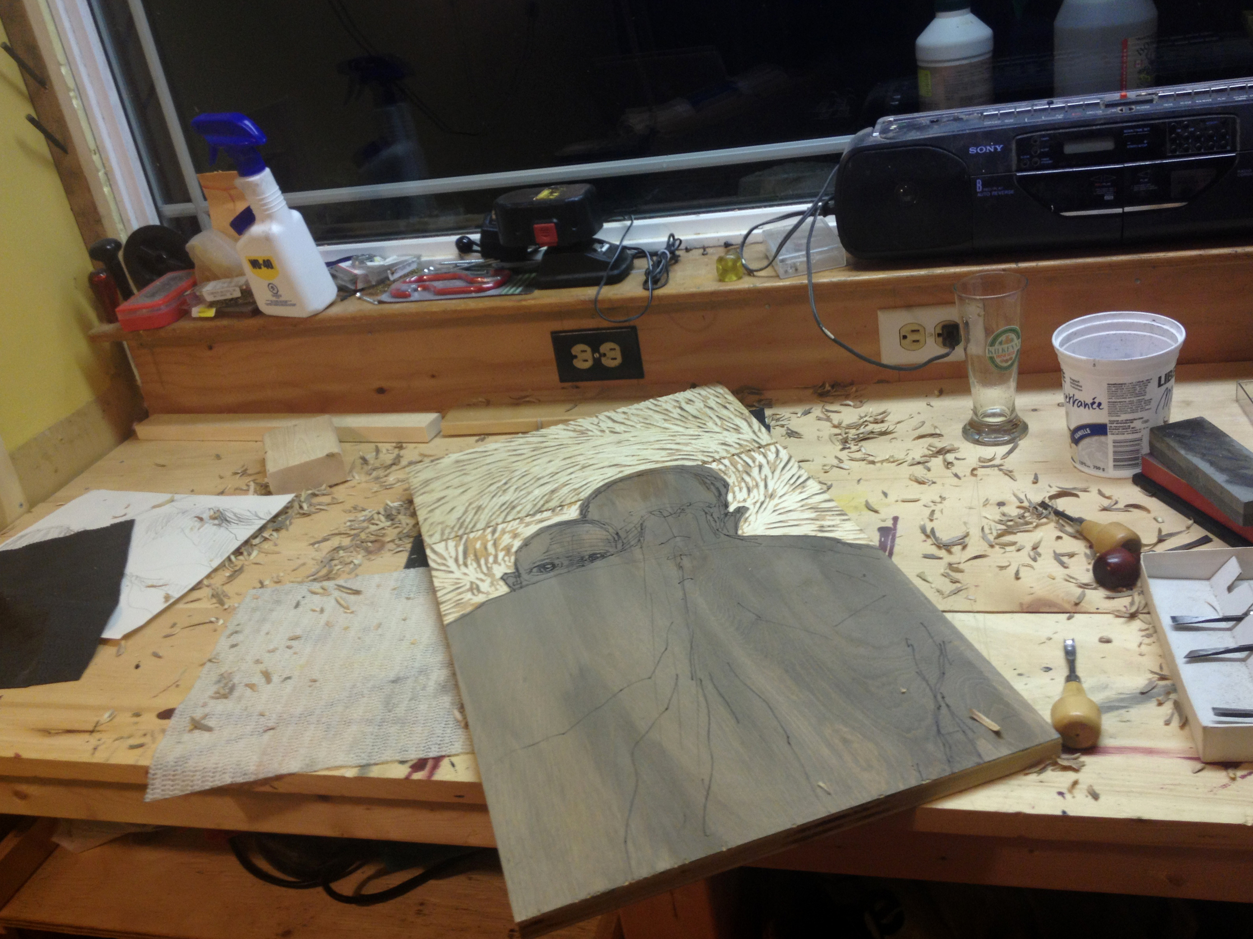
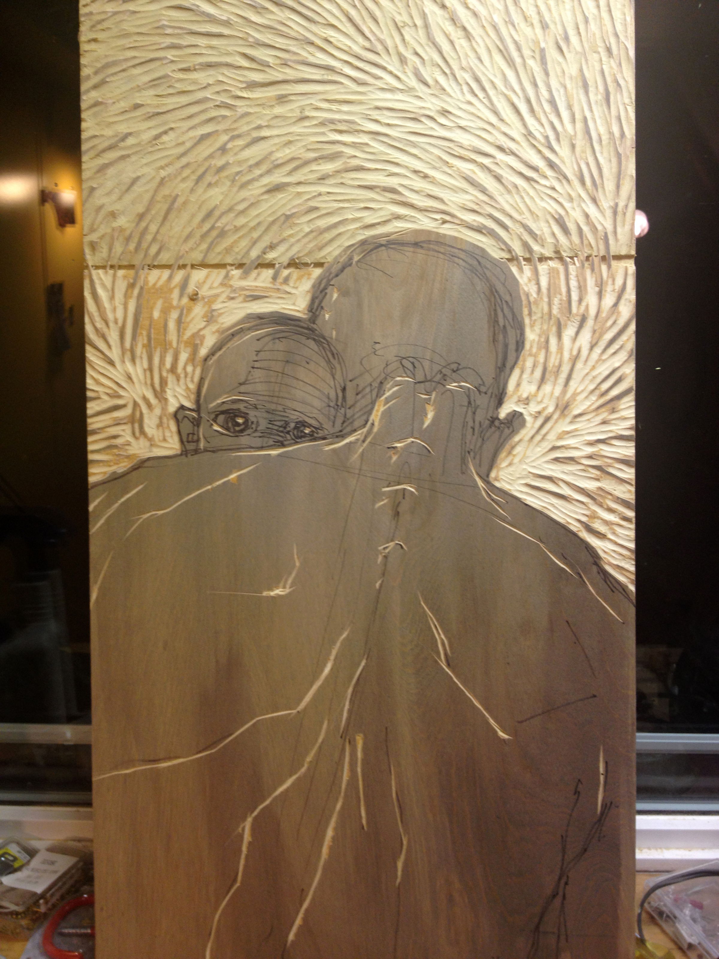
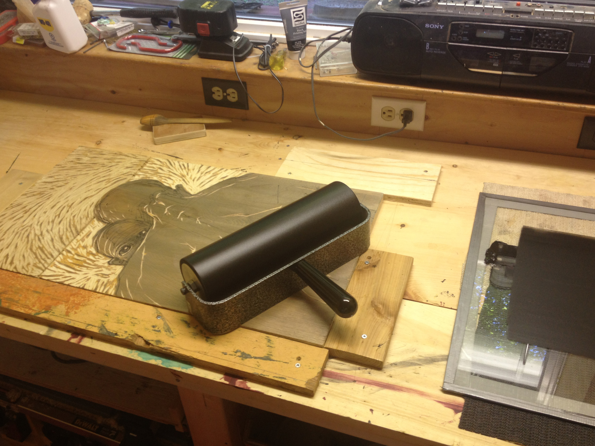
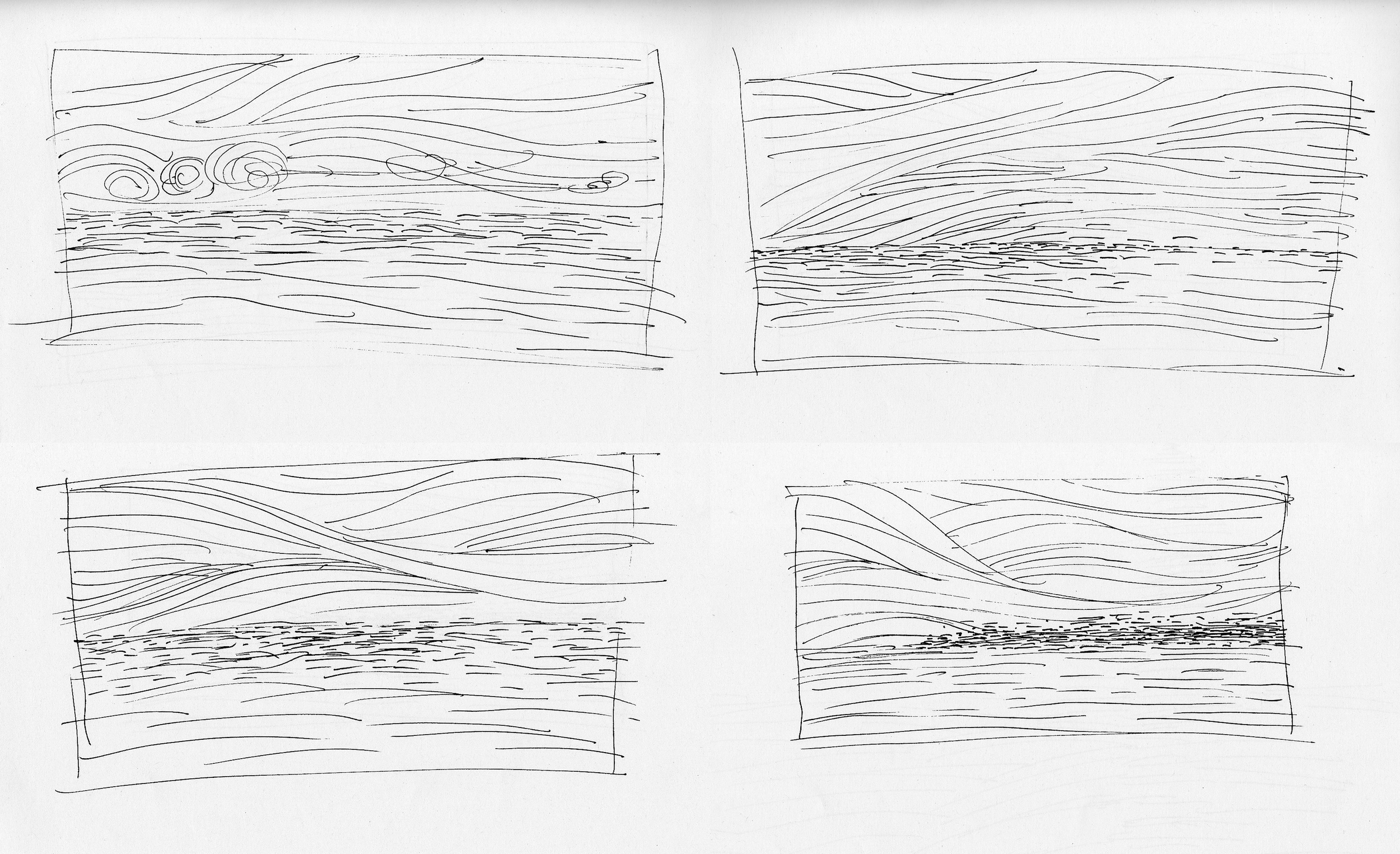
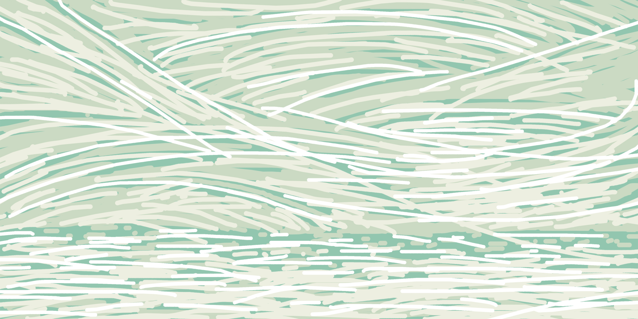
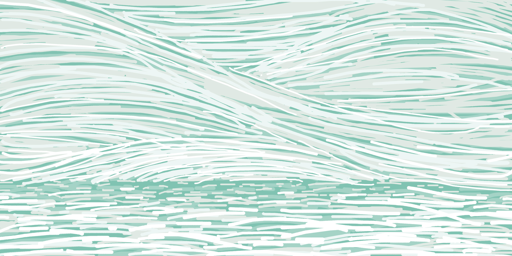
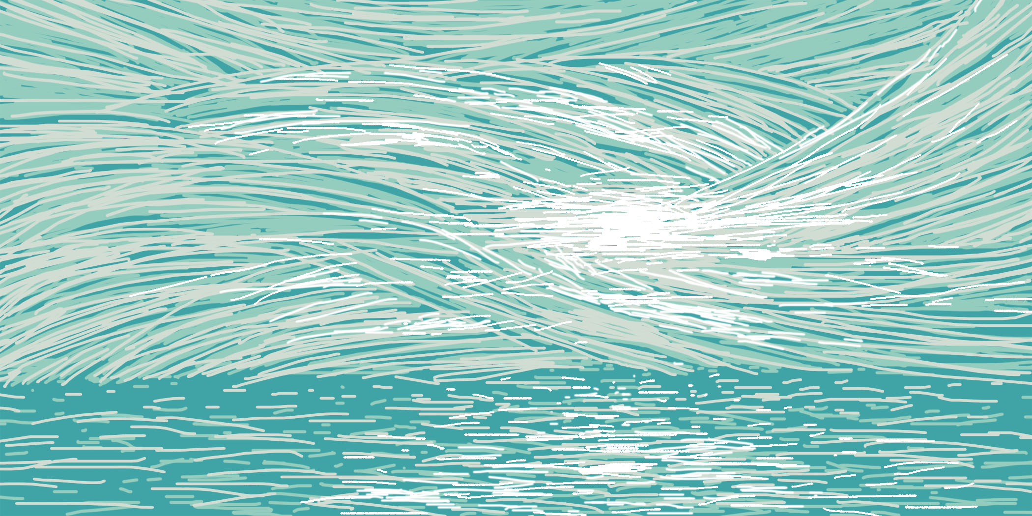
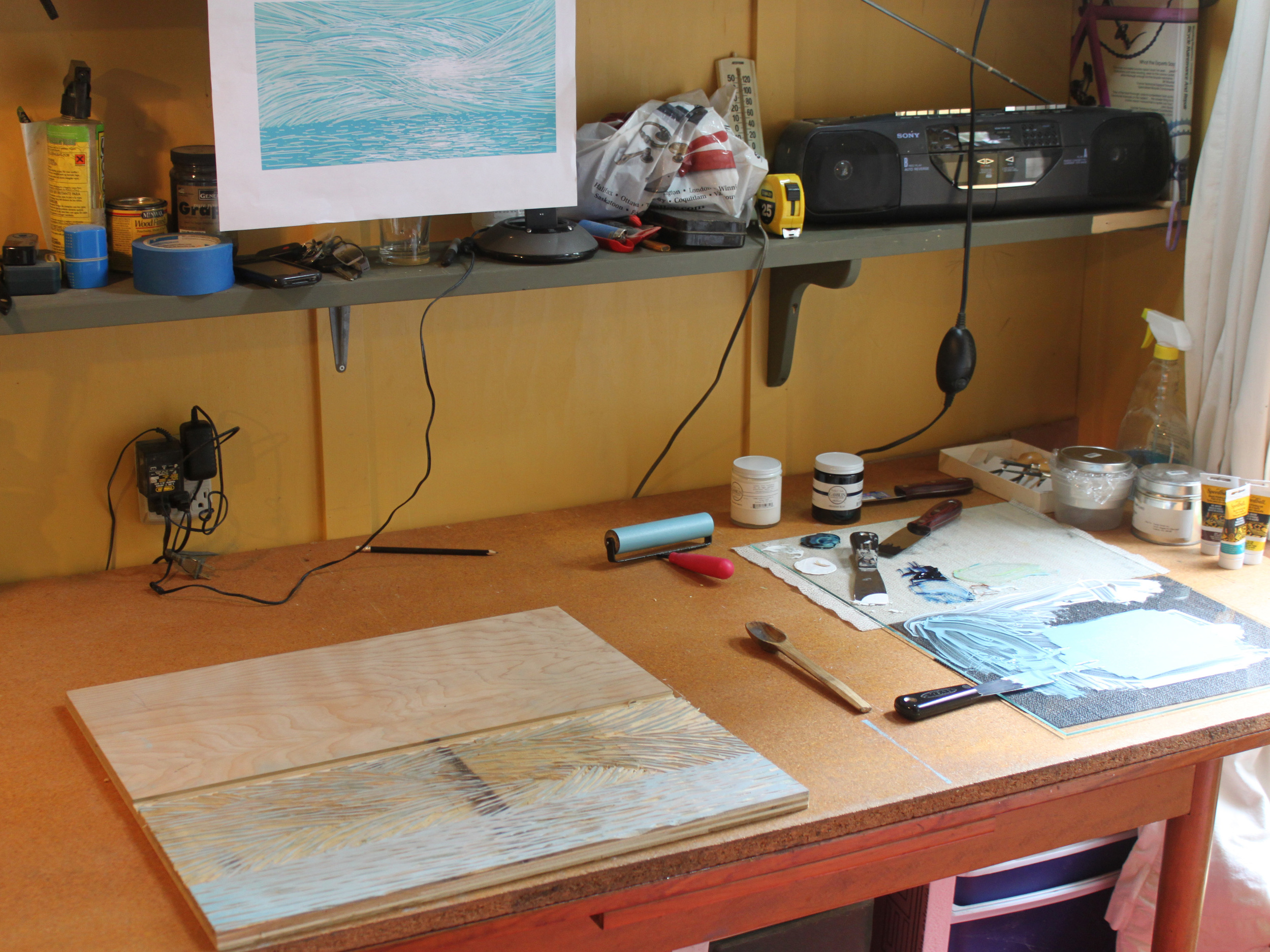
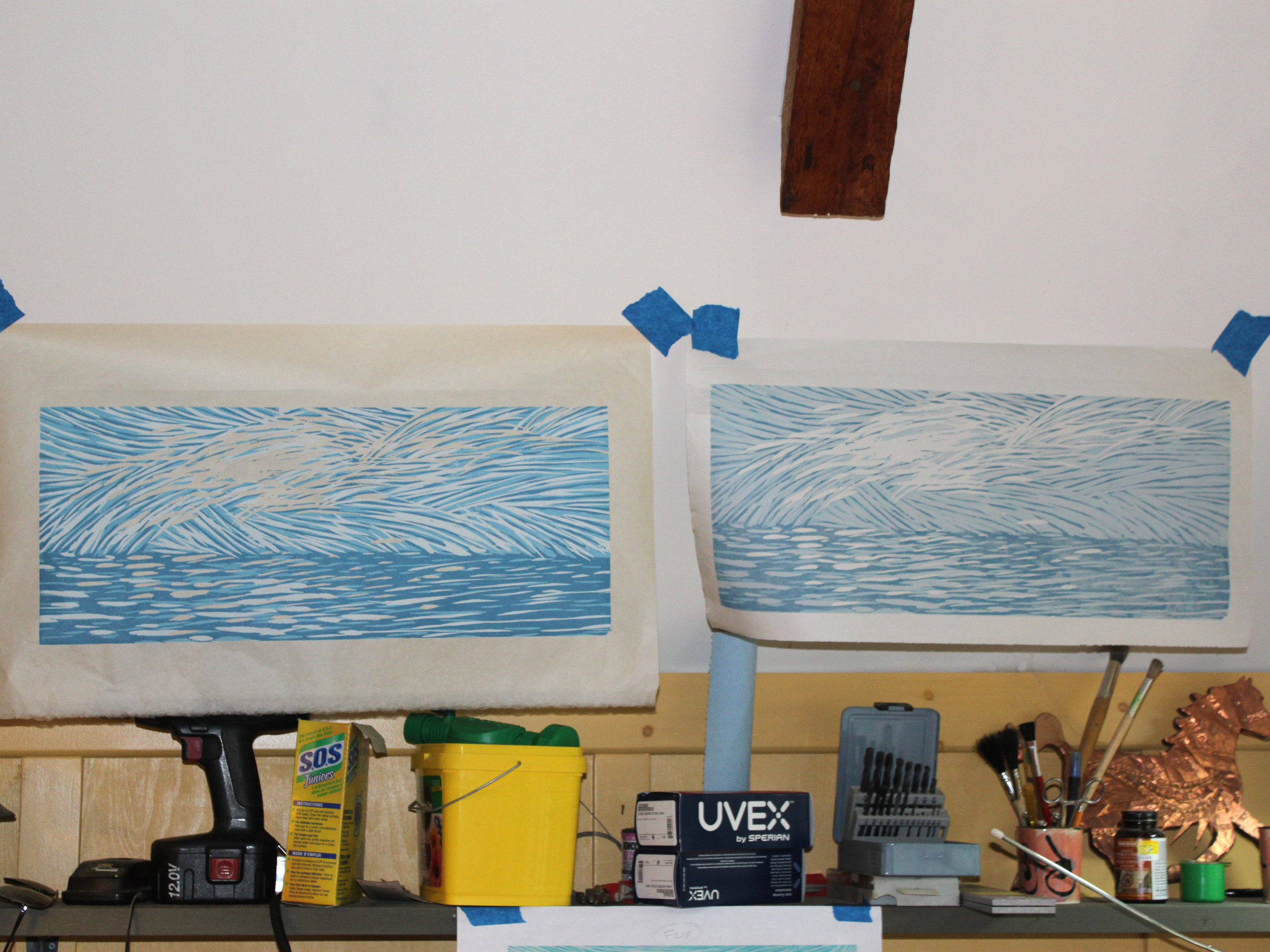
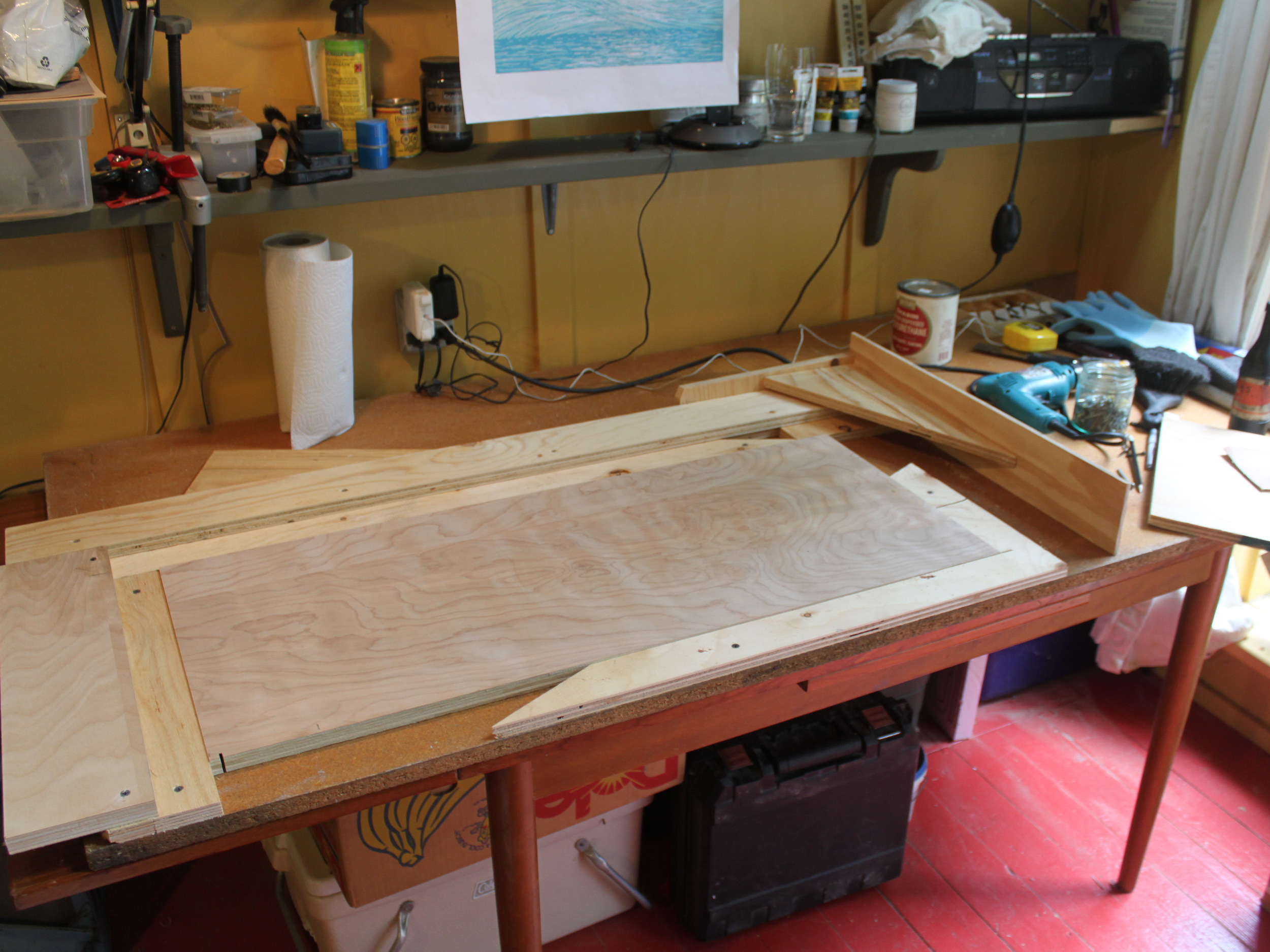
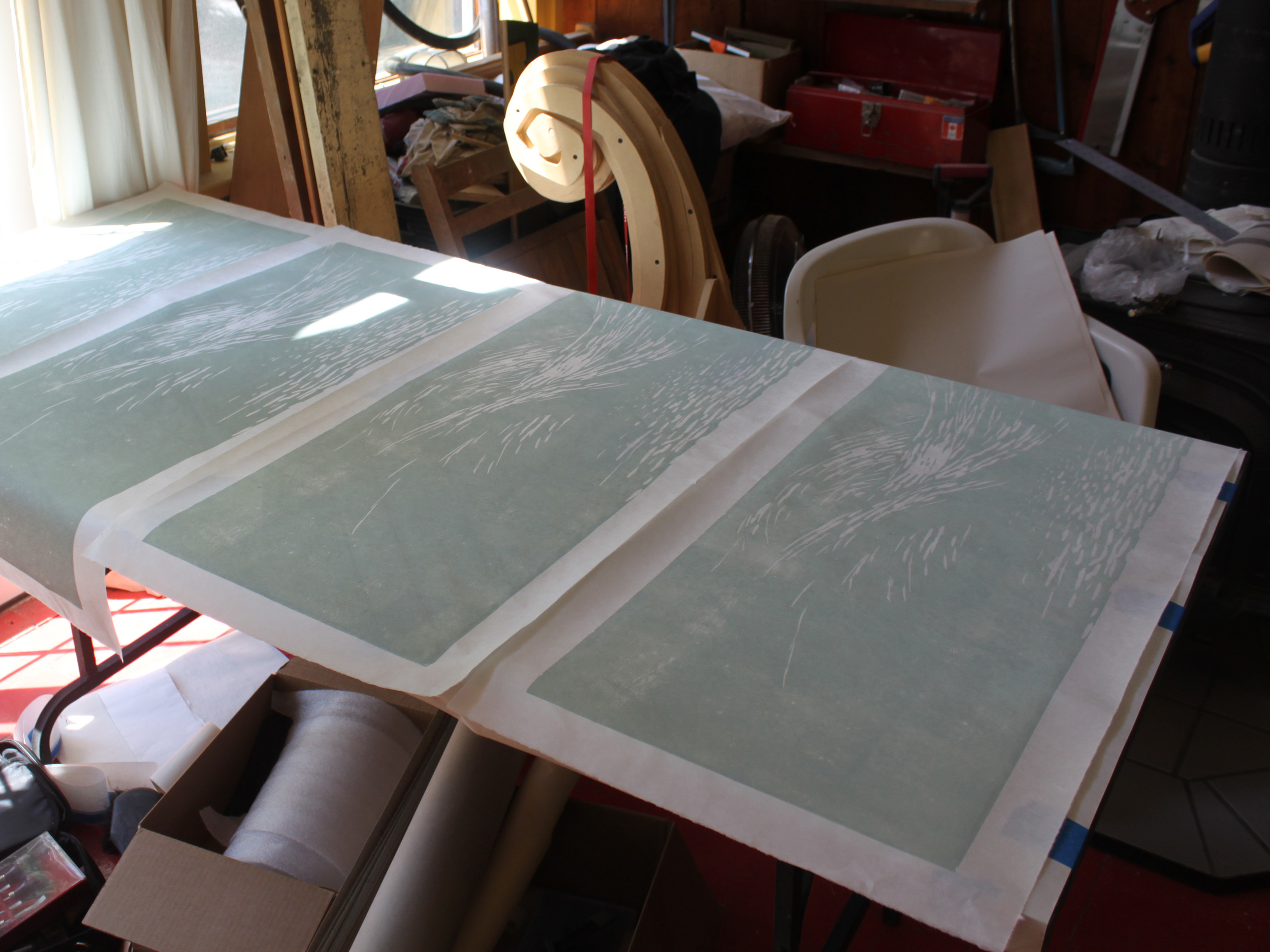
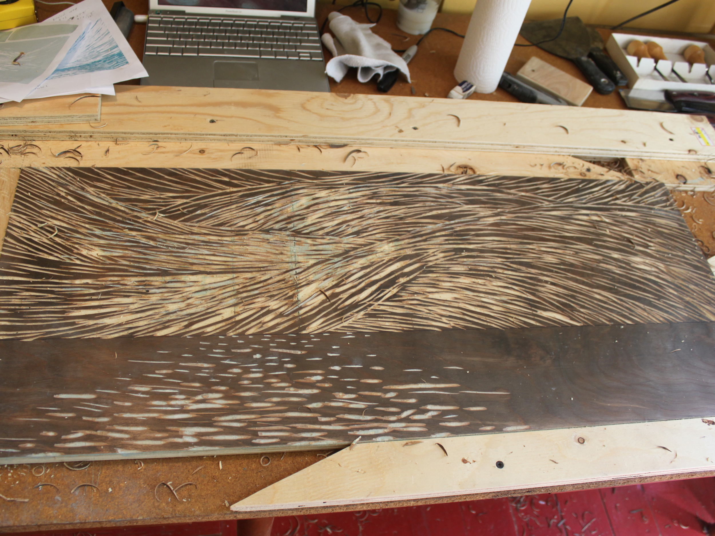
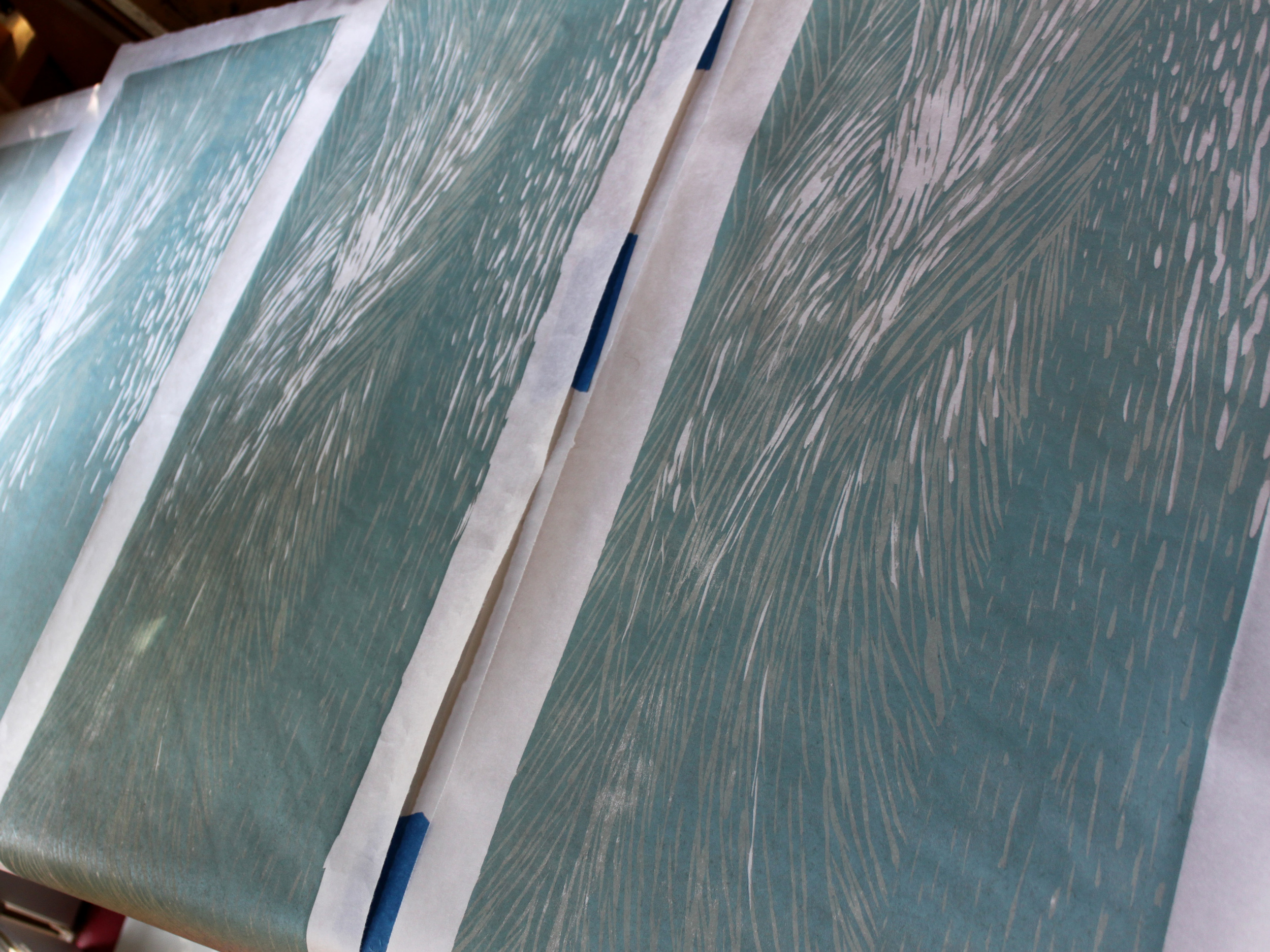
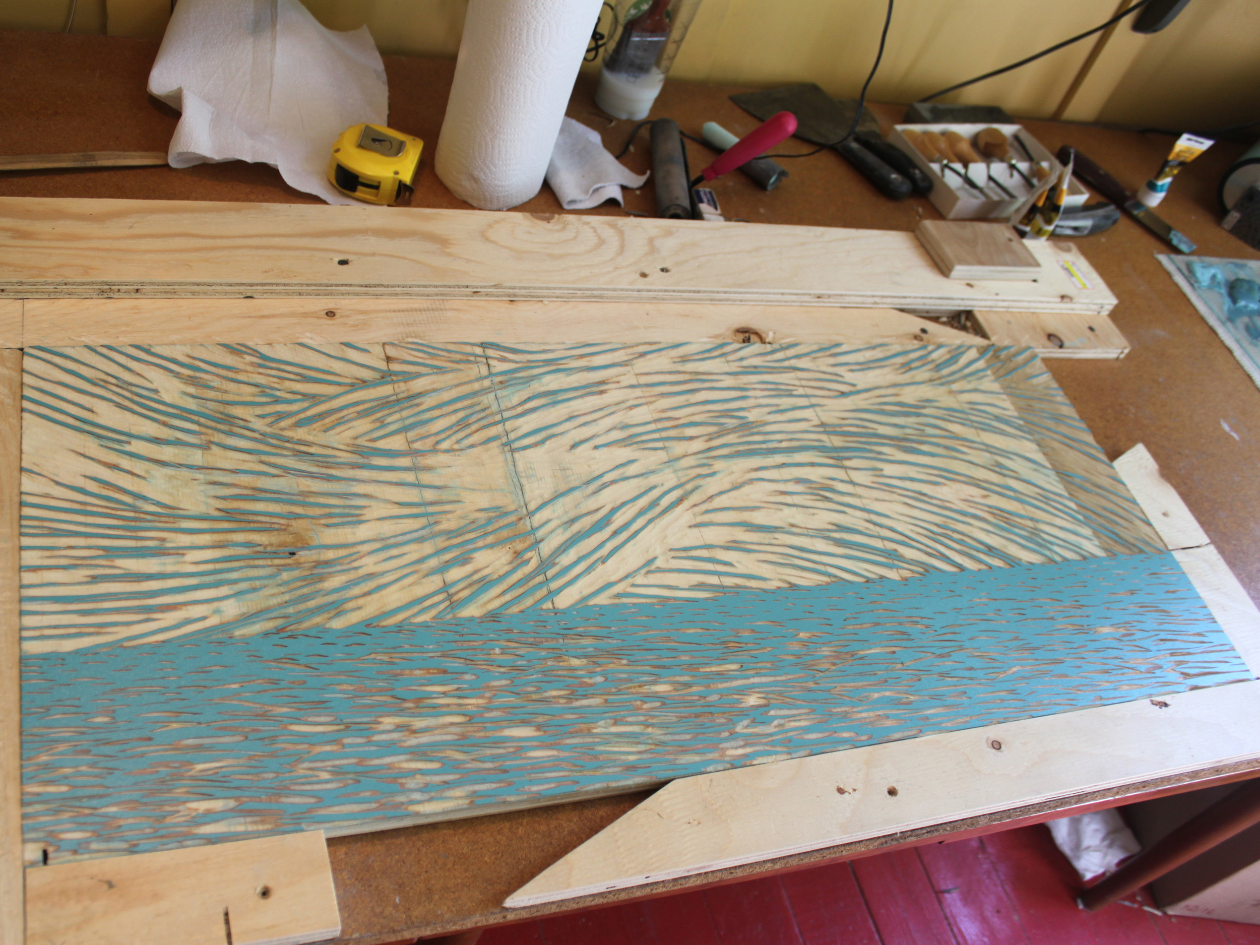
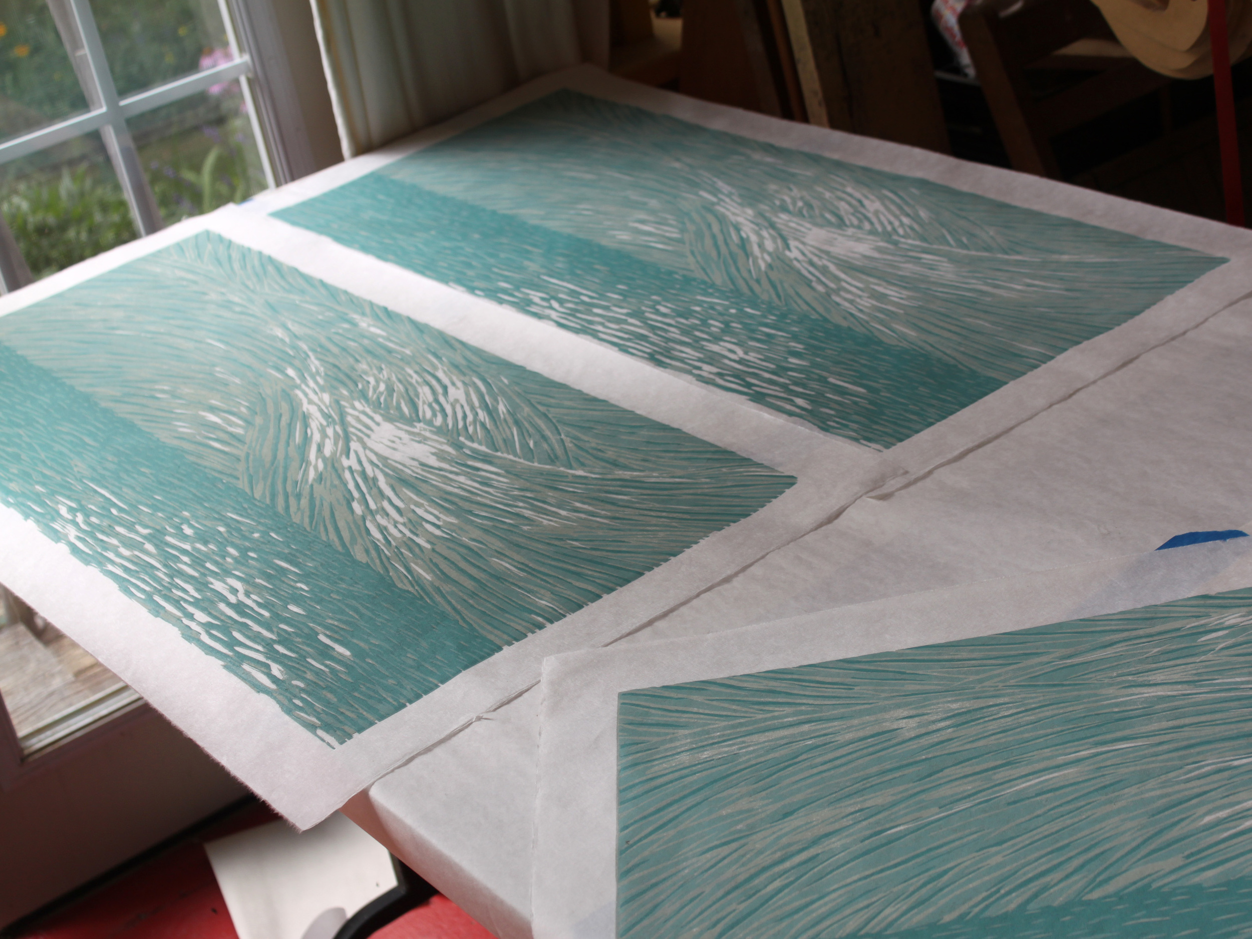
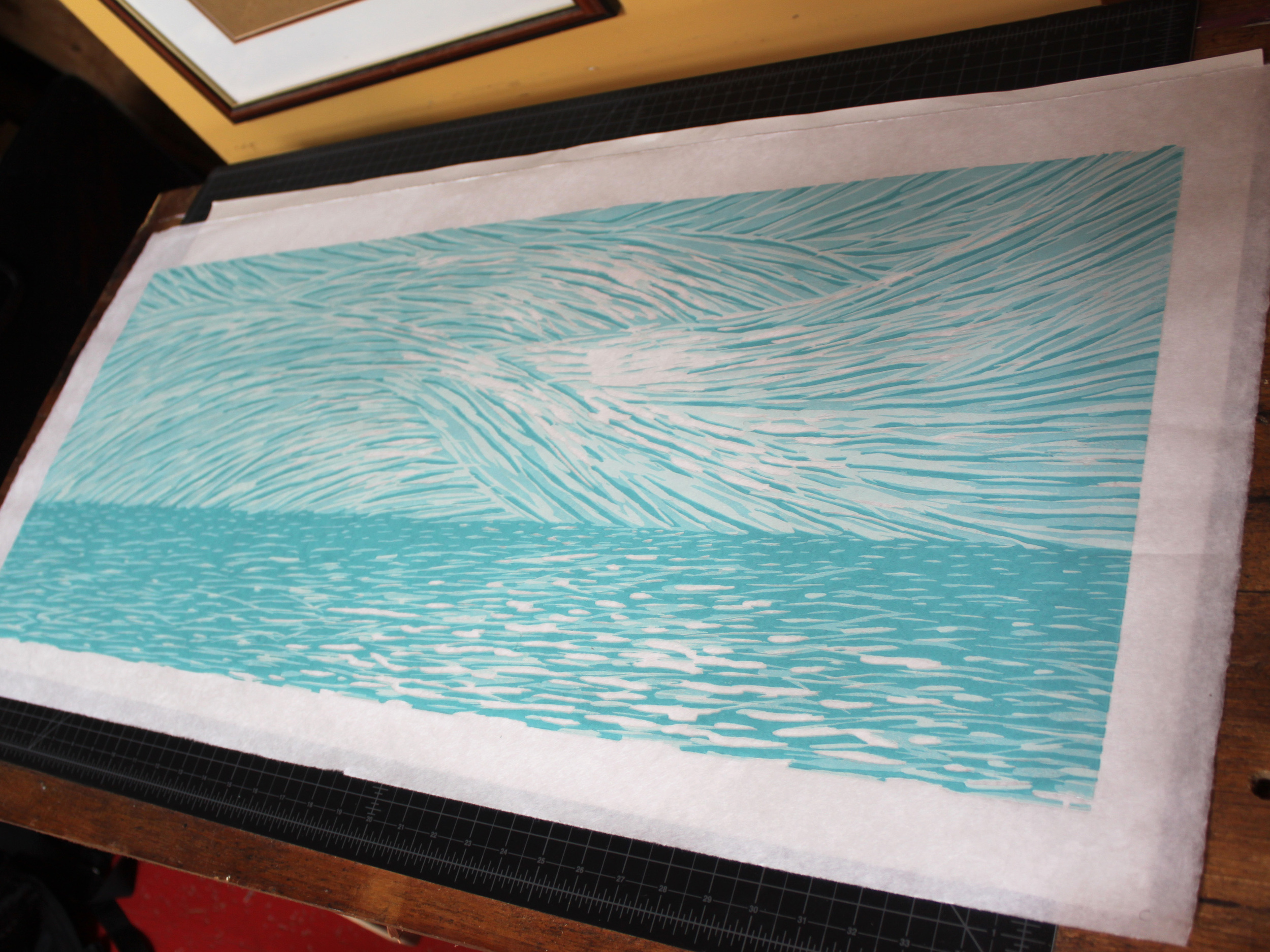
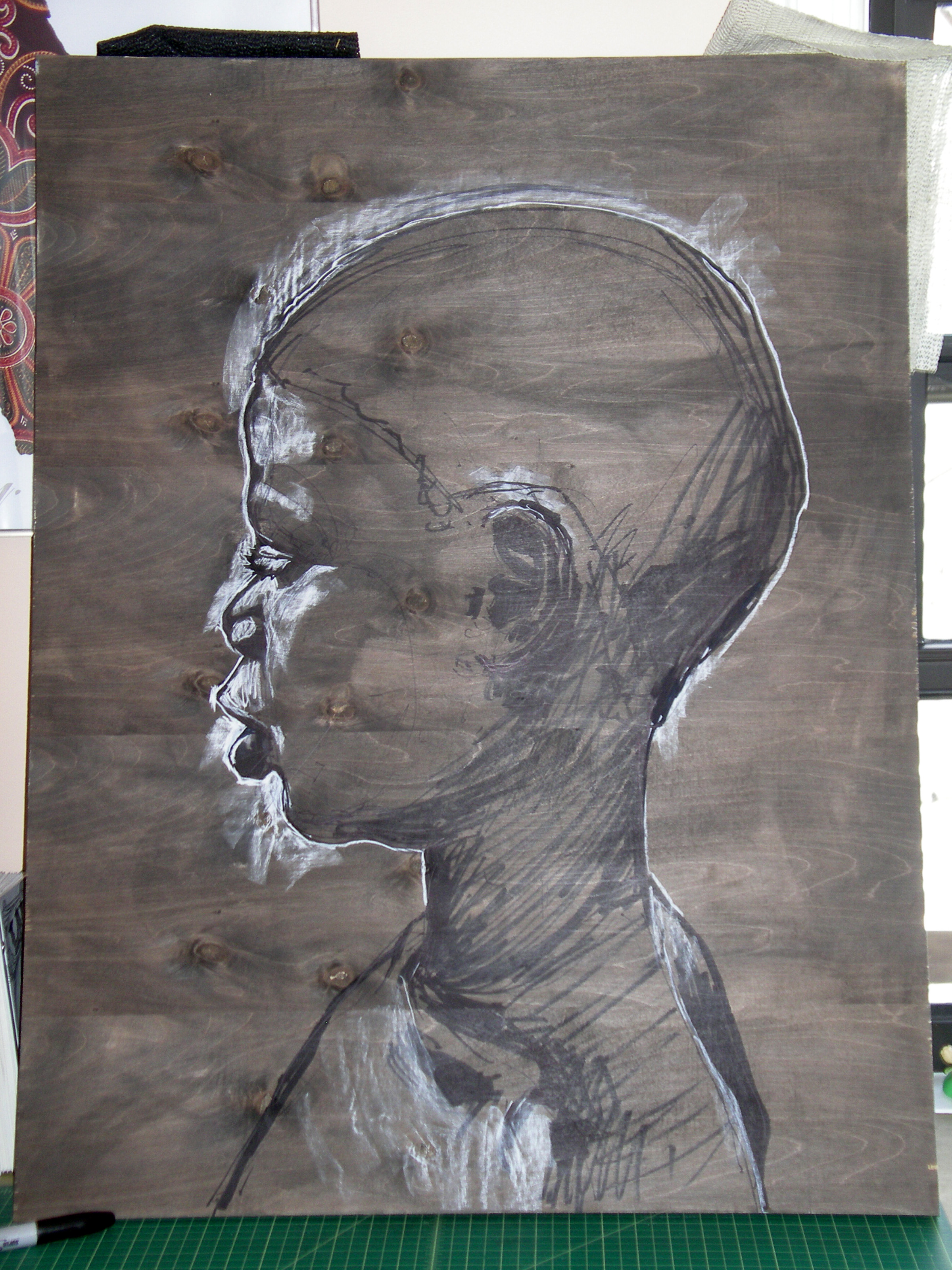
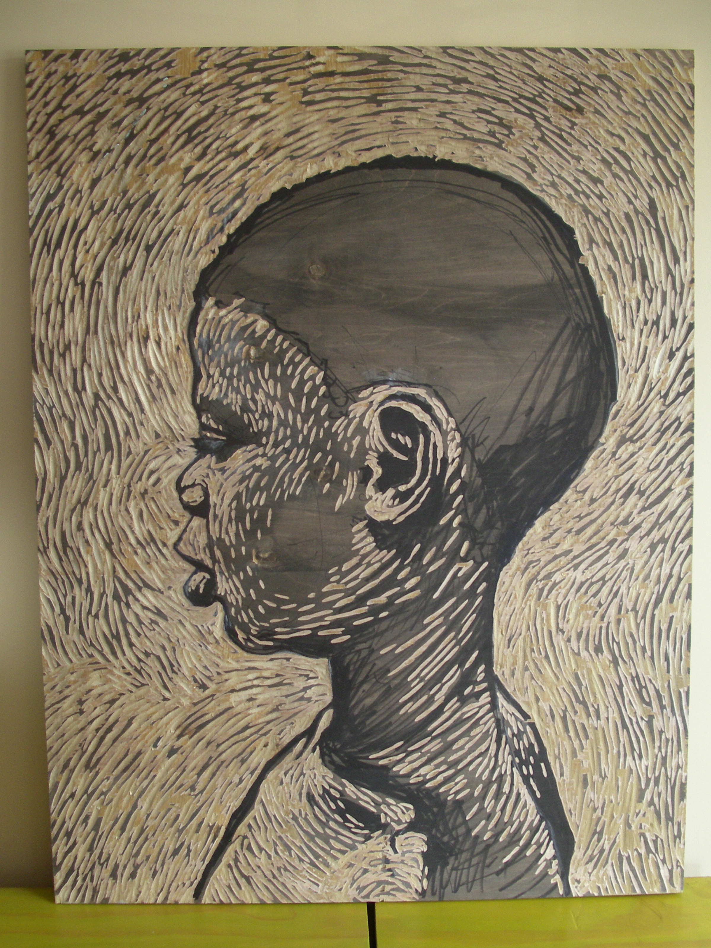
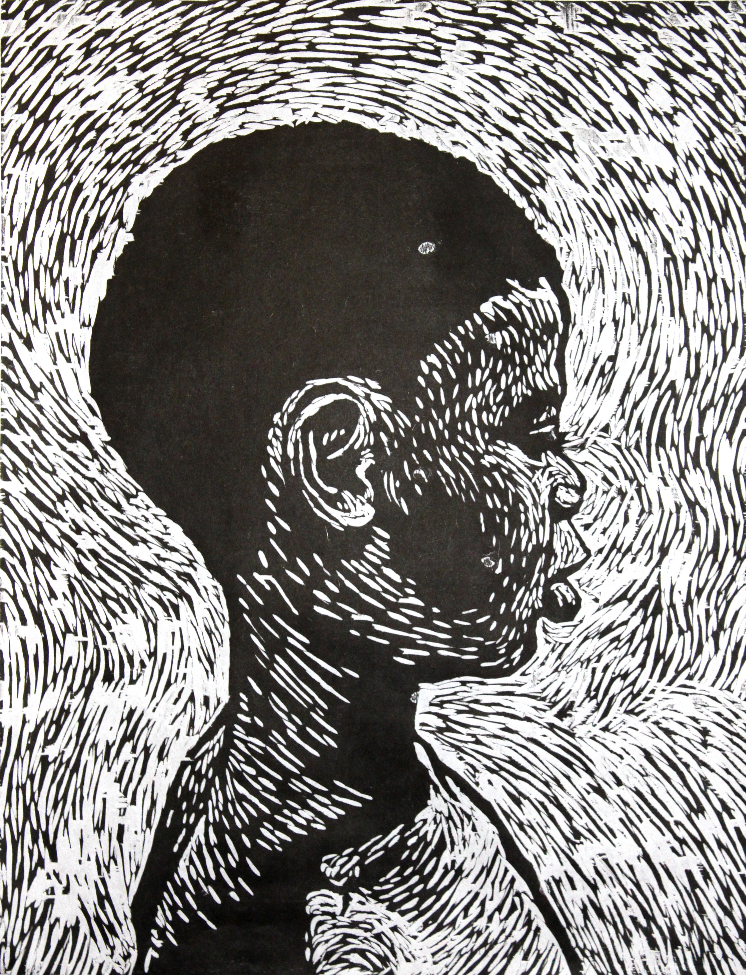
2011: Woodcut Reduction Print Process
I was commissioned to create a semi-abstract piece of art in the summer of 2011. This was a new and unique challenge for me as almost all of my work before this time had been figurative. The client’s were looking for a piece that would evoke the ocean and incorporate light, movement and a sense of hope. It was also important that the piece wasn’t too literal and somewhat abstract.
I drew a great deal of inspiration from friend and painter Shannon Craig. Her treatment of wind whipped clouds was in my mind when I began sketching. I owe my patrons on this project for pushing me in a new and different direction, I am still playing with permutations of this piece in my work today.
I wanted to make sure my color choices and technique were going to work. Before I made the final art I created a smaller prototype version.
3-color prototype prints drying.
The technique I used here is called Reduction Printing. It’s a process of building up an image from lightest tone to darkest. I carved the block with an image, printed that image in the lightest color. I then clean up the block carve it again and print the next darkest color. In this case I repeated this process three times.
Sometimes I create a jig to hold the block steady while I carve. In this case the jig will also serve as a registration device when I print the multiple colors and need them all to line up.
Here I’ve removed more of the block. Whatever I carve away will allow the first light blue to show through.
Here I’ve removed even more of the block. Whatever I carve away will allow both the first and second colors to show through.
Final print on Japanese paper.
Edition of four.
Image: 36" x 14"
Paper: 40" x 19"
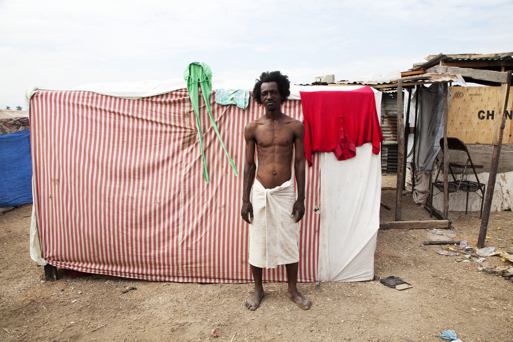
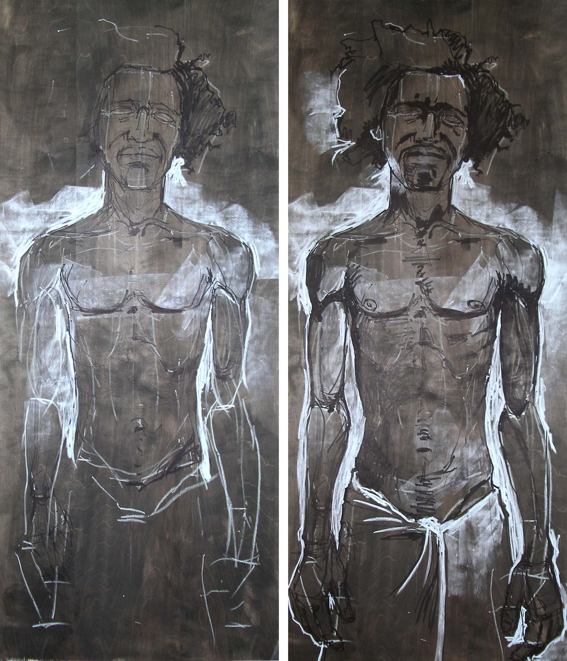
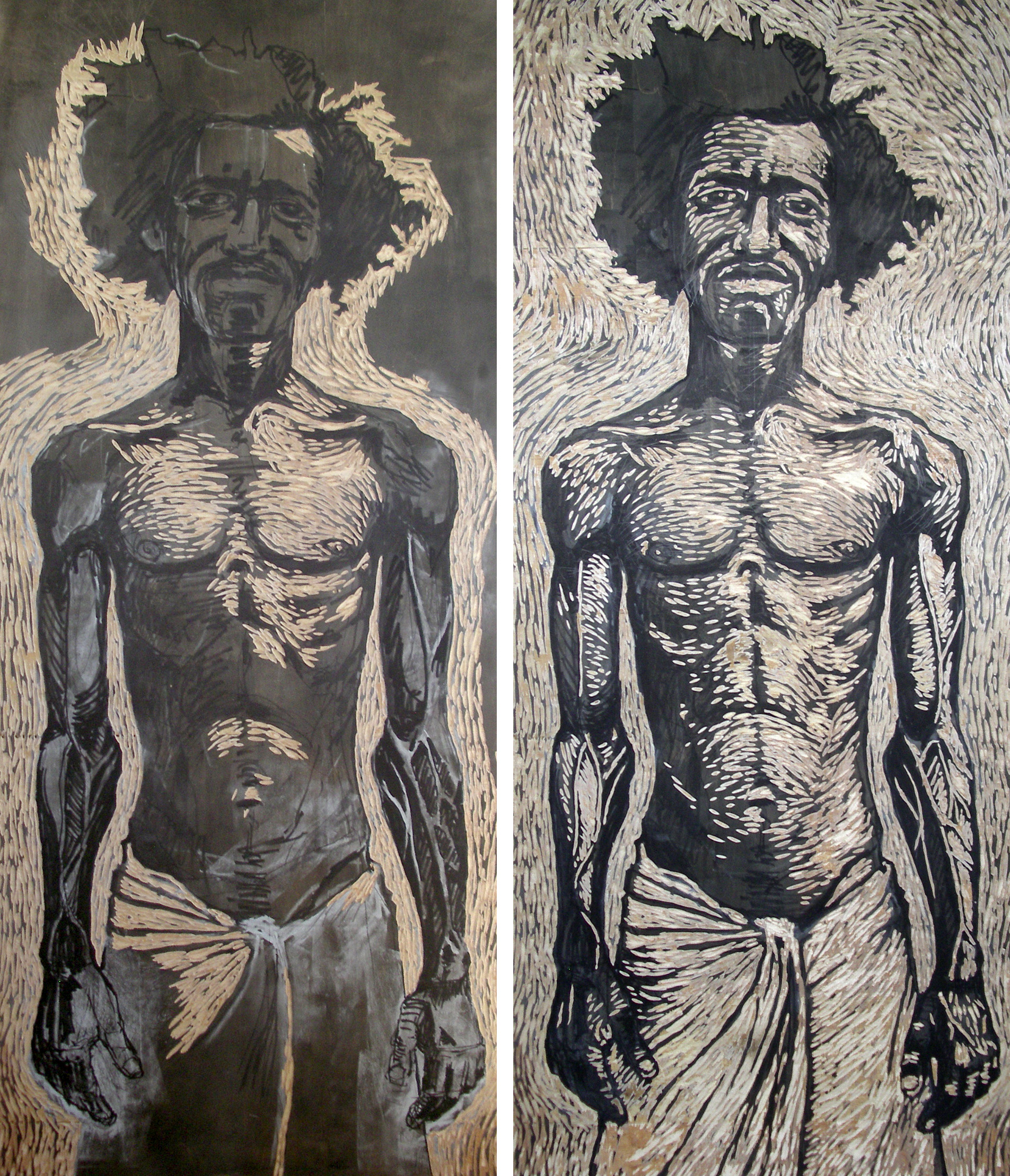
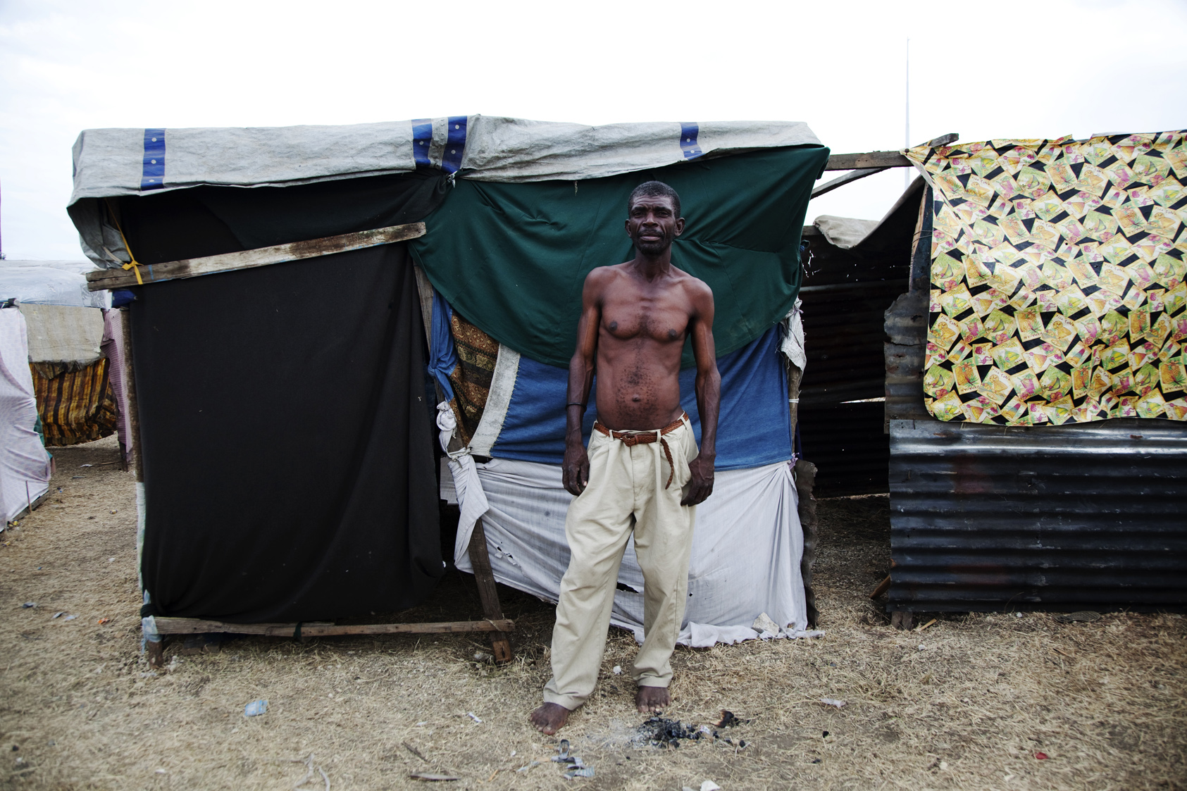
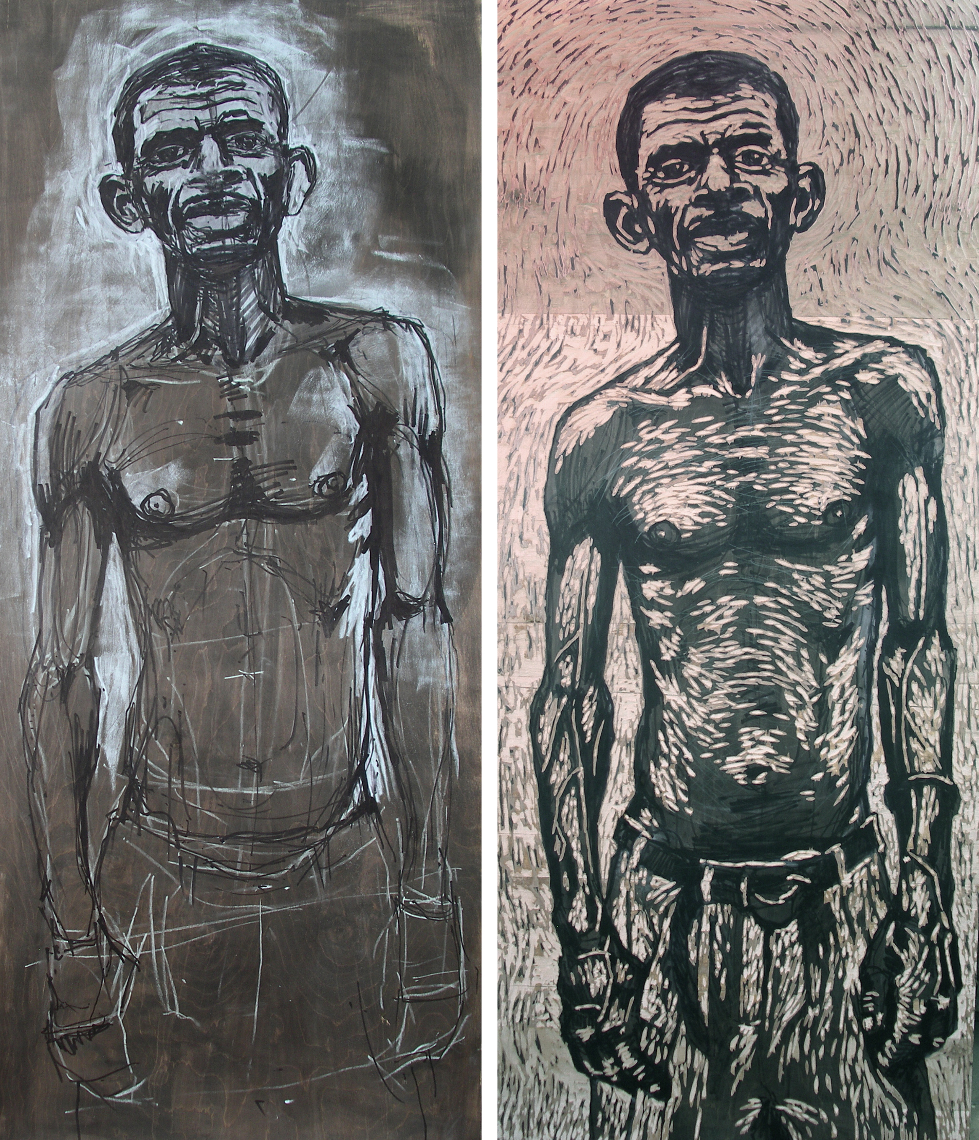
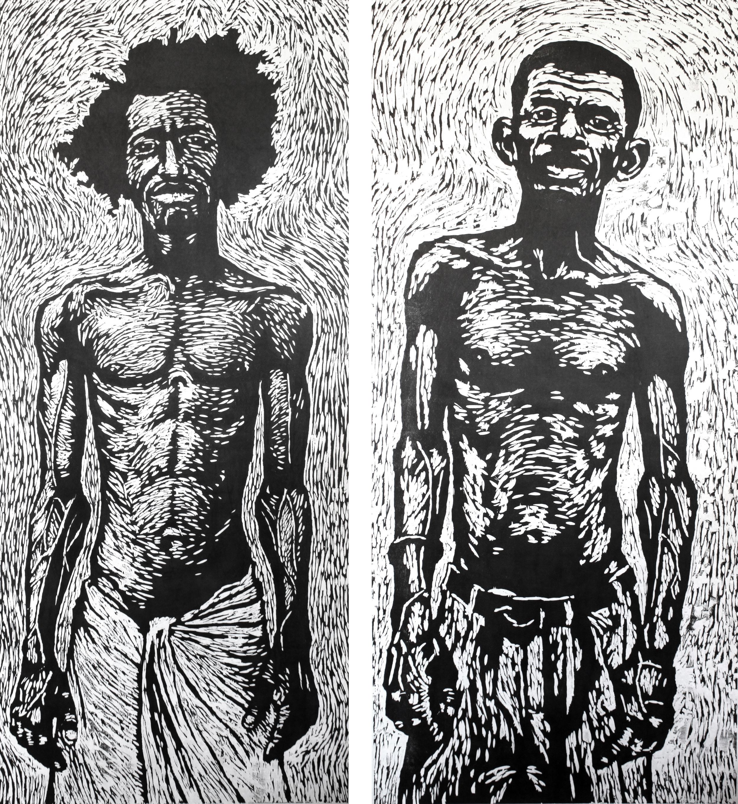
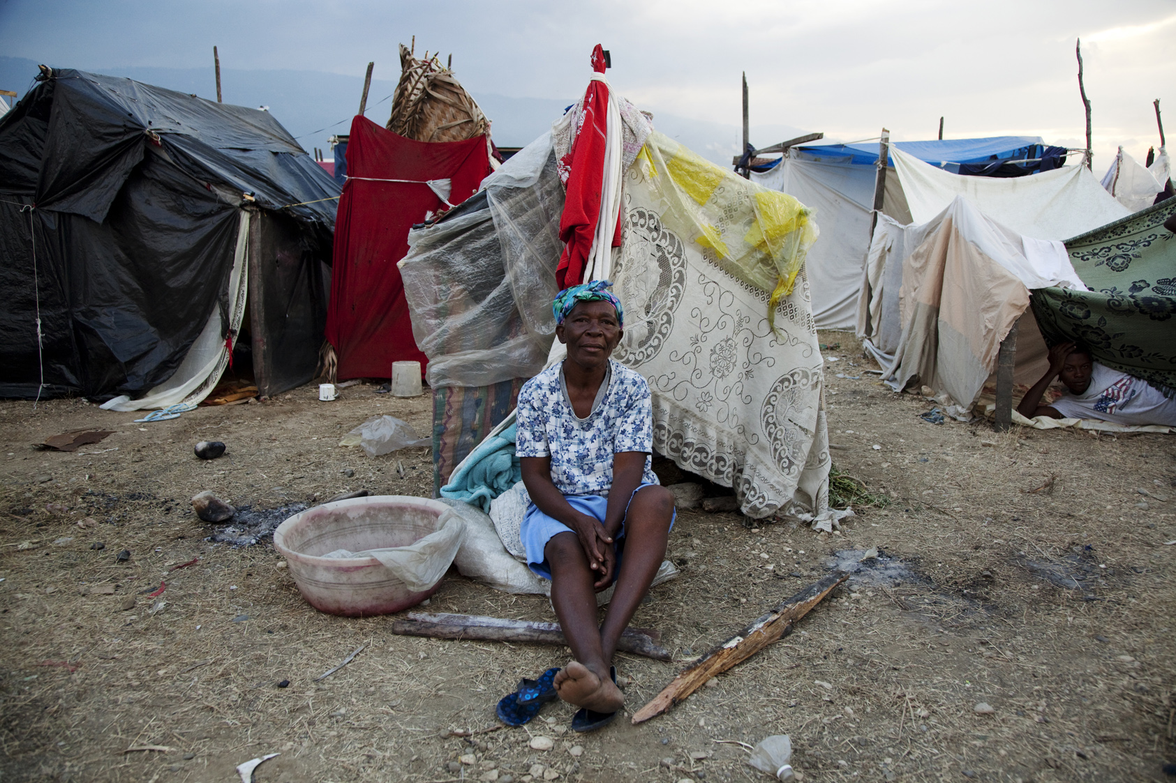
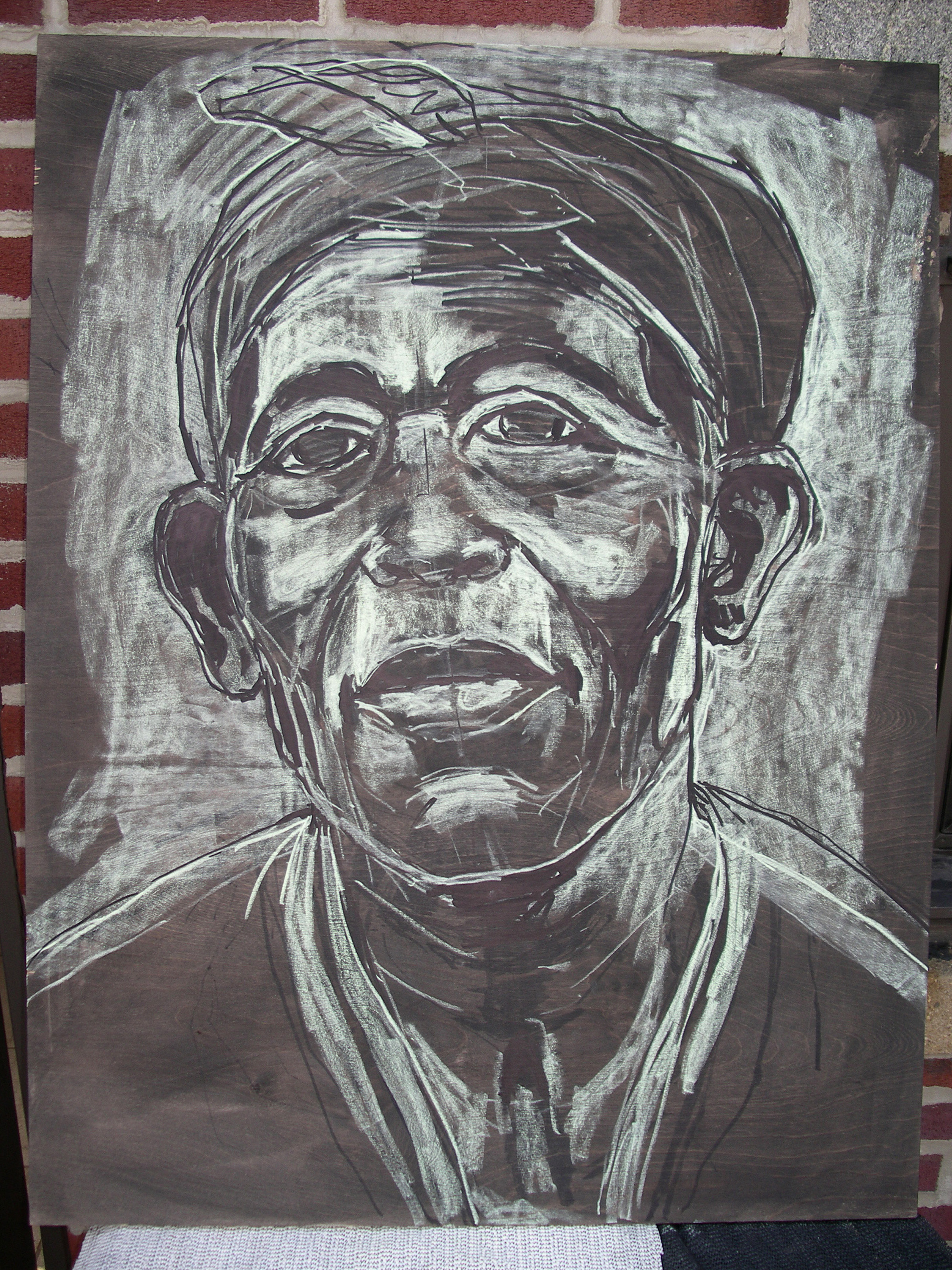
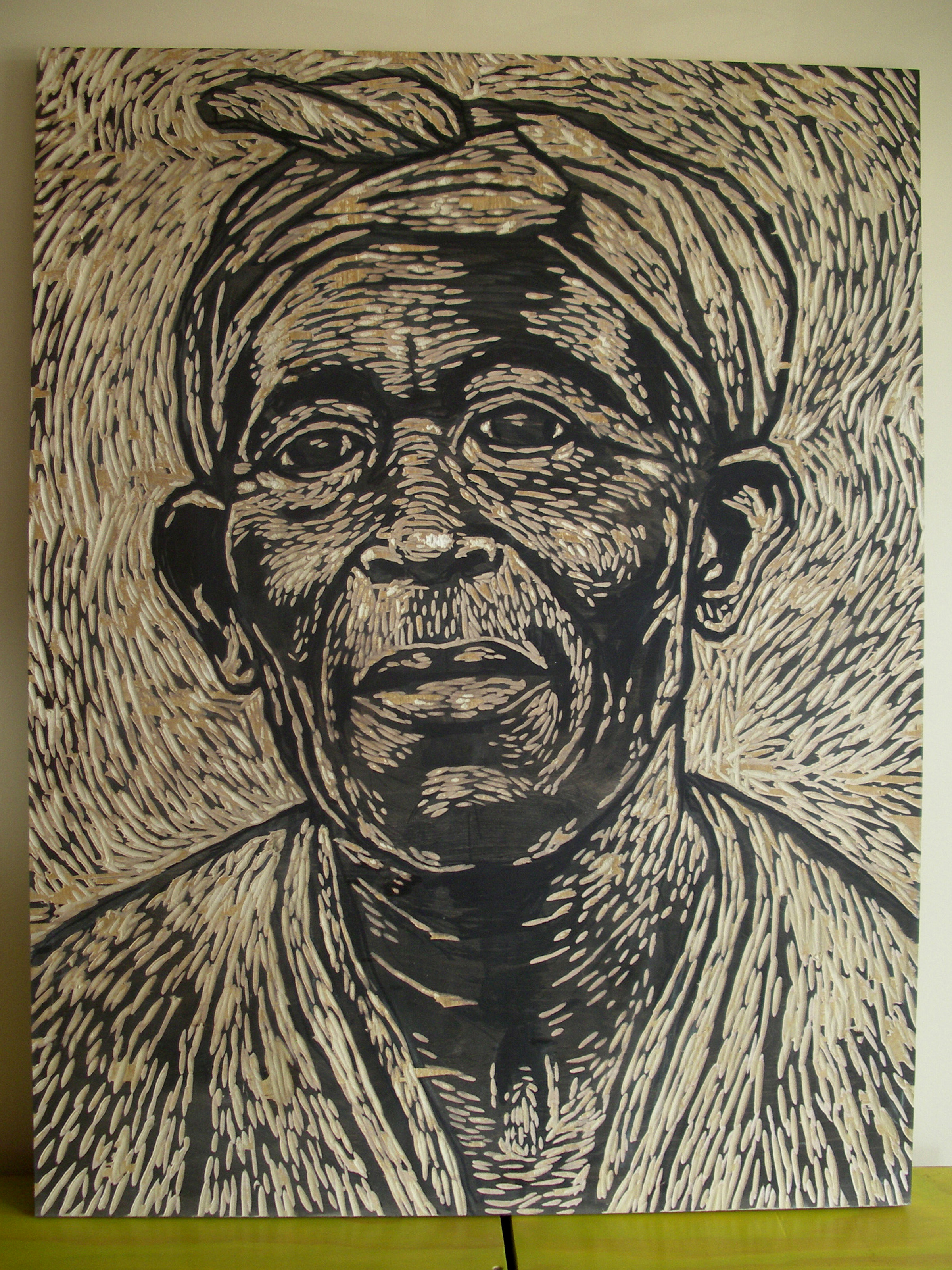
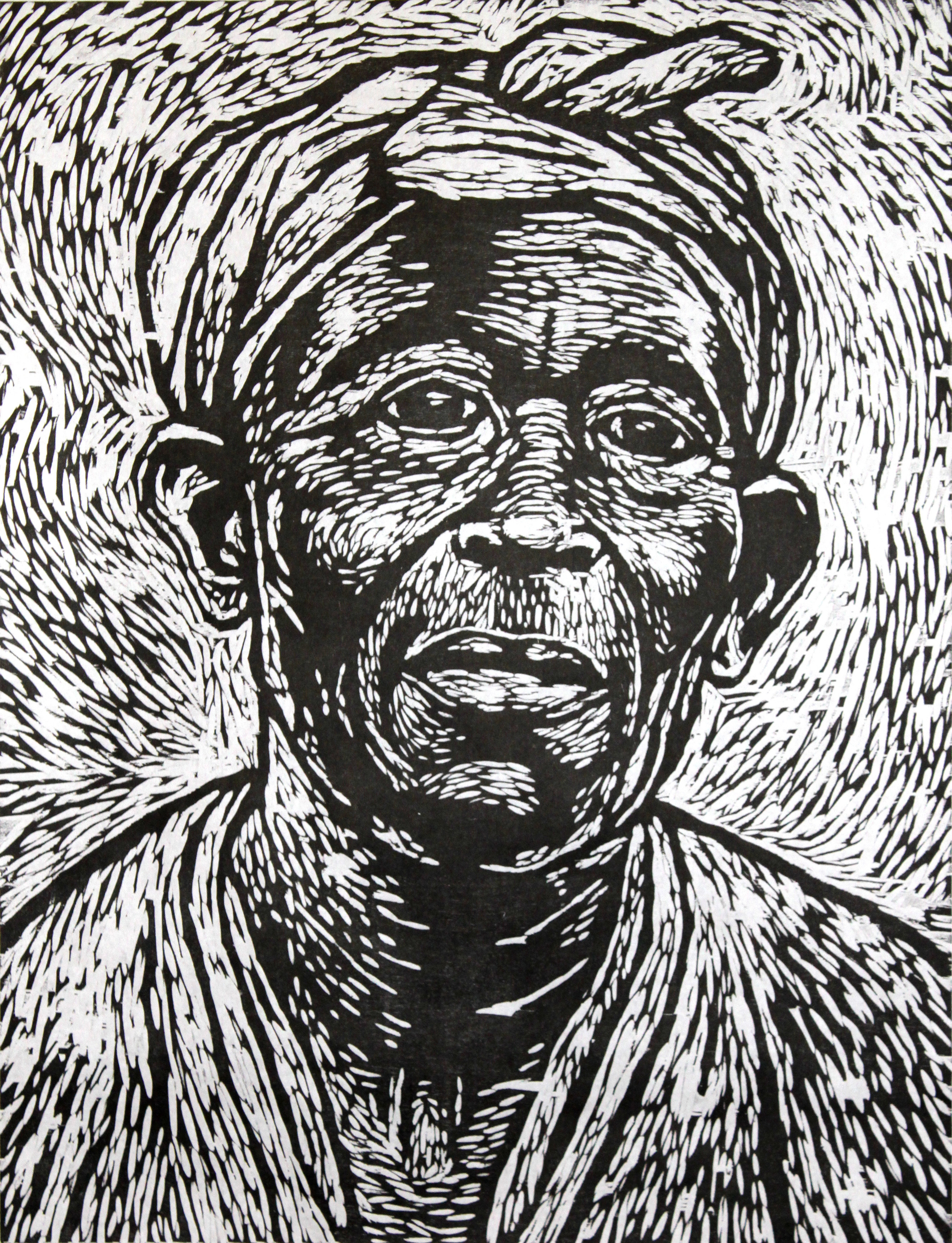
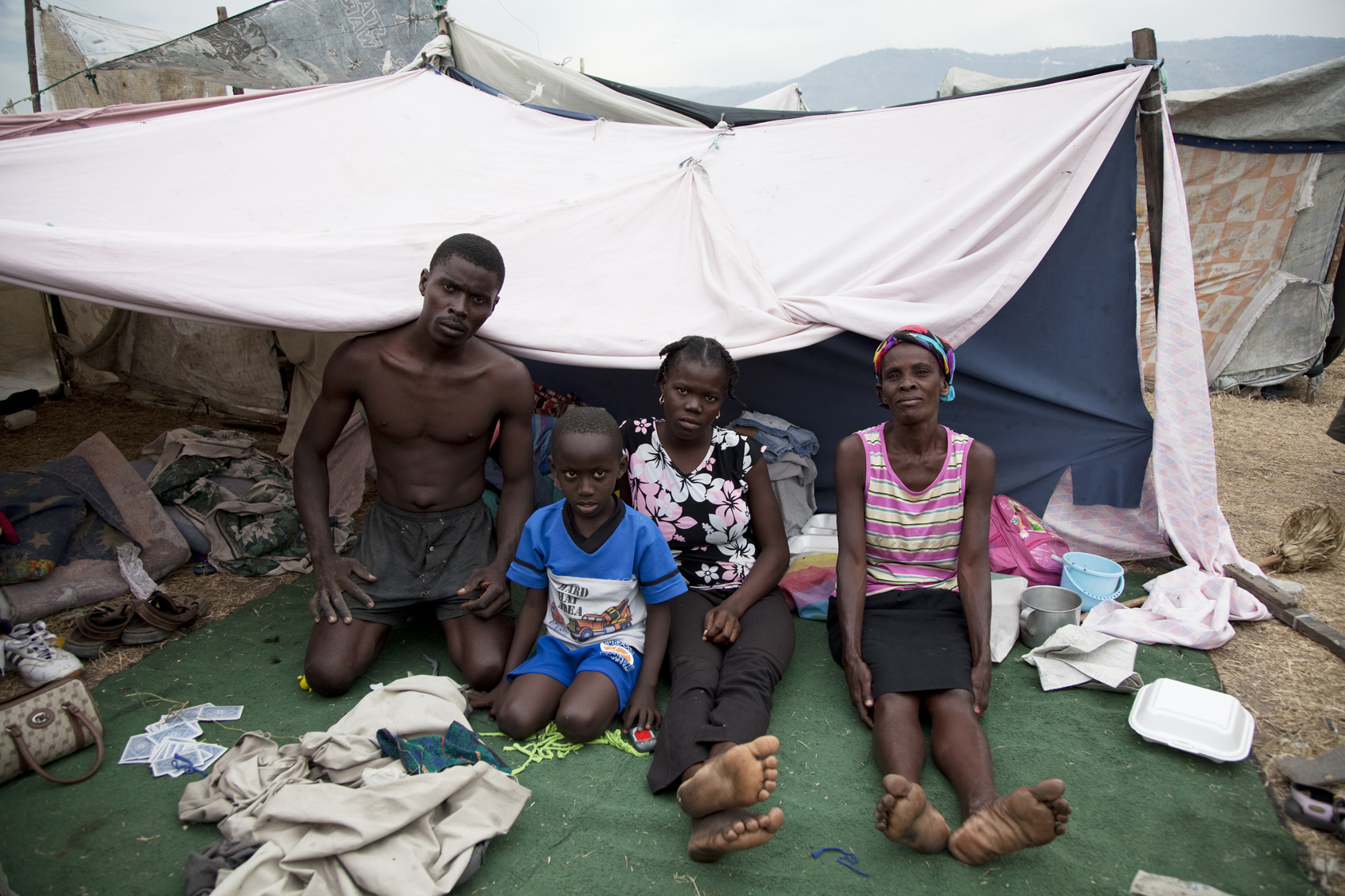
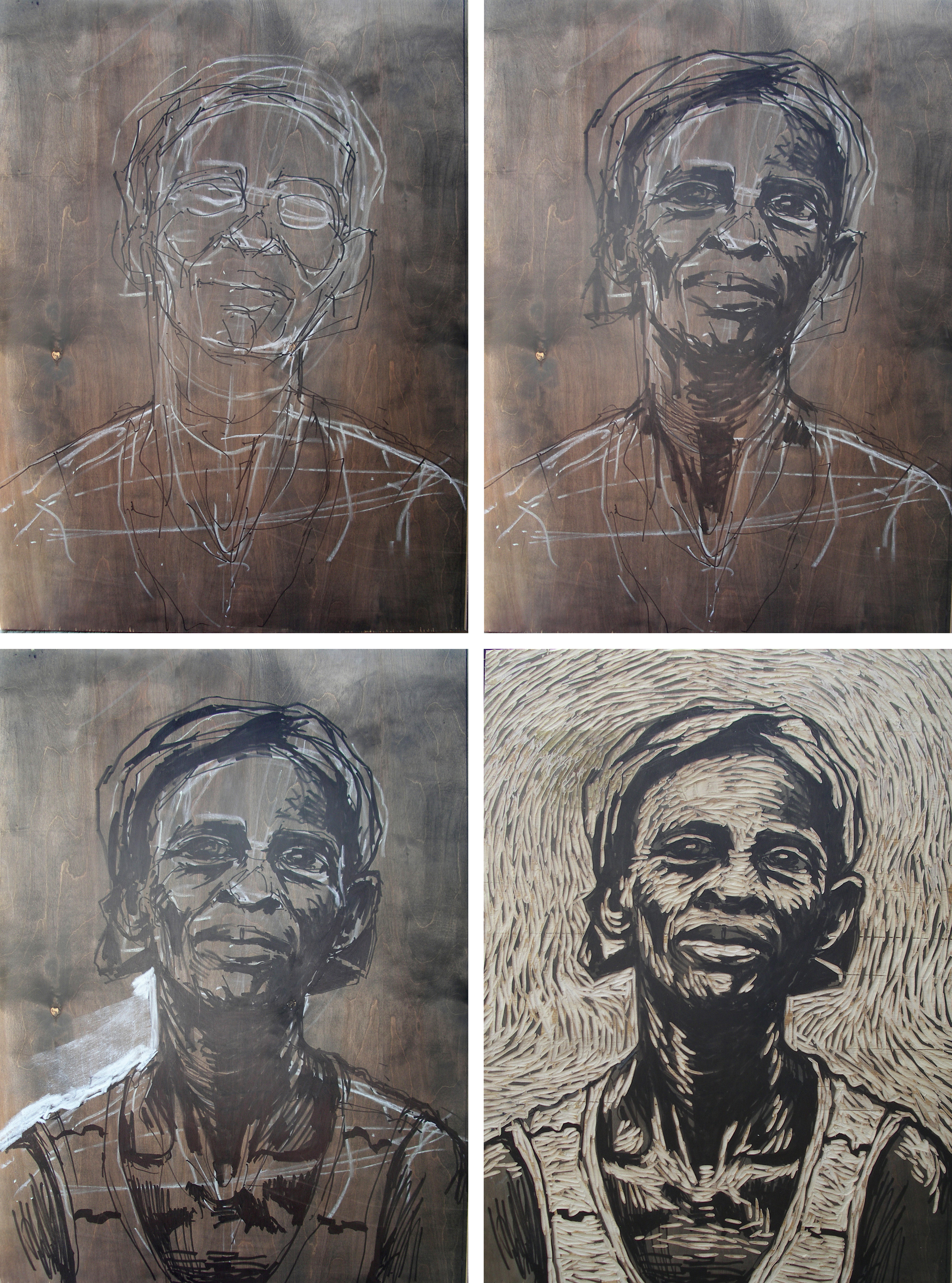
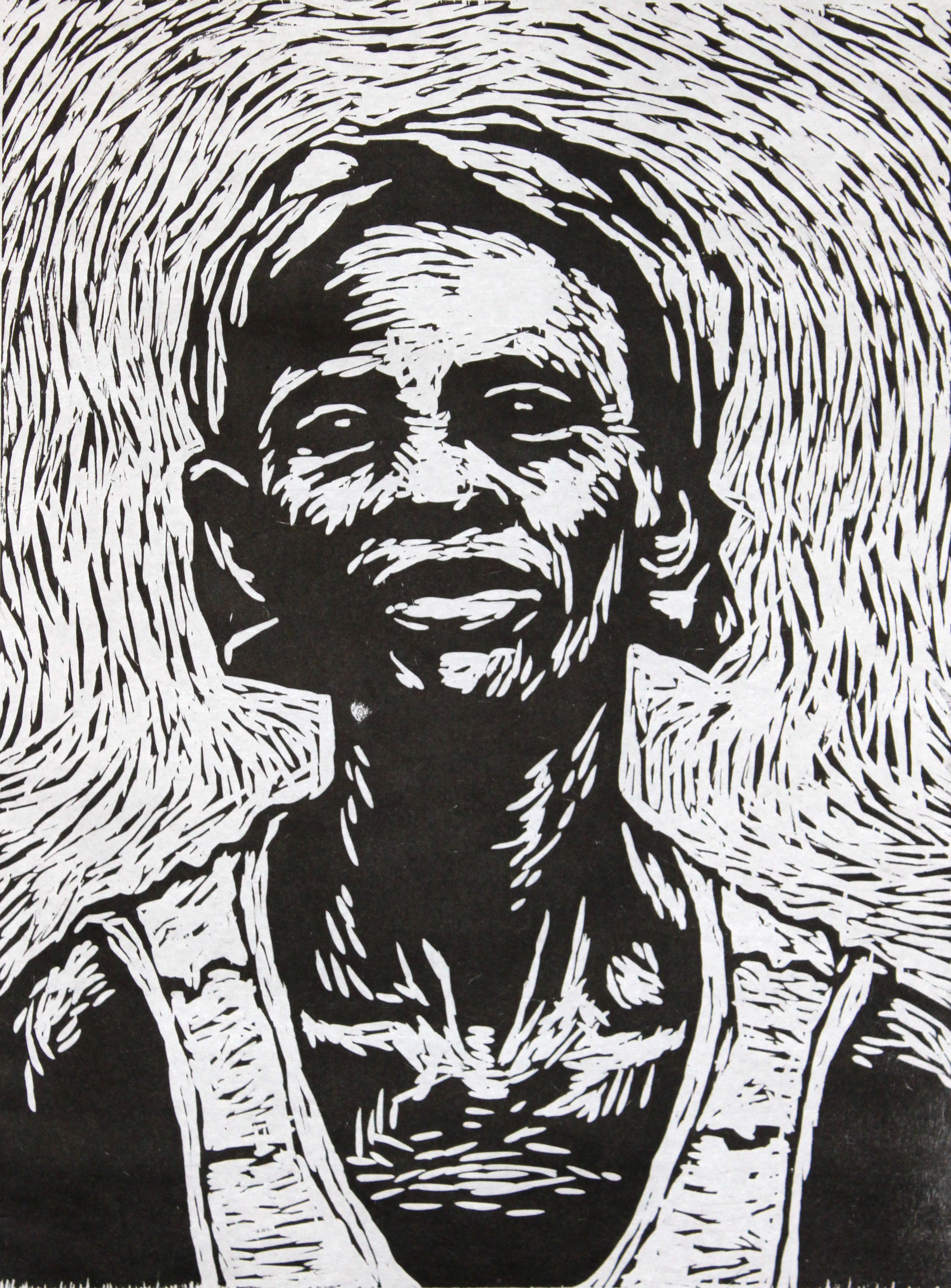
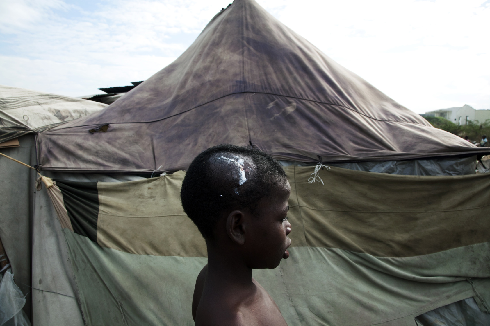
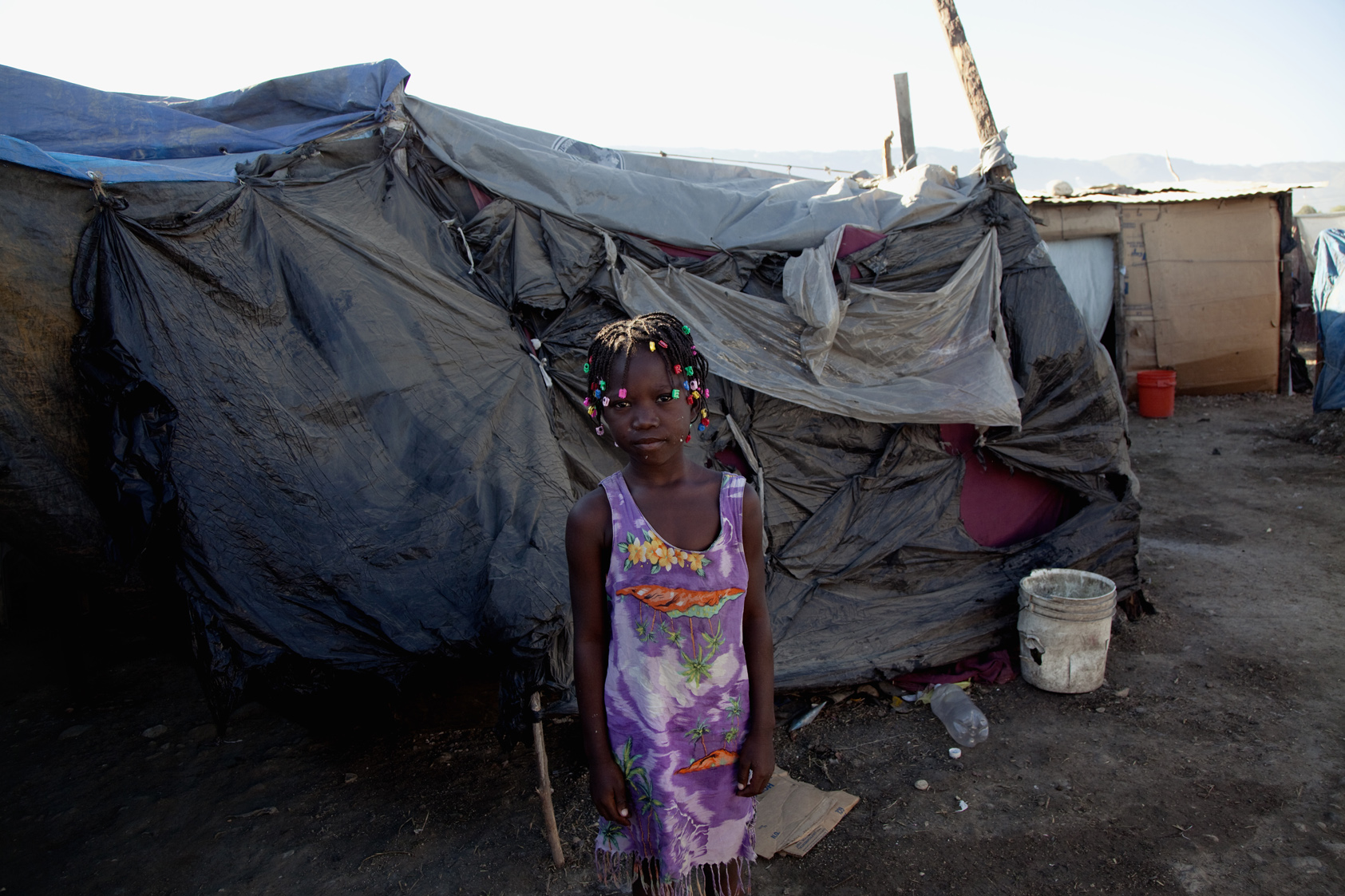
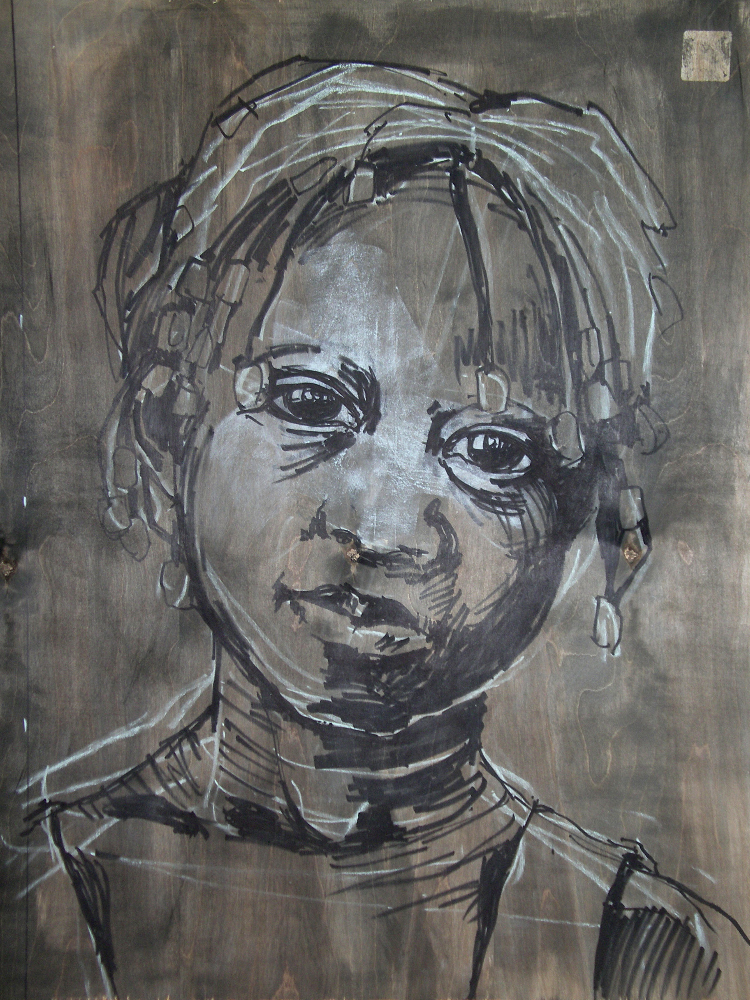
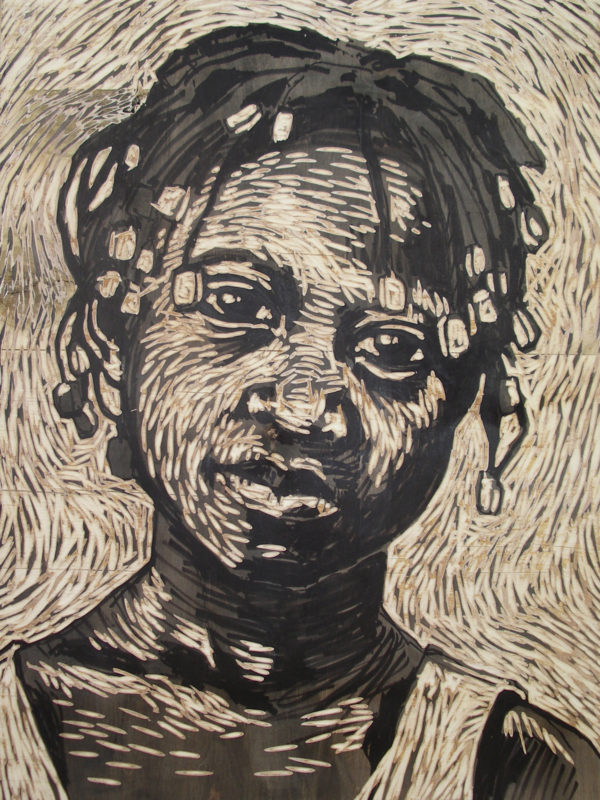
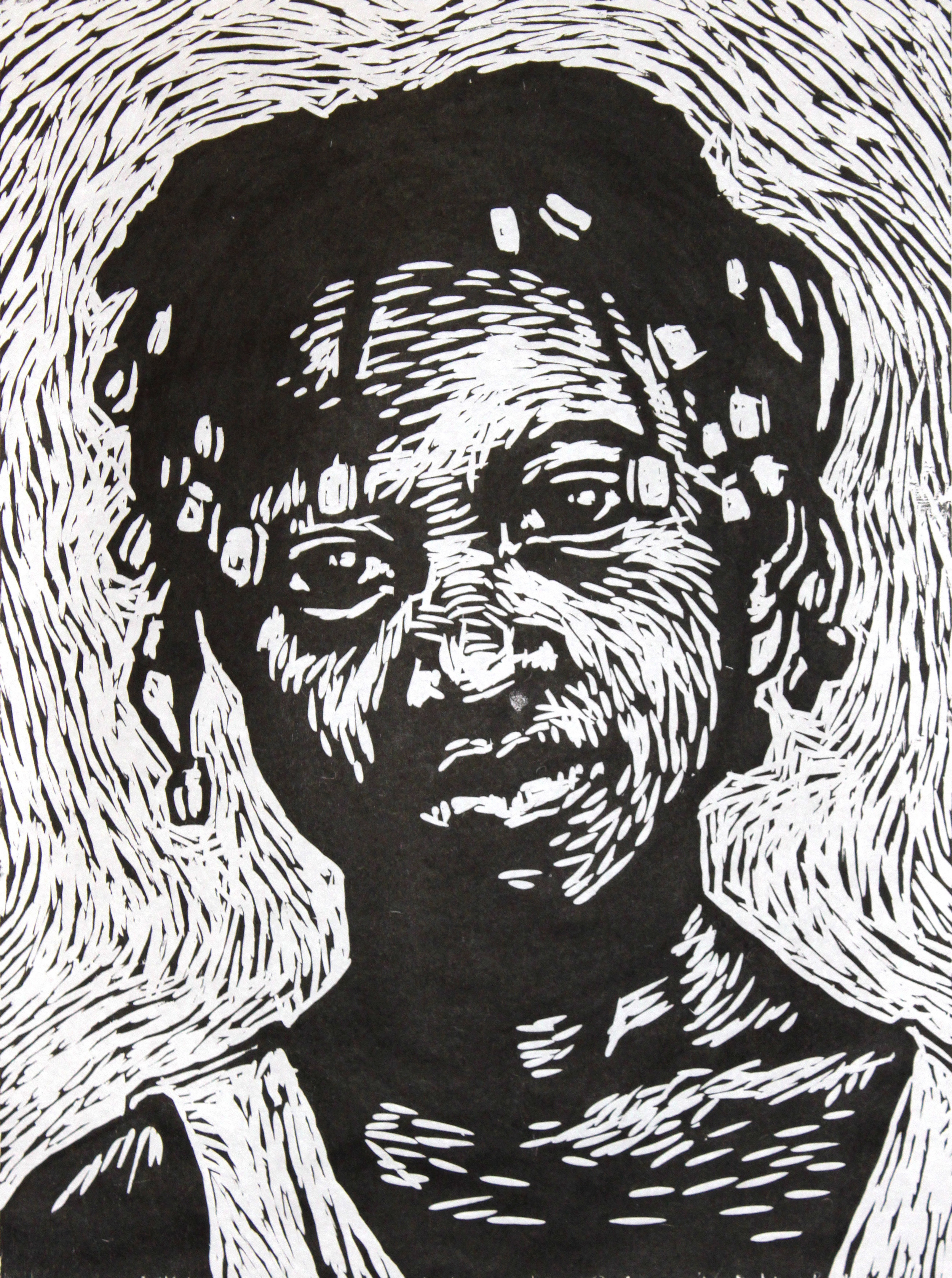
2010: Woodcut Series Photojournalism Collaboration
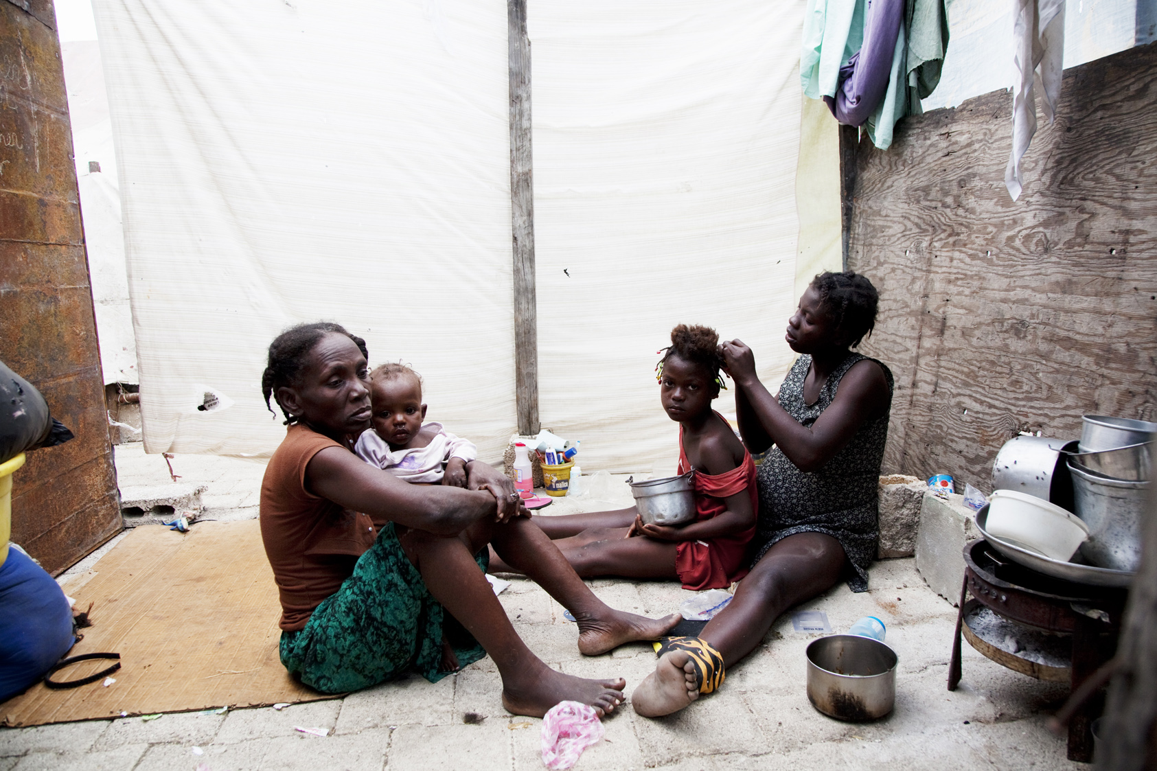
My friend Christina Boyle was one of the first American journalists to arrive in Port-au-Prince after the Haitian earthquake in 2010. Weeks later, back in NYC and visibly shaken she recounted to me the dire reality she had witnessed in Haiti.
This conversation began the process of developing the Pont-Rouge Portrait Project, an art project, a collaboration and a fundraising effort.
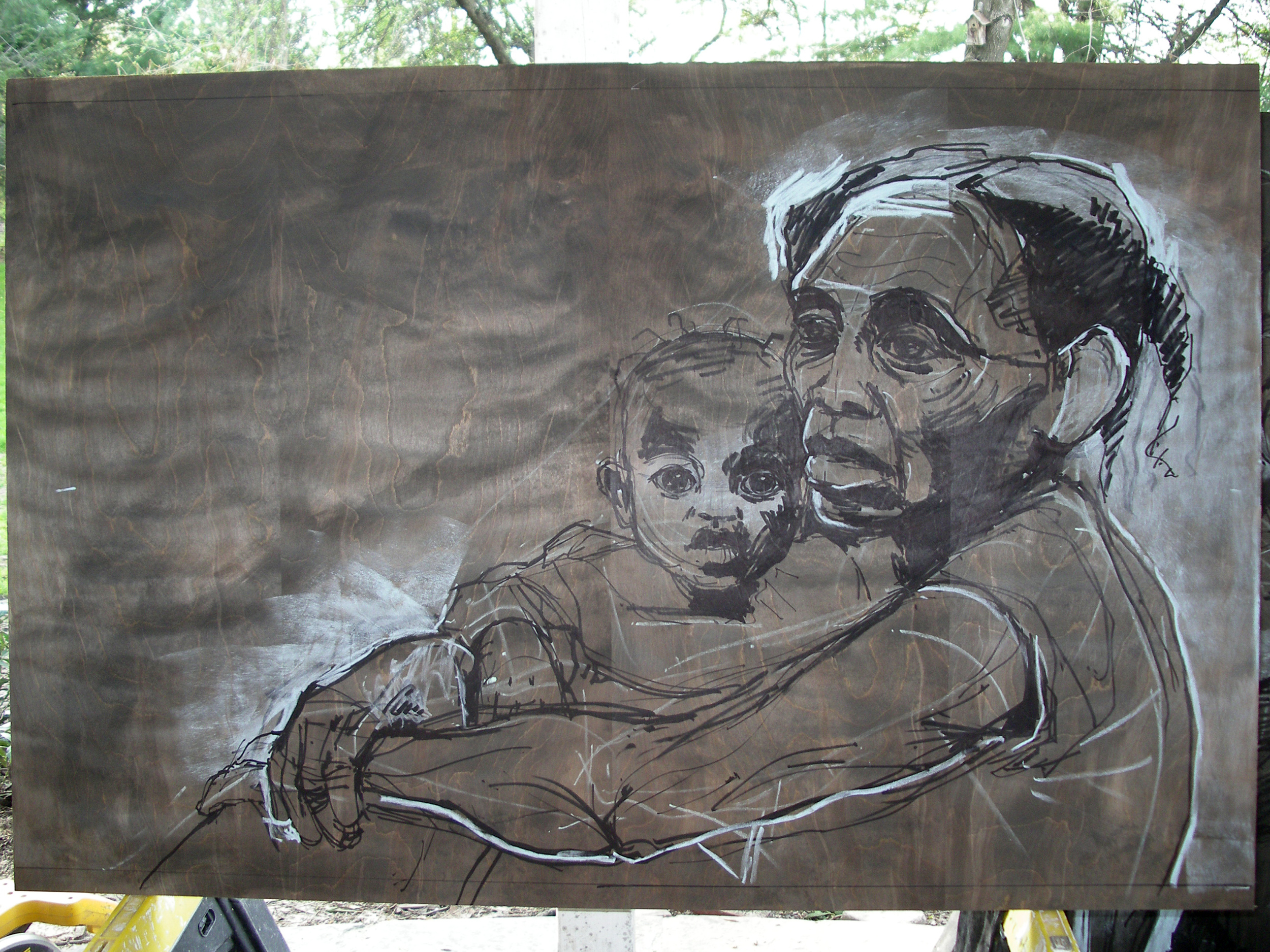
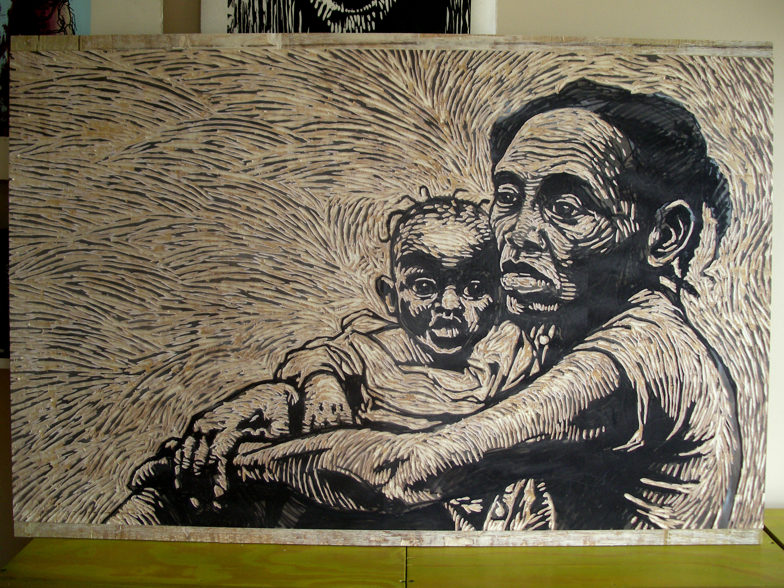
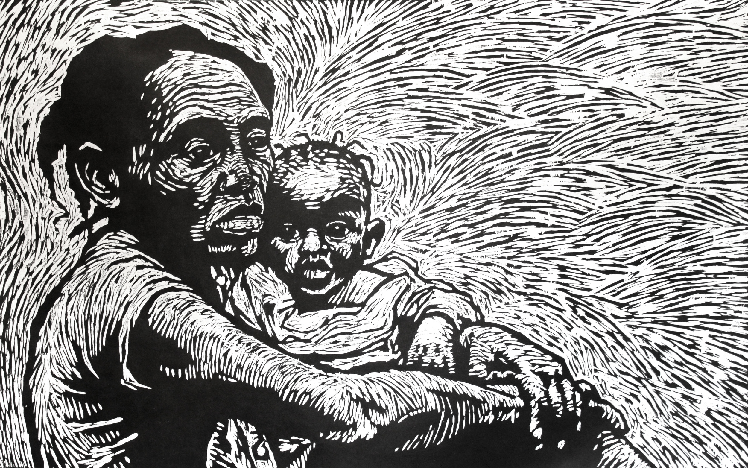
Photojournalist David Goldman connected me with award-winning photographer Q. Sakamaki.Q. had shot portraits of Haitian earthquake survivors at Pont-Rouge Displaced Persons Camp. I created seven large-scale woodcut portraits based on Q.’s work.
In September we exhibited our work side-by-side and held a fundraising art auction benefitting the grassroots organization Haitian Support Project. The exhibit was held at Powerhouse Arena in DUMBO, Brooklyn.
Q. Sakamaki’s original photo of Apollon Ralpho in Pont-Rouge Displaced Persons Camp in Haiti after the 2010 earthquake.
Q. Sakamaki’s original photo of Claudel Louimas in Pont-Rouge Displaced Persons Camp in Haiti after the 2010 earthquake.
Left, marker and chalk drawing on stained birch plywood. Right, final carved block.
Left, Apollon Ralpho, right, Claudel Louimas
Woodcut print on Japanese paper
Edition of 12
Image: 64" x 28"
Paper: 70.75" x 35"
Q. Sakamaki’s original photo of Roseline & Wadeline Etienne in Pont-Rouge Displaced Persons Camp in Haiti after the 2010 earthquake.
Woodcut print on Japanese paper
Edition of 12
Image: 48" x 30"
Paper: 55" x 37.5"
Q. Sakamaki’s original photo of Claudette Beausile in Pont-Rouge Displaced Persons Camp in Haiti after the 2010 earthquake.
Woodcut print on Japanese paper
Edition of 12
Image: 36.5" x 28"
Paper: 43.25" x 34.75"
Q. Sakamaki’s original photo of Maciani Vakena and her family in Pont-Rouge Displaced Persons Camp in Haiti after the 2010 earthquake.
Woodcut print on Japanese paper
Edition of 12
Image: 32" x 23.75"
Paper: 39" x 30.5"
Q. Sakamaki’s original photo of Fedner Seraphin in Pont-Rouge Displaced Persons Camp in Haiti after the 2010 earthquake.
Woodcut print on Japanese paper
Edition of 12
Image: 36.5" x 28"
Paper: 43.25" x 34.75"
Q. Sakamaki’s original photo of Sabaline Estiven in Pont-Rouge Displaced Persons Camp in Haiti after the 2010 earthquake.
Woodcut print on Japanese paper
Edition of 12
Image: 32" x 23.75"
Paper: 39" x 30.5"
After reviewing the sketch development my client's had two inspired insights that changed the piece from this point forward. 1) They wanted to have more sense of ground, giving the composition more space to breath. 2) They thought of including water and infrastructure, real systems that maintain living, breathing communities. This drawing also includes the homes of everyone involved in the project.